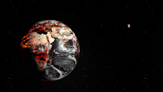
Global Famine Is Not Just A Theoretical Scenario Anymore
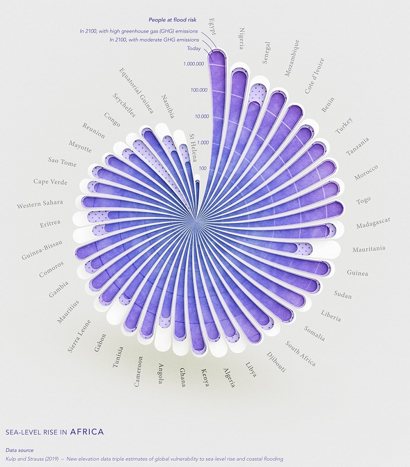
Climate change is already causing sea levels to rise across the globe. In the 20th century alone, it’s estimated that the mean global sea level rose by 11-16 cm.
How much will sea levels change in the coming years, and how will it affect our population?
In the below series of visualizations by Florent Lavergne, we can see how rising sea levels could impact countries in terms of flood risk by the year 2100.
Click to view a larger version of the map.
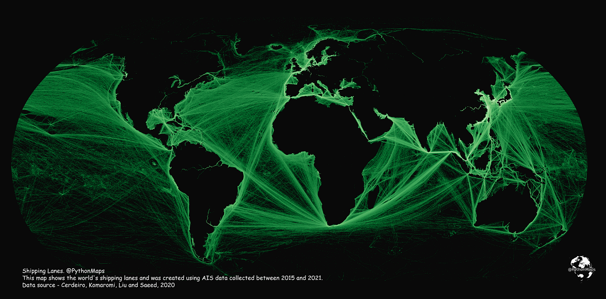
Mapping Shipping Lanes: Maritime Traffic Around the World
Each year, thousands of ships travel across the globe, transporting everything from passengers to consumer goods like wheat and oil.
Visualizing the World’s Most Popular Religions
According to some estimates, there are over 4,000 religions, faiths groups, and denominations that exist around the world today. Researchers and academics generally categorize the world’s religions into five major groups: Christianity, Islam, Buddhism, Hinduism, and Judaism.
This graphic by Chit Chart visualizes the most popular religions around the world, using the latest available data from Index Mundi’s world demographics.
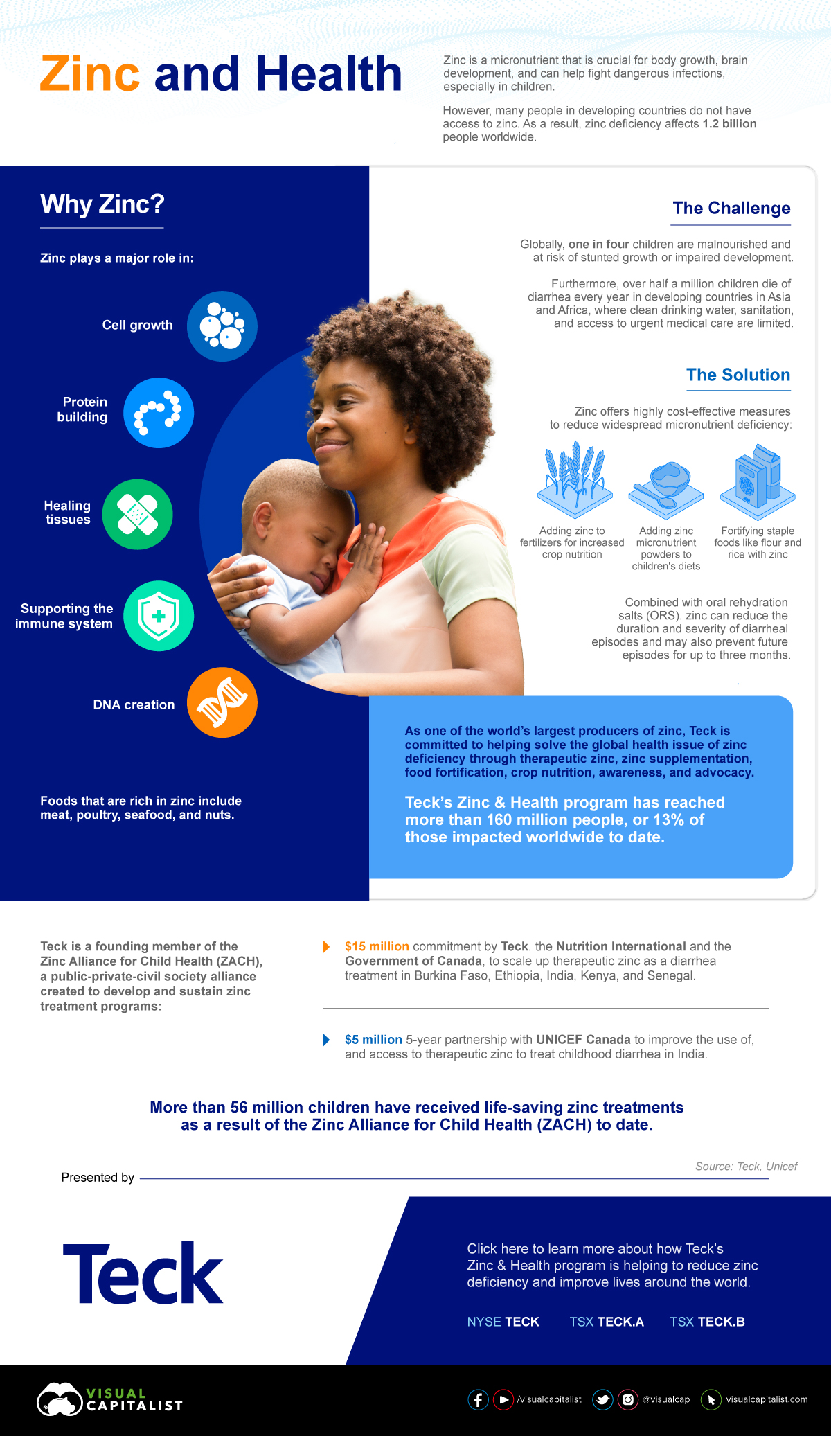
The following content is sponsored by the Teck
Zinc: A Life Saving Commodity
Zinc is crucial for body growth, brain development, and helps fight dangerous infections, especially in children.
However, the reality is that millions around the world lack sufficient zinc in their diets in order to live healthy lives.
This graphic, sponsored by Teck, shows how zinc supplementation could save millions of lives.
Why Zinc?