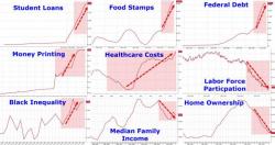
These Are The 9 Zero Hedge Charts Showing "Obama's Recovery" That Angered The Washington Post

As regular readers know, one of our favorite chartpacks to show "Obama's recovery" is the one below, presented most recently just two days ago during Obama's now almost weekly televised sermon of how the economy is great and anyone who disagrees is "peddling fiction", which using simple Bloomerg data, summarize recent changes in key economic indicators including soaring federal debt and government dependency via food stamp use, surging healthcare costs and social inequality, plunging homeownership, income, and labor force participation, and - of course - driving it all, none of the presiden


