At the end of 2023, we publicly launched Voronoi, our free new data discovery app!
The initial response from both users and creators has been incredible. We now have millions of in-app views, and there are already more than 1,500 interesting visualizations to discover, many of which will never be published on Visual Capitalist.
For that reason, we’ve chosen to highlight some of the most popular visualizations and creators from July in this roundup. To see them and many others, make sure to download the app!
Join Voronoi Now
Let’s take a look at a popular creator worth highlighting, a top “Editor’s Pick” of the month, and also the most popular and most commented on visuals.
POPULAR CREATOR
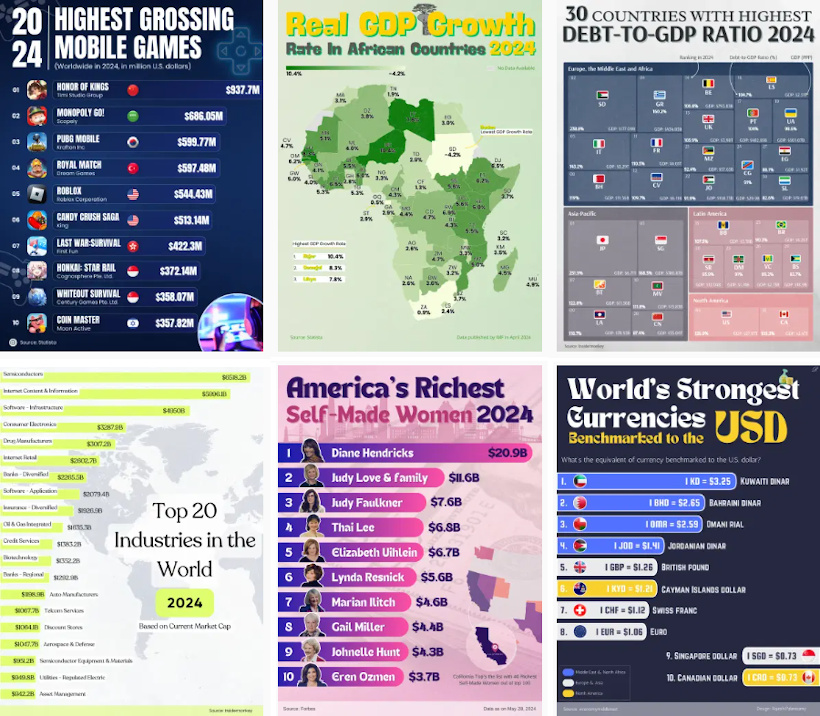
Rajesh Palanisamy
Visual Capitalist isn’t the only creator on the Voronoi app.
Instead, it features incredible data-driven charts and stories from many of the world’s best creators, like Rajesh Palanisamy.
Rajesh has been one of the most popular new creators over the last month, covering a wide range of topics like:
- Countries with the highest debt-to-GDP ratios
- Mapping the fastest growing U.S. state economies
- The highest-grossing mobile games
- The GDP per capita of African countries mapped
Make sure to follow Rajesh Palanisamy on Voronoi today to see many charts, maps, and visualizations on a wide range of exciting topics.
![]() View all visuals from Rajesh on Voronoi today.
View all visuals from Rajesh on Voronoi today.
MOST VIEWED
Ranked: The Most Reliable Car Brands in the U.S.
A vehicle is one of the most important purchases that consumers make.
Yet, each car can have numerous problems, sometimes sucking all the value out of a purchase. So which cars are the most reliable, on average?
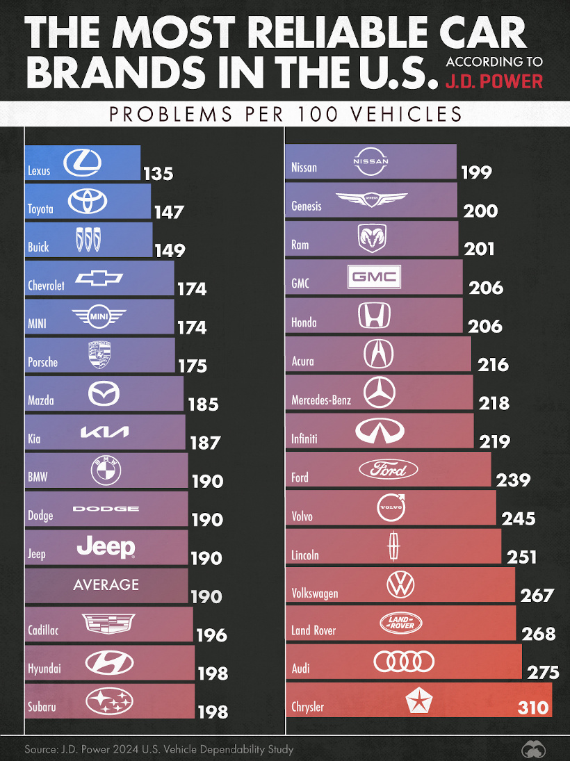
In this graphic, Visual Capitalist ranks the most reliable cars based on data from J.D. Power, using problems per 100 vehicles as a metric.
Japanese vehicles, and specifically Toyota and Lexus (a Toyota brand) performed well in the ranking, with Chrysler finishing at the very bottom of the standings.
![]() Get the data behind this visual on Voronoi today.
Get the data behind this visual on Voronoi today.
EDITOR’S PICK
What Powered the World in 2023?
One of the recent picks in our Editor’s Pick feed on the app is from creator Elements, and it shows what energy fueled the world in 2023.
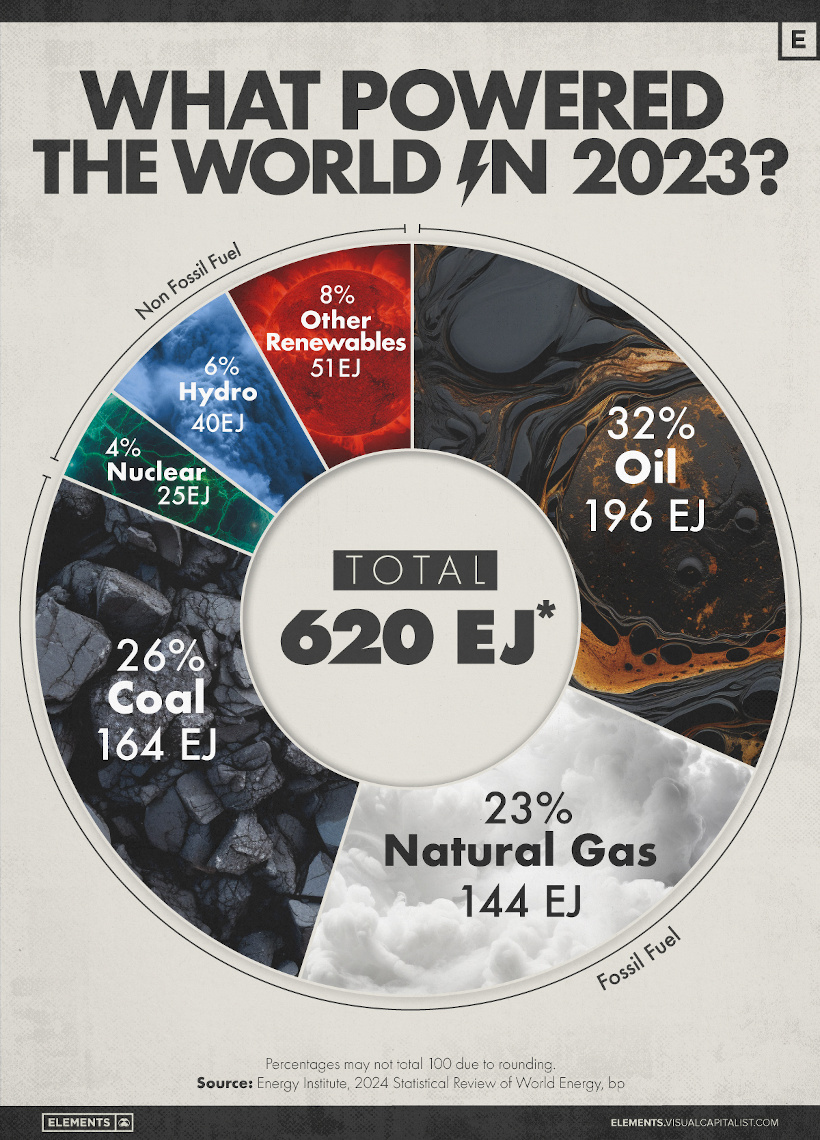
This data comes from the Energy Institute’s flagship report each year, called the 2024 Statistical Review of Energy.
Although the data is quite high level, perhaps the most obvious takeaway is the prominence of fossil fuels in the energy mix: oil, coal, and natural gas combine for more than 80% of the world’s energy needs.
![]() Get the data behind this visual on Voronoi today.
Get the data behind this visual on Voronoi today.
MOST DISCUSSED
Ranked: Average Annual Salaries by Country
What do average workers make around the world?

This visualization by Visual Capitalist breaks down average wages by OECD country, showing a wide range in salaries. Each salary is adjusted for purchasing power parity (PPP) to be more directly comparable.
![]() To join the conversation, join Voronoi today.
To join the conversation, join Voronoi today.
Use This Visualization
The post Best Visualizations of July on the Voronoi App appeared first on Visual Capitalist.