Just over a year ago, we launched Voronoi, our free new data discovery app.
Believe it or not, there are already more data-driven visuals on Voronoi than on Visual Capitalist (which has been around for 13 years!).
Every day there’s something new on Voronoi to see. And in aggregate, there are roughly 5,000 data stories to explore on the platform from 150+ world-class creators.
Explore Voronoi
Let’s see what captivated users in June.
We’ll take a look at some of the best Voronoi visuals over the last month, including two standout Editor’s Picks, as well as the most discussed and most liked posts.
MOST DISCUSSED
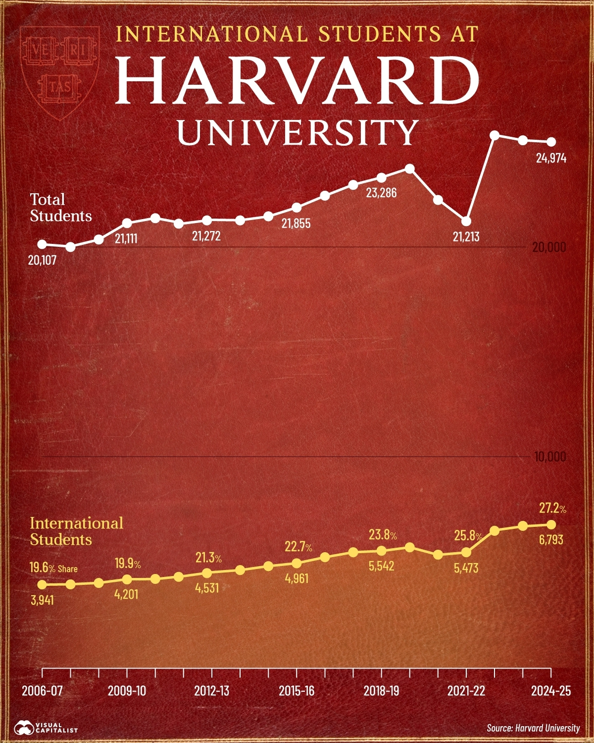
Charted: International Students at Harvard (2006-2024)
A decision by President Trump to bar Harvard from enrolling international students ignited fierce debate—and this timeline from Visual Capitalist became the month’s most commented-on post this month.
The chart shows foreign enrollment rising from 19.6% in 2006-07 to a record 27.2% (6,793 students) today—growth that hit its biggest single-year jump in 2022-23.
Commenters sparred over academic freedom, visa policy, and whether capping international students at 15% (as proposed) would hurt U.S. competitiveness.
![]() Join the discussion on Voronoi today.
Join the discussion on Voronoi today.
EDITOR’S PICK
Turning Point in Hormuz Strait Tensions
Economist Ehsan Soltani unpacks why the Strait of Hormuz—choke point for ~20 mbpd of oil—no longer exerts the same leverage over Western economies.
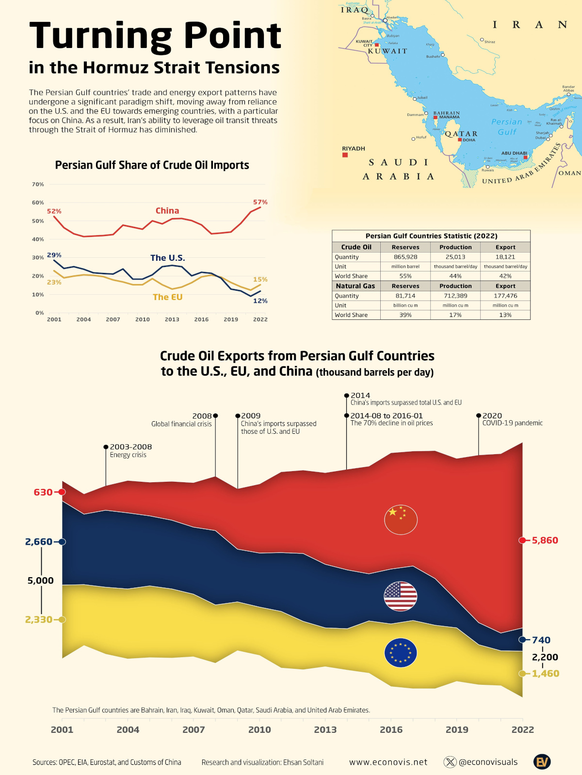
With U.S. and EU demand down and China now the biggest customer, any disruption would hurt Beijing far more than Washington—flipping the strategic script and giving U.S. producers room to benefit.
![]() Dive into the analysis on Voronoi today.
Dive into the analysis on Voronoi today.
MOST LIKED
High Blood Pressure Rates by Country
Gorgeous design meets global health data in this infographic from Edit Gyenge—one of the most liked pieces on Voronoi in June.
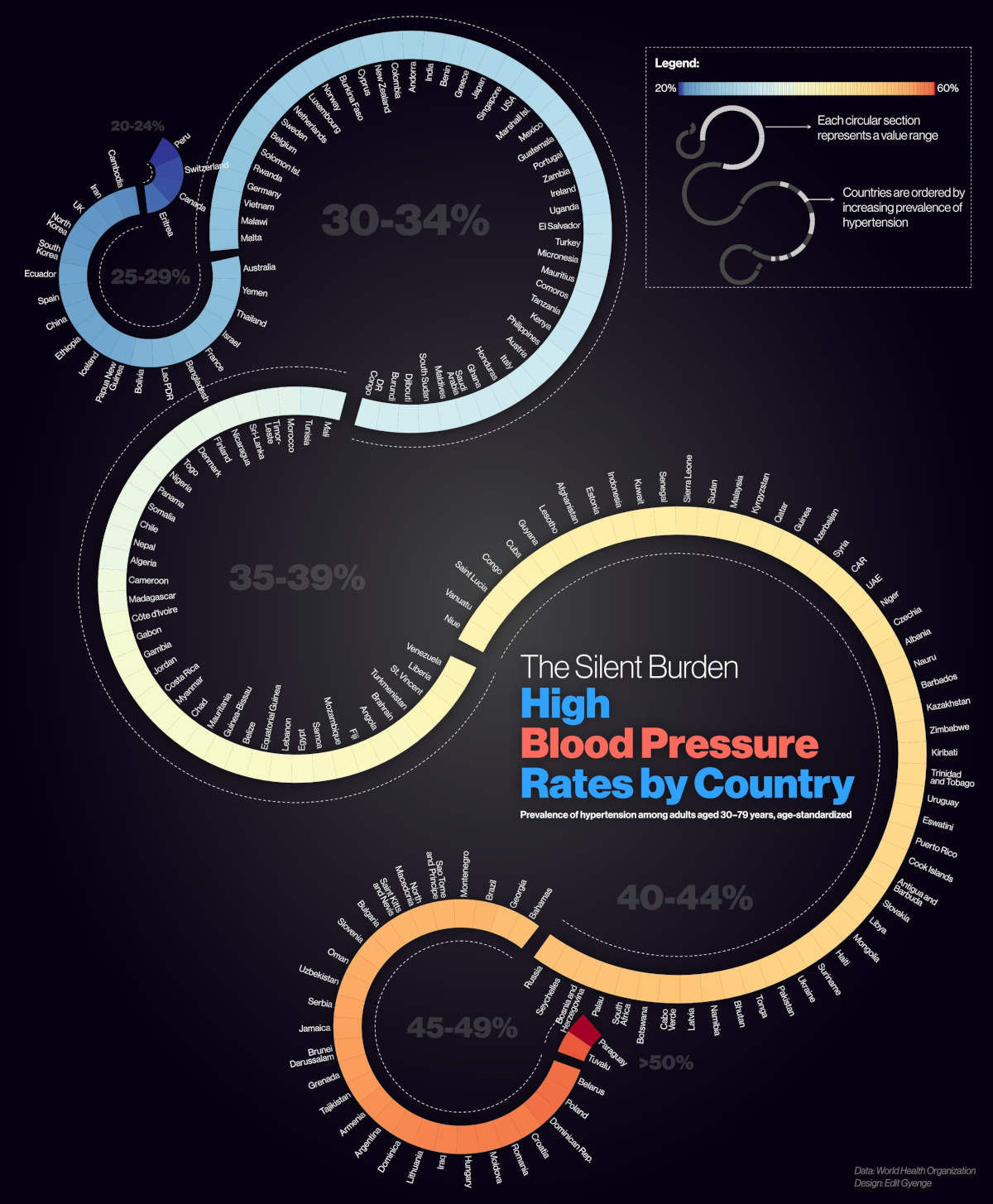
It reveals stark contrasts: hypertension affects just 21% of adults in Switzerland but more than half in Paraguay. Western Europe and East Asia cluster below the global average, while parts of Eastern Europe, Central Asia, and the Pacific Islands sit well above it.
![]() See how your country ranks on Voronoi today.
See how your country ranks on Voronoi today.
EDITOR’S PICK
Youth Unemployment Trends Across Europe
Edit Gyenge earns a second feature this month with a decade-long look at Europe’s youth job market.
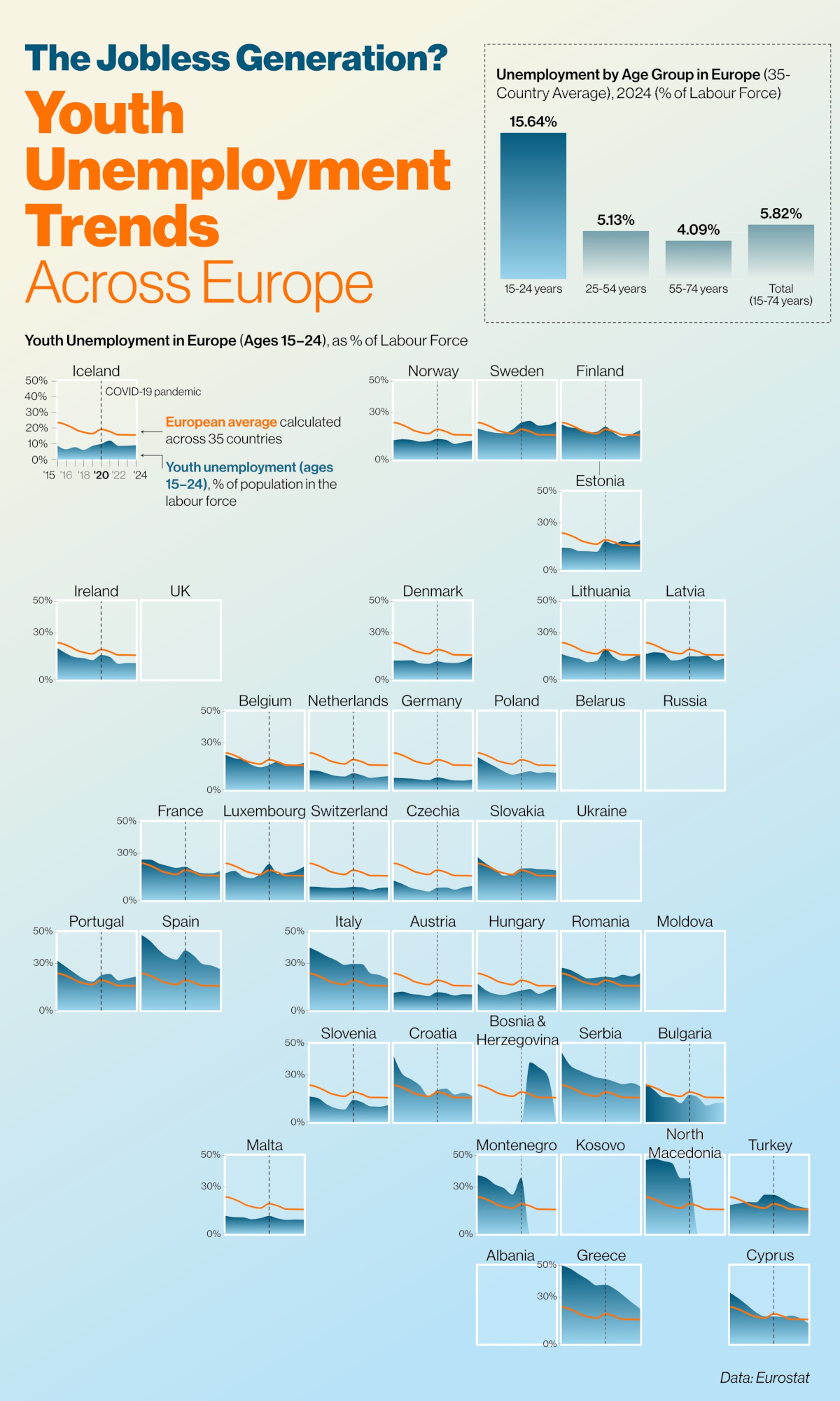
Using Eurostat data, the graphic shows Greece and Spain sliding from 50% youth unemployment in 2015 to the mid-20s today, while the Netherlands and Germany hold below 9%. The pandemic’s lasting impact keeps under-25 joblessness the highest among age groups, underscoring the need for targeted policy.
![]() Explore the full dataset on Voronoi today.
Explore the full dataset on Voronoi today.