About 18 months ago, we launched Voronoi, our free new data discovery app.
Believe it or not, there are already more data-driven visuals on Voronoi than on Visual Capitalist (which has been around for 13 years!).
Every day there’s something new on Voronoi to see. And in aggregate, there are roughly 6,500 data stories to explore on the platform from nearly 200 world-class creators.
Explore Voronoi
Let’s see what captivated users in November.
We’ll take a look at some of the best Voronoi visuals over the last month, including one standout Editor’s Pick, as well as the most viewed, most discussed, and most liked posts.
MOST VIEWED
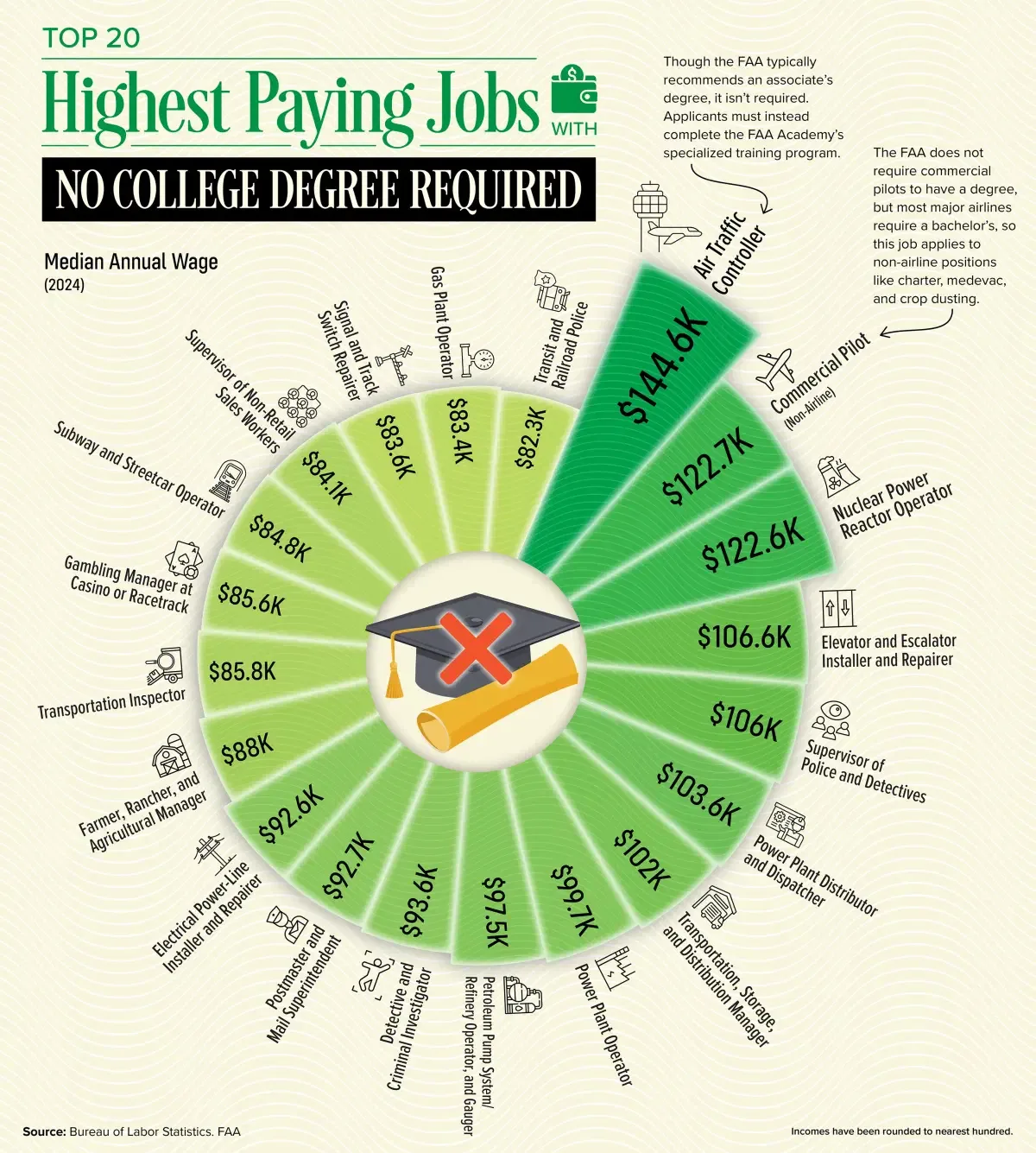
Highest Paying Jobs with No College Degree Required
This month’s most viewed visual came from Julie Peasley, exploring the top-paying U.S. jobs that don’t require a college degree.
Based on data from the U.S. Bureau of Labor Statistics (May 2024), this visualization highlights 20 careers where experience, certification, or specialized training outweigh formal higher education. The top spot goes to air traffic controllers, earning a median wage of $144,580—without requiring an associate’s or bachelor’s degree.
Users were fascinated by how many six-figure opportunities exist for those with hands-on skills, trade experience, or niche expertise in logistics and public safety.
![]() Explore the full dataset on Voronoi today.
Explore the full dataset on Voronoi today.
MOST DISCUSSED
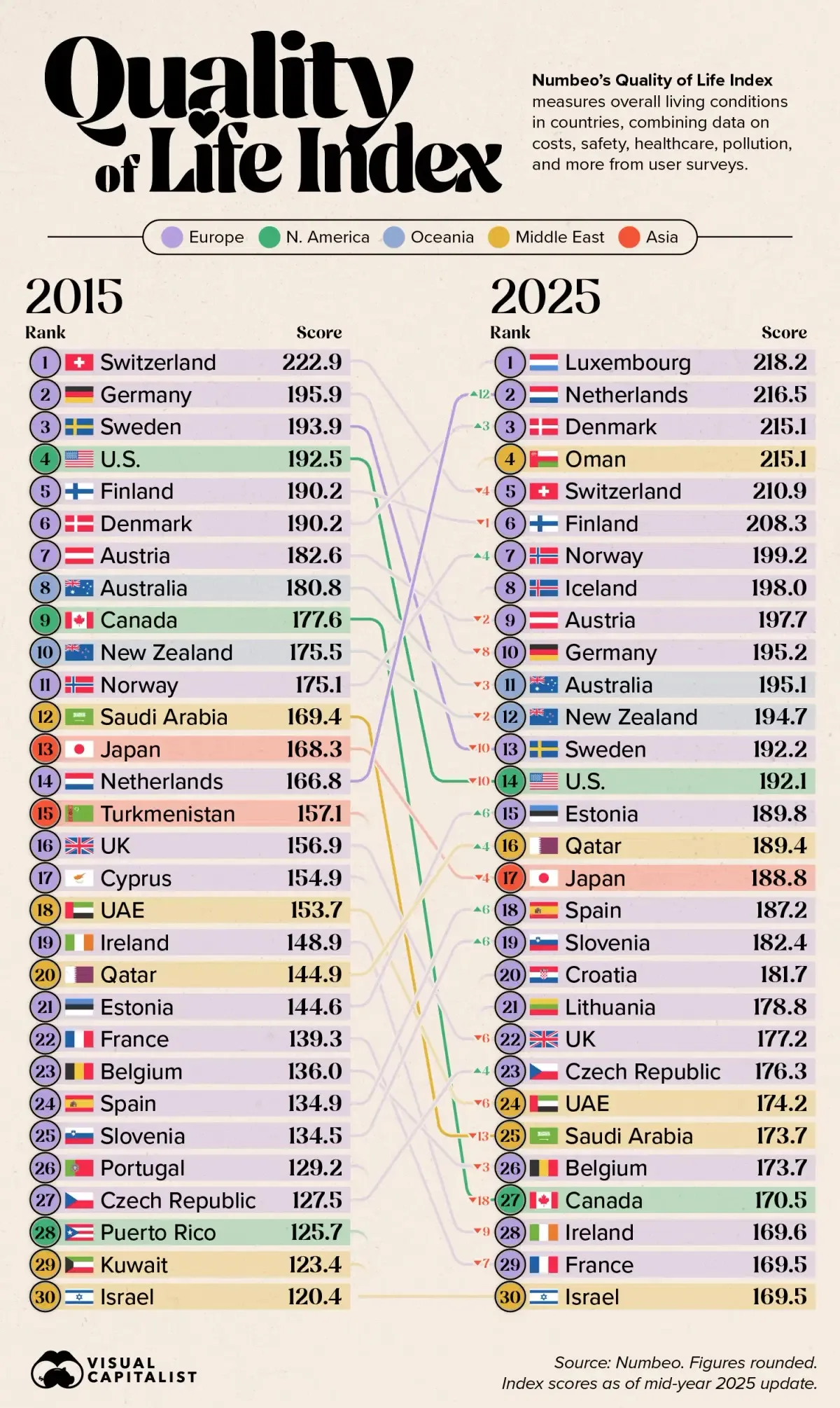
How Quality of Life Has Changed in 30 Countries, According to Citizens
This snapshot from Visual Capitalist sparked wide discussion this month by visualizing how citizens perceive changes in their country’s quality of life.

Using Numbeo’s Quality of Life Index, the chart combines data on costs, safety, healthcare, pollution, and more. While countries like Switzerland continue to rank among the world’s highest, others such as the Netherlands and Norway have climbed steadily.
The conversation heated up around the biggest declines: Canada (from 9th to 27th), Saudi Arabia (12th to 25th), the U.S. (4th to 14th), and Sweden (3rd to 13th)—prompting debate on affordability, policy, and post-pandemic priorities.
![]() Join the discussion on Voronoi today.
Join the discussion on Voronoi today.
MOST LIKED
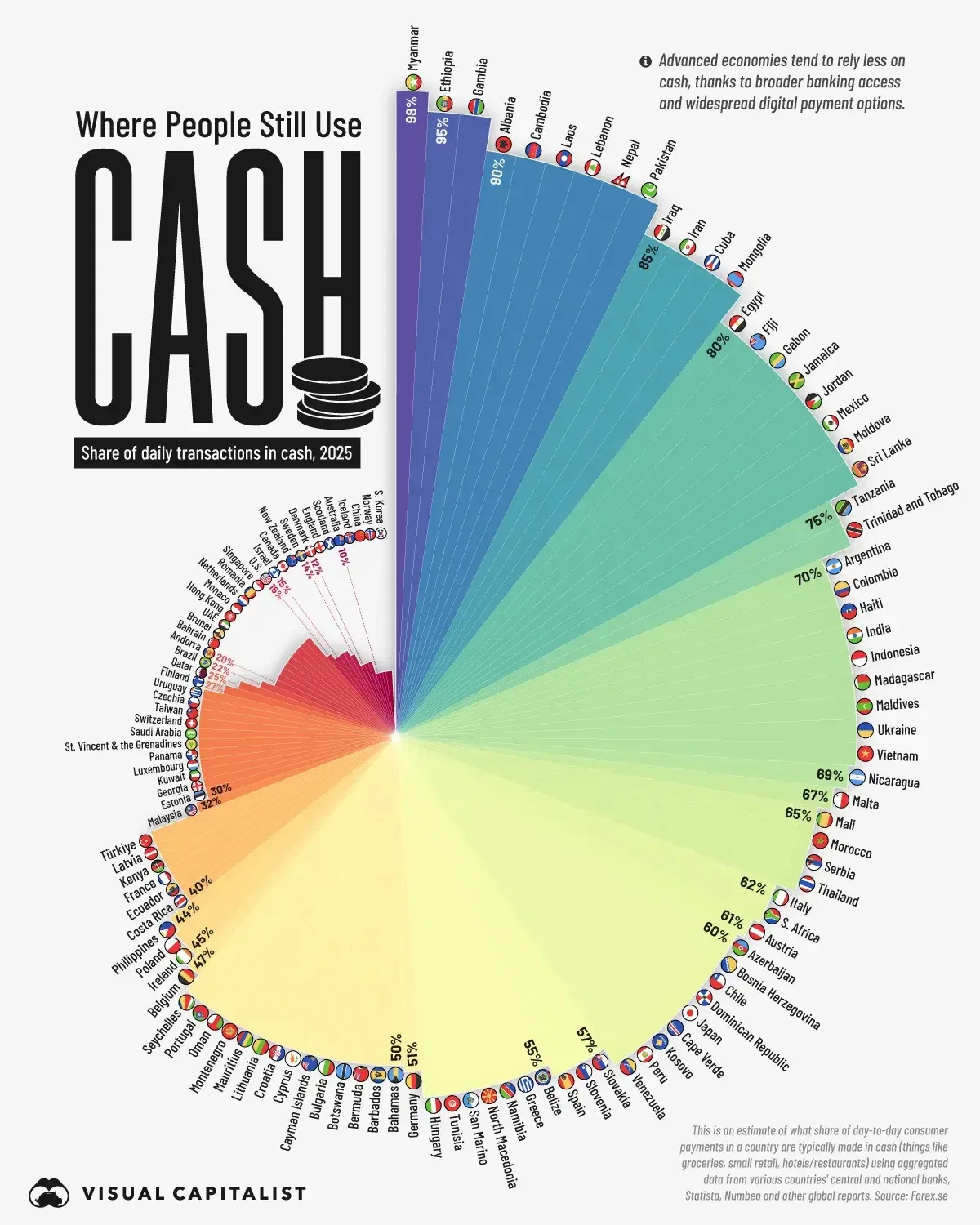
Who Still Uses Cash?
This data-rich visualization from Visual Capitalist captured user attention worldwide, showing the global divide between cash-based and digital economies.

Cash use remains near-universal in lower-income nations such as Myanmar (98%), Ethiopia (95%), and Gambia (95%), where digital infrastructure is limited. In contrast, wealthy nations like Sweden (14%), Norway (10%), and South Korea (10%) have nearly eliminated physical cash.
Cultural outliers drew the most interest: Japan (60%) and Germany (51%) retain high cash use despite advanced economies—while China (10%) exemplifies a rapid leap to mobile payments, skipping the credit card era entirely.
![]() See how your country compares on Voronoi today.
See how your country compares on Voronoi today.
EDITOR’S PICK
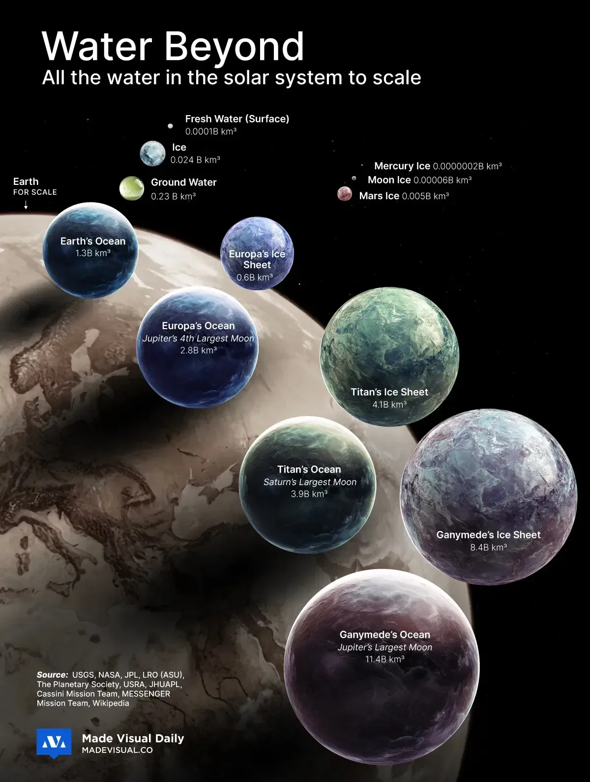
The Largest Bodies of Water in the Solar System: Visualized
Our Editor’s Pick for November comes from MadeVisual, who turned the spotlight to outer space—mapping where water exists beyond Earth.

The visual reveals that oceans and ice reserves on moons like Titan and Ganymede vastly exceed Earth’s total water volume, hidden beneath thick crusts of ice. Even airless worlds like the Moon and Mercury harbor small pockets of frozen material in permanent shadow.
Together, these discoveries challenge assumptions about habitability—and hint that water, the foundation of life, may be far more common across the Solar System than once believed.
![]() Dive deeper into the data on Voronoi today.
Dive deeper into the data on Voronoi today.