![]()
See this visualization first on the Voronoi app.
Visualizing the Global Distribution of Wealth by Region
This was originally posted on our Voronoi app. Download it for free for Apple or Android and discover incredible data-driven charts from a variety of trusted sources.
The distribution of wealth provides insight into a region’s stage of economic maturity.
As economies grow, they are more likely to have a higher share of adults with greater wealth. Naturally, incomes increase as corporate profitability flourishes, shifting the distribution of earnings.
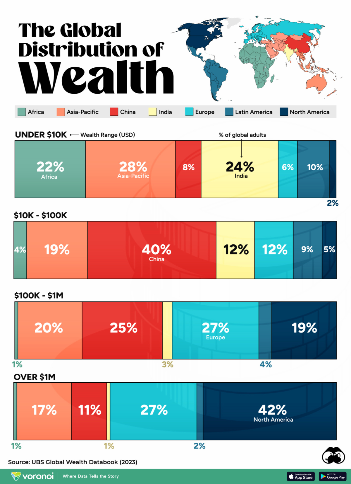
This graphic shows the share of adults across global regions by their wealth range, based on data from UBS.
Global Wealth Distribution in 2023
Here’s how patterns of wealth compare around the world:
| Percent of Global Adults, by Wealth Range | Under $10K | $10K - $100K | $100K - $1M | Over $1M |
|---|---|---|---|---|
| Africa | 22% | 4% | 1% | 1% |
| Asia-Pacific | 28% | 19% | 20% | 17% |
| China | 8% | 40% | 25% | 11% |
| Europe | 6% | 12% | 27% | 27% |
| India | 24% | 12% | 3% | 1% |
| Latin America | 10% | 9% | 4% | 2% |
| North America | 2% | 5% | 19% | 42% |
North America and Europe, which have advanced economies, represent the largest share of people in the “over $1 million” range.
China, which is transitioning to a more service-oriented economy, accounts for a large chunk of people within the $10K to $1 million range.
Emerging markets like India account for larger shares of the bottom two wealth ranges.
Overall, inequality within countries and between countries has increased since the 1980s. Yet global median wealth has increased fivefold since 2000, driven by the economic expansion of China lifting the global median level.
The post Charted: The Global Distribution of Wealth, by Region appeared first on Visual Capitalist.