Via NorthmanTrader.com,
If there was one key trading lesson to draw from 2015 it is this: Ignore the noise and focus on the technicals. Hence in today’s article I’m outlining what I’m seeing from a technical perspective across multiple time frames and asset classes. Note I’m not trying to convince you of any particular view here, but my aim is to share, what I consider to be, fascinating data sets that hopefully offer some insights worth considering.
But before I go into the technicals I want to provide some context on the noise factor. What is noise? Well mostly it’s the myriad of opinions, forecasts, predictions and news flashes that come our screens every day and they can be of detriment to traders and investors alike. Now I’m not saying not to seek out information and other perspectives, but I am saying to not take anything as gospel especially when it comes to consensus.
Consider the following:
Wall Street forecasts for 2015 were largely wrong across the board. Now I have no problem with anybody being wrong. I’m wrong all the time and my wife is sure to let me know when I am. But what I do take issue with is that Wall Street largely insisted on staying wrong even though the facts were changing in 2015. The main factor changing: Earnings forecasts were coming down. Hard. And yet price targets stayed higher. The only thing that really changed was the narrative, i.e. “well if earnings are down so what then markets go up because fund managers have to chase performance”. And hence you end up with overly optimistic forecasts not based on reality. But Wall Street is in the business of selling supply to the public.
And nothing has changed on this front. For 2016 Wall Street appears to see little risk in markets and the same forecasts for 2015 have been moved into 2016. Not a single analyst sees the $SPX moving below 2000 or even 2,100 for that matter. No downside. None. And none was projected in 2015.
Yet Hedge funds got hammered in 2015 resulting in hundreds of closings and many well known funds and hedge fund managers are down severely. Heck even Warren Buffet had a lousy year being down 11%.
Economists also have widely missed the boat on economic growth projections. It’s been a year of slowing growth globally and yet forecasts kept pointing to more optimistic outlooks. For along time markets have been either ignoring or outright celebrating any bad news as it suggested more central bank easing to come. And to be fair this has worked for years. After all central banks have cut rates over 650 times since 2008 and even in the 2015 the ECB and BOJ added $1.2 trillion in assets to their balance sheets.
But the scale and scope of forecast misses is eye opening. Just this last week the Chicago PMI figure came in so mismatched in both direction and magnitude versus economists’ forecasts one has to wonder what they are actually looking at: “The index fell to 42.9 from 48.7 in November. Economists had expected it to rise 1.3 points to 50 in the December reading. The index has spent much of the year below the 50 mark that separates expansion from contraction”.
What’s the standard excuse for the missed forecasts? The weather of course which prompted this sarcastic tweet from me:
Lessons for 2016: Never trust an economist without a degree in meteorology
— Northy (@NorthmanTrader) December 31, 2015
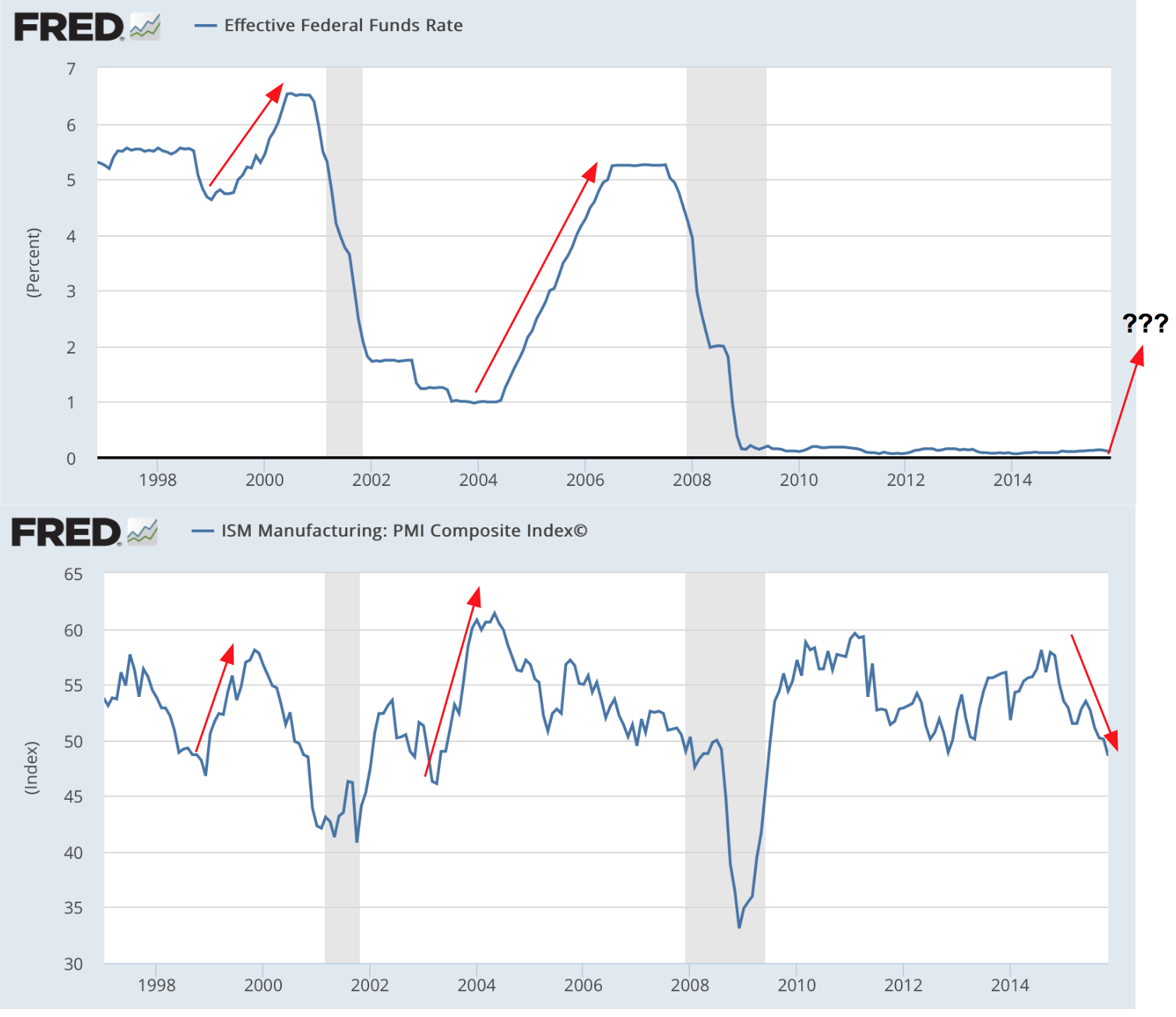
Which brings me to my beloved Fed. After months and months and months of talking, tinkering, and handwringing they finally hiked rates while insisting it meant nothing. Janet Yellen keeps claiming the Fed is data dependent. Yet their own forecasts continued to be wrong and GDP growth figures continued to be revised downward throughout the year. So why did they hike rates? To maintain credibility?
Certainly not because of the mentioned PMI figures. In fact, during the last two rate hike cycles (who can even remember those) PMI was leading by expanding not contracting as it does now. So I have to ask: They want to hike rates into a declining PMI trend into the lows 40s?
So one has to really wonder if the Fed really knows what they are doing here. I have my well founded doubts.
And finally: 2015 put to shame statistical folklore. “Stocks go up in December” “Years ending in a 5 are always positive”, etc. All these historical notions were really off base. Yes historical stats can be interesting to look at, but perhaps the breaking of many historical precedents raises a key question:
If all forecasts and predictions and conventional wisdoms are wrong perhaps nobody really knows what kind of market we are dealing with here?
After all, never before has the world seen such a combination of massive expansion in debt, central bank intervention and low to negative interest rates for such an extended period of time.
Do the technicals provide clarity? Let me walk you through the charts and I’ll outline both bearish and bullish considerations. Note my aim is to be as clinical as possible in my review here.
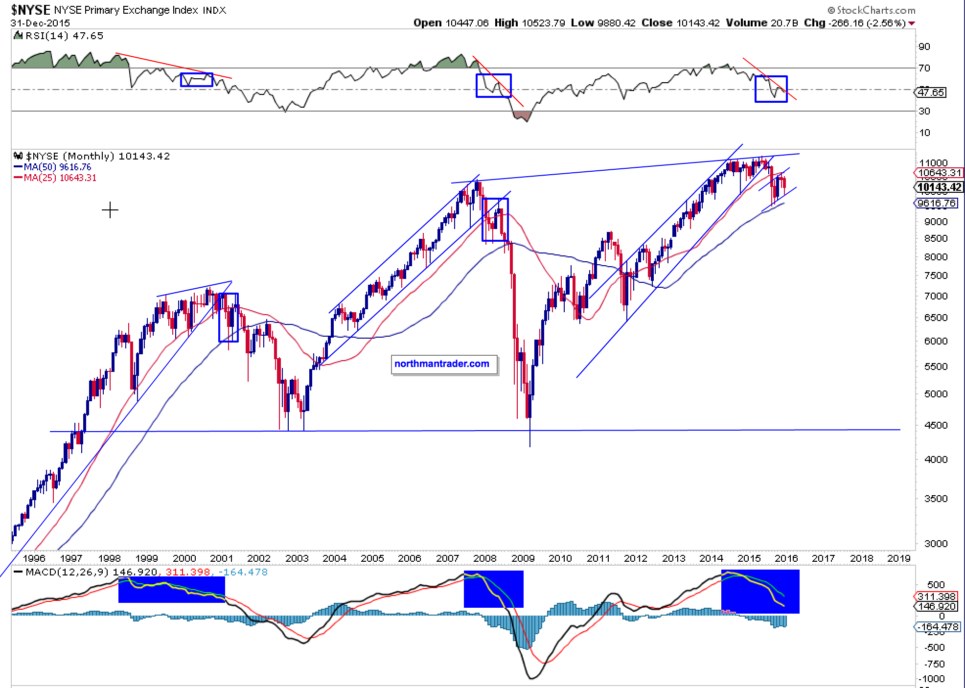
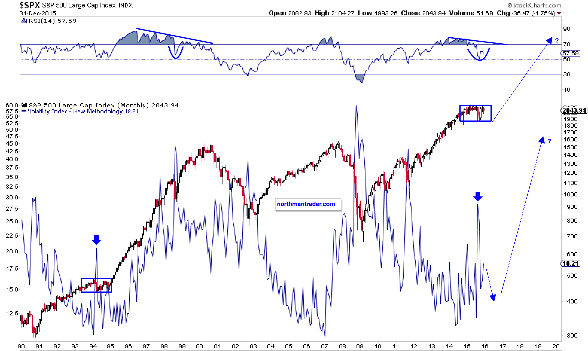
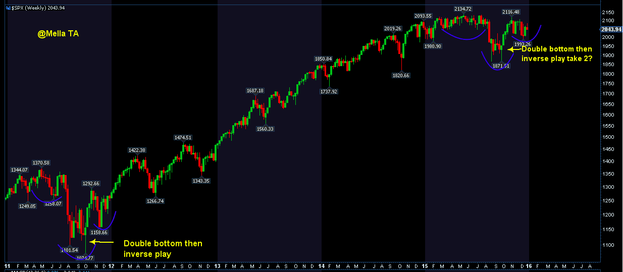
First off, please note that during this past year the $SPX has moved from a series of higher highs to a series of lower highs. Until proven otherwise this could be regarded as a rounding top:
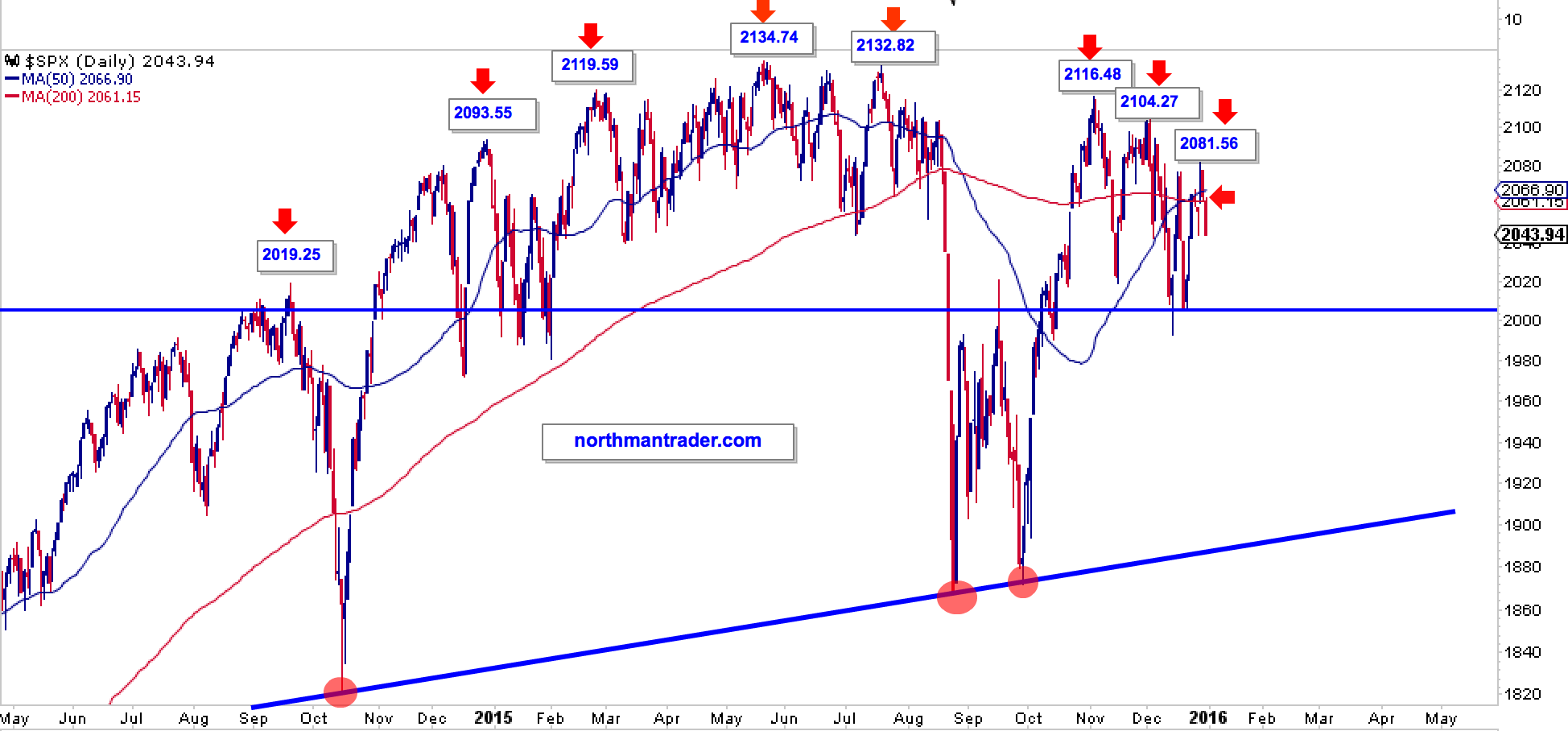
The $SPX finished the year just below its 50 and 200 day moving averages. These are still on a so called golden cross and could easily be recaptured unless further selling commences in early January. Also note that since September 2014 we have seen 2 larger corrective events. Both recovered quickly in price and in the process produced a very well defined supporting trend line connecting these lows (see above).
Yet a very clear message comes across here: Months of price discovery can disappear in an instant. Who can forget this morning in August?
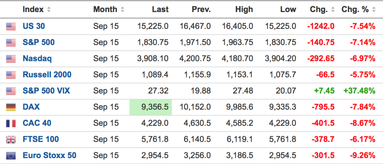
Anybody remember what stopped this? Circuit breakers. Trading was stopped and for many it was a travesty. Why? Because many trading platforms only reopened AFTER markets already bounced higher. Many people simply couldn’t enter or re-enter if they had been stopped out on the way down.
The seeming good news for investors: Every time markets break down a magic hand appears and markets bounce back. I have to admit I do worry about this repetitive market expectation as it breeds a certain level of complacency: Nothing bad can ever happen right? Markets always come back. Buy the dip. And technically one has to respect the results. And we did ourselves as we bought long on the technical signals.
But the subsequent recovery produced lower highs. And we can’t ignore this. Nor can we ignore that internals have been horrid and this is where the bearish evidence comes in.
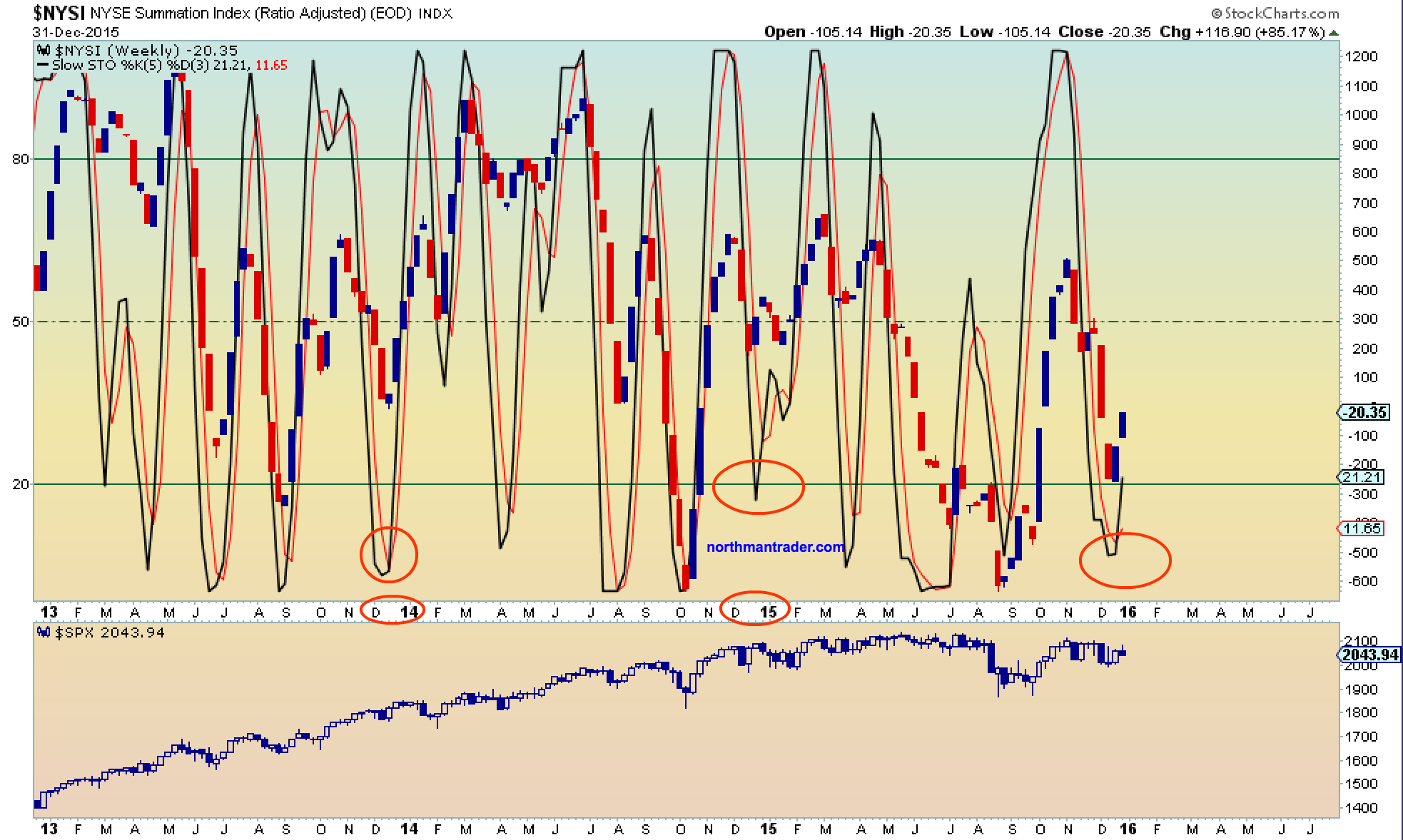
Purely technically speaking we are observing a very similar pattern for previous major tops.
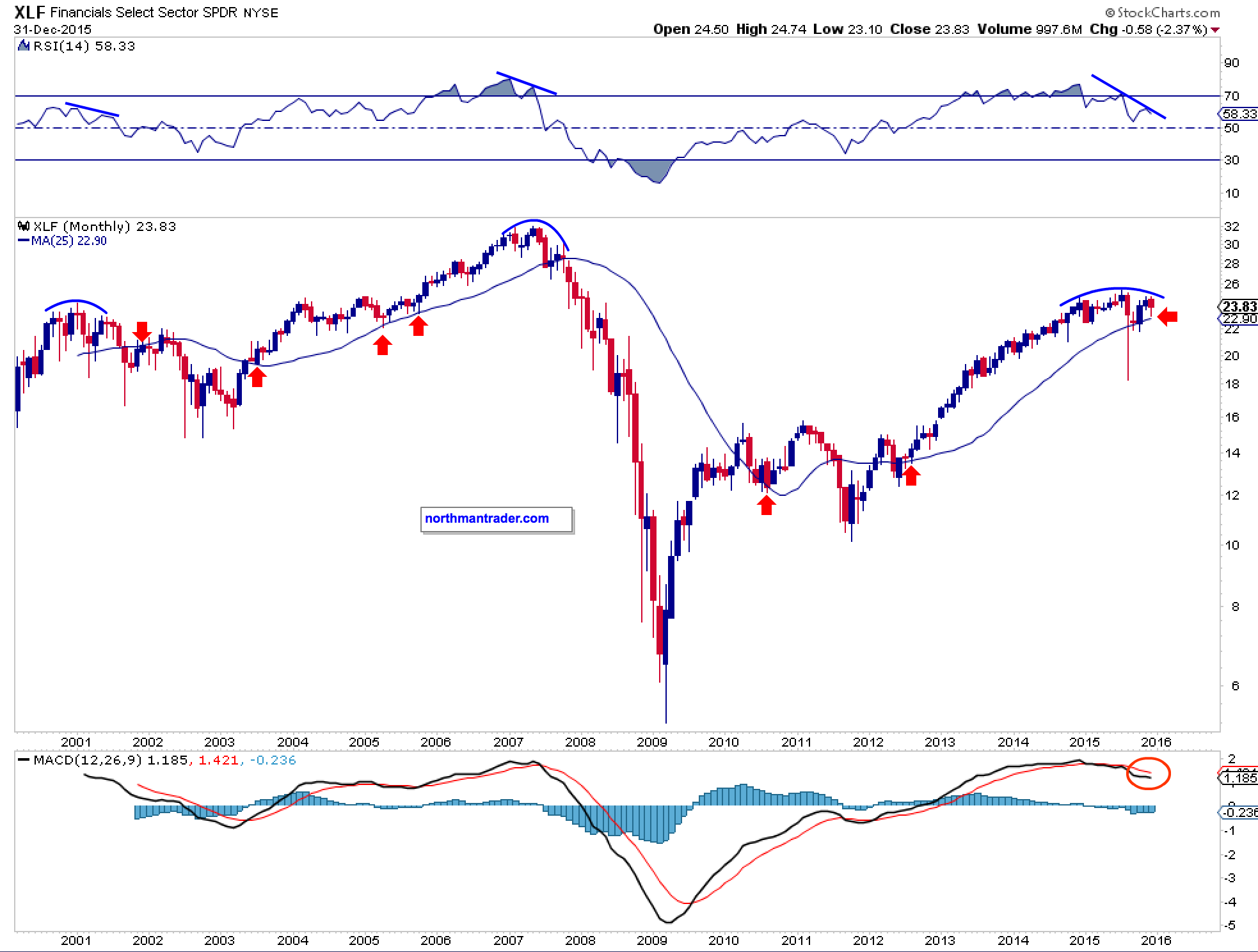
Consider the equal weight charts:
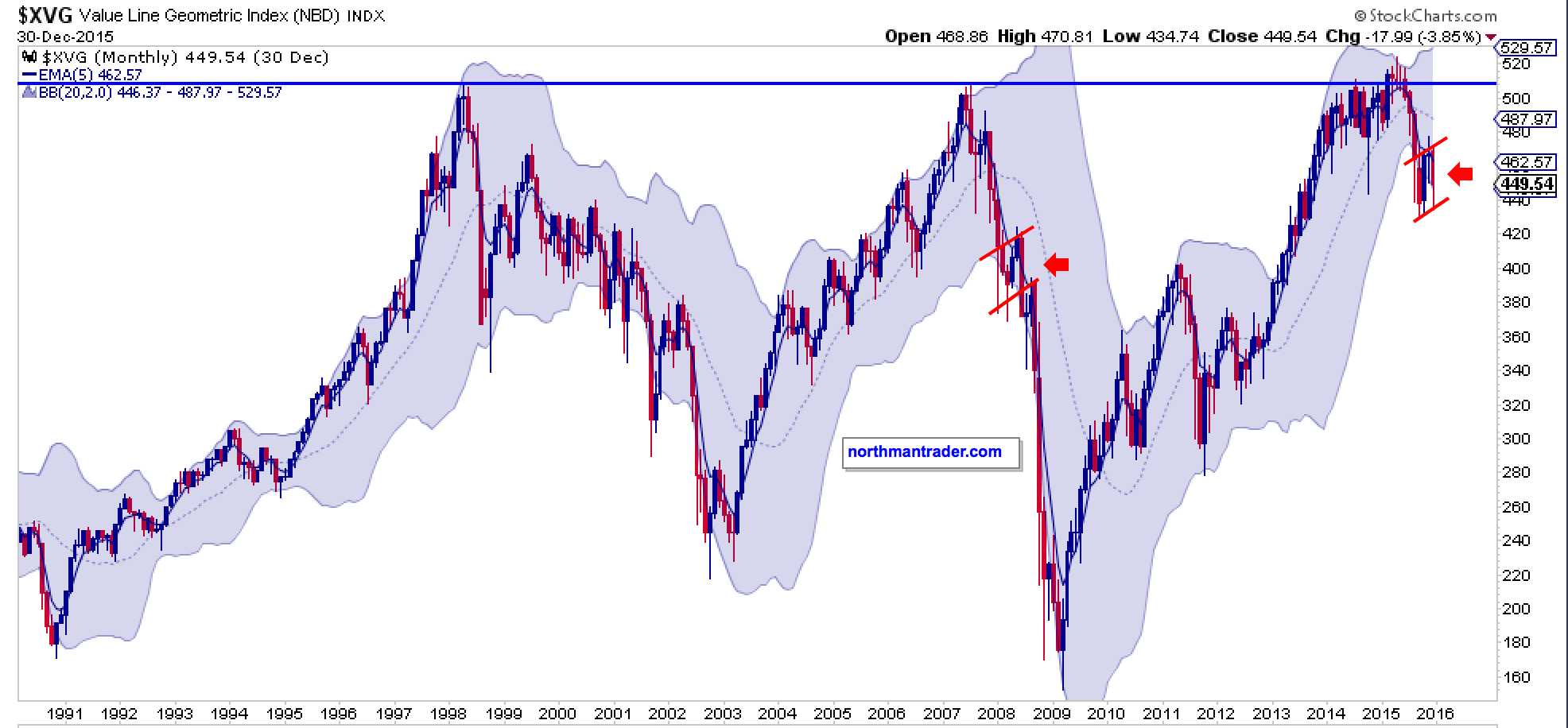
While the value line geometric index temporarily broke above its 1998 and 2007 highs it has since literally fallen off the cliff and is sporting a potential bear flag similar to the one in 2007/2008.
This similarity is supported by the Guggenheim equal weight index and it raises the question of a repeat to come:
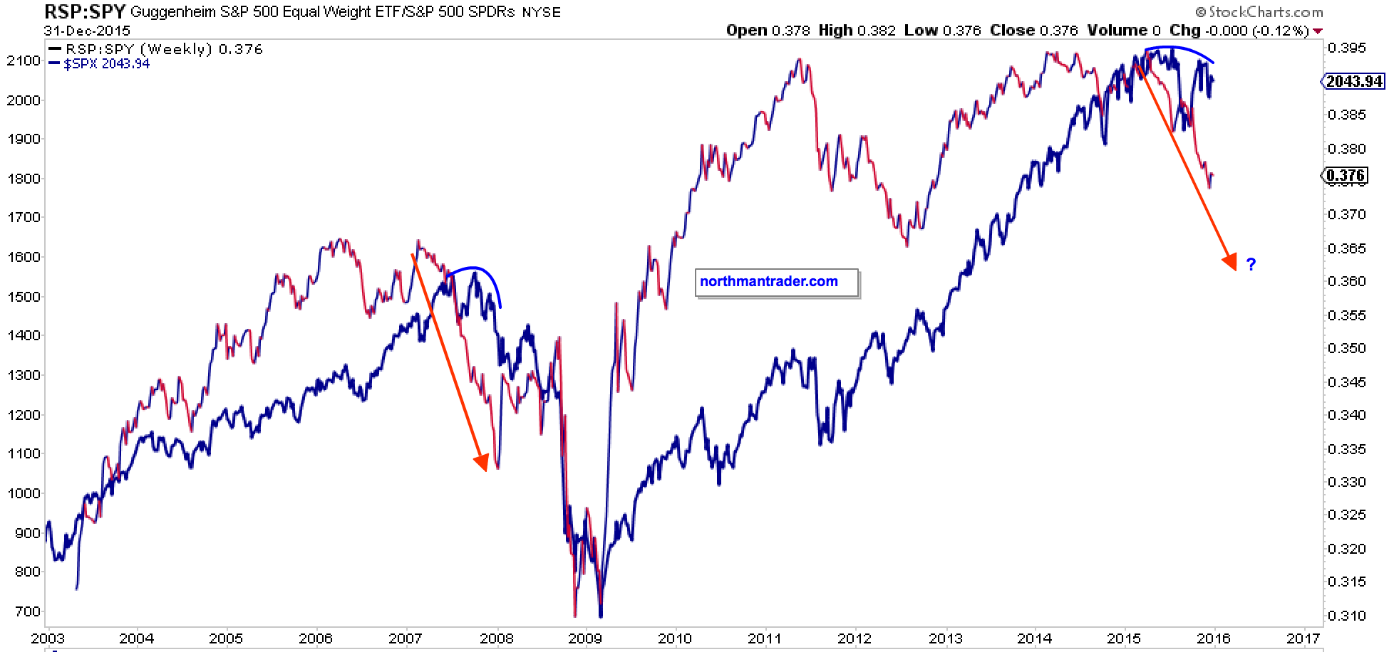
Equal weight of course is reflective of a harsh reality: Most stocks are underperforming the indices greatly. Here too we see similar behavior to the 2007/2008 top, specifically stocks above their 200 day moving averages are showing a seeming repetitive pattern of lower highs:
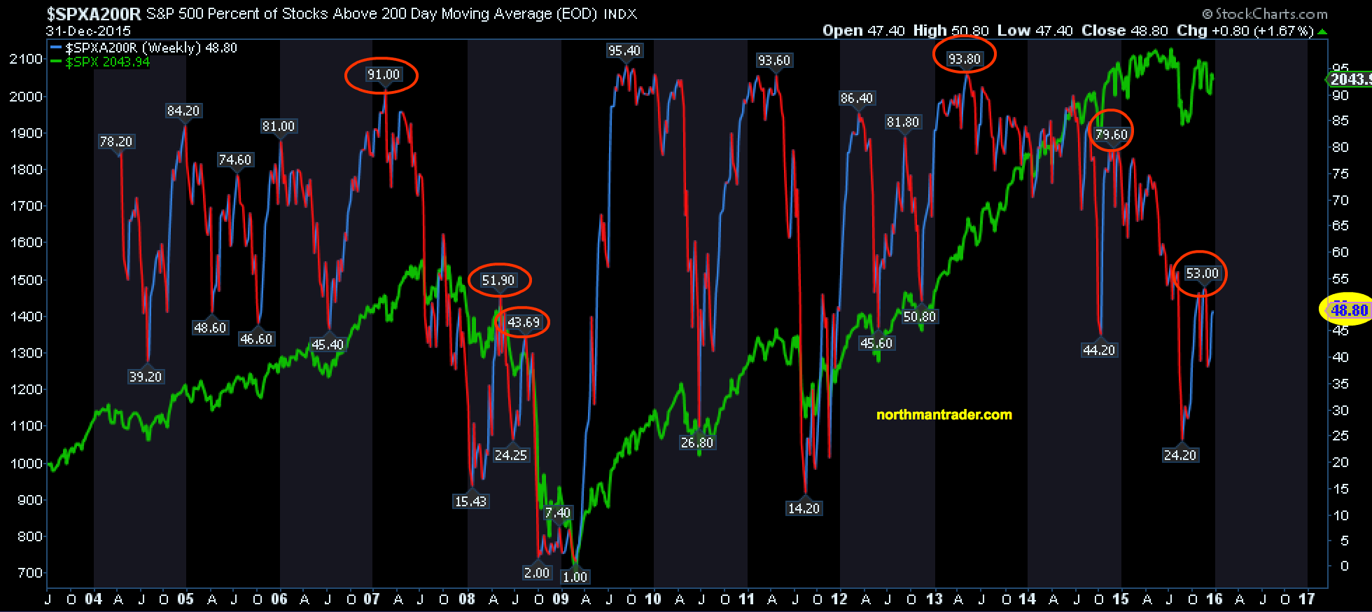
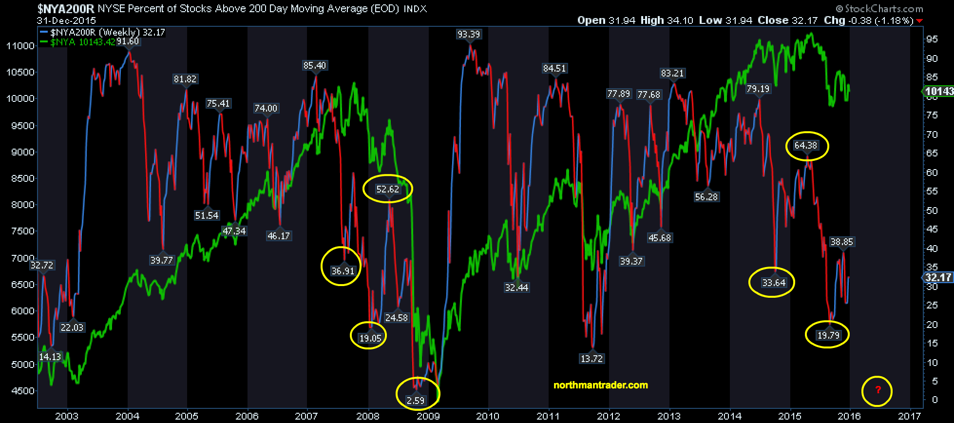
If the pattern is to repeat new lows could well be in this market’s future.
And there are many bearish patterns to support this notion. Consider several large heads and shoulders patterns on indices and key individual stocks:
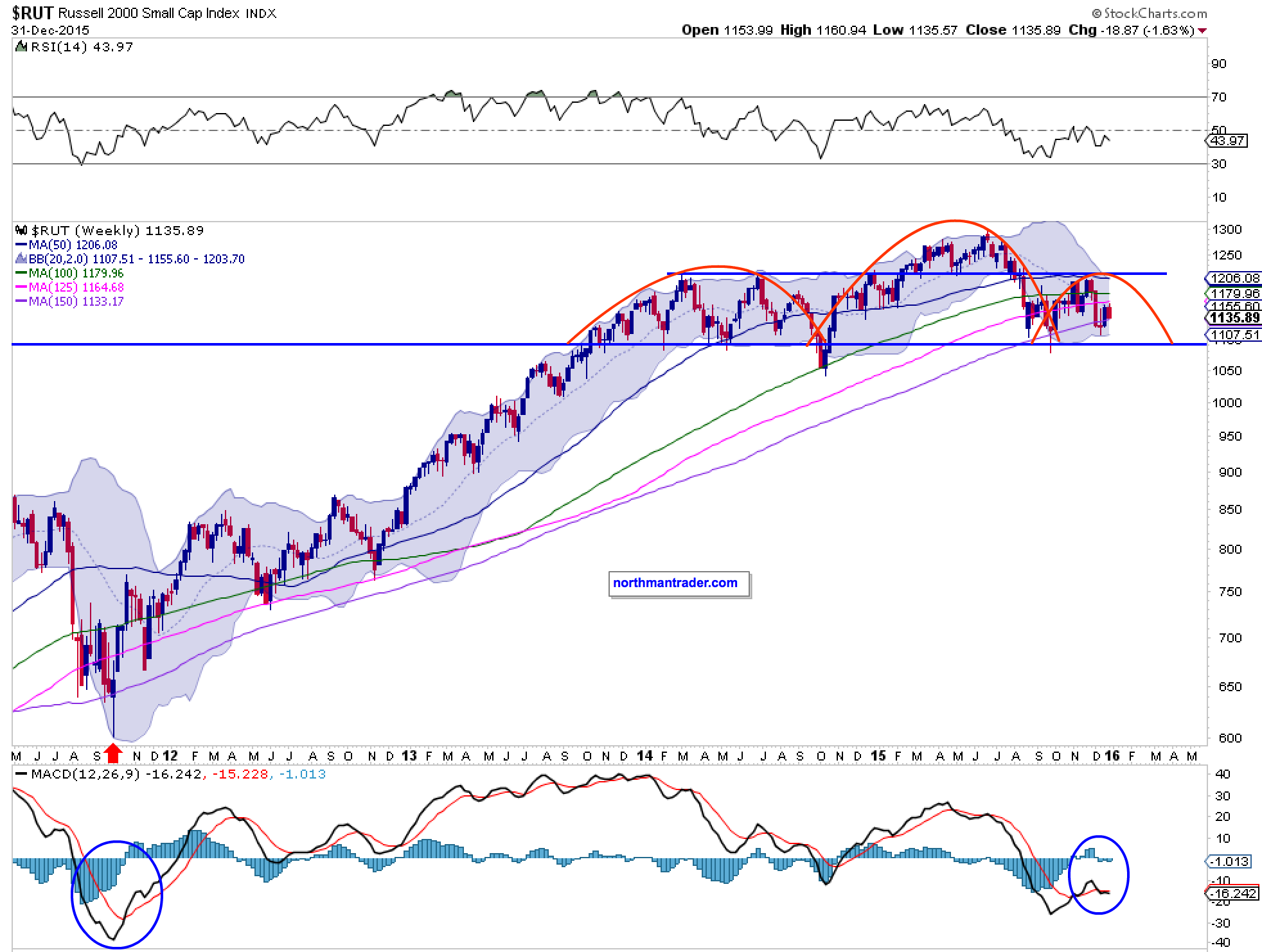
MACD patterns are well below the center lines on all of them. And the larger monthly charts highlight the technical bearish picture with negative RSI divergences, negative MACD patterns and broken trend lines in many cases:
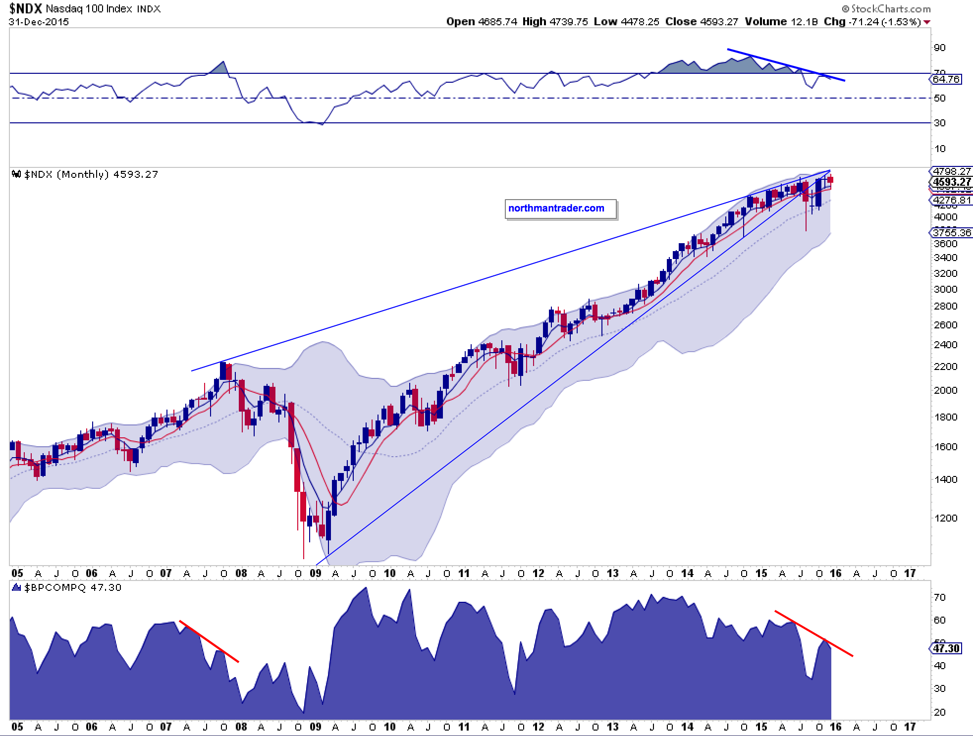
Even the best performing index in 2015 the $NDX is showing negative divergences and the broken trend line is yet to be recaptured:
But, and I need to stress this here as well: Nothing has really broken yet. None of the patterns above really mean anything until they show a confirmed break. In the case of the heads and shoulders patterns they won’t confirm until they break their necklines.
Will we see a similar corrective move in the months to come? That is the key question isn’t it as it has potentially significant ramifications. Consider the potential target of such a corrective move. If the rounding top indeed plays out and price were to break below the established lower trend line there is an obvious target: The .382 fib off the 2009 lows as it also coincides with the 2007 highs or 1574 on the $SPX:
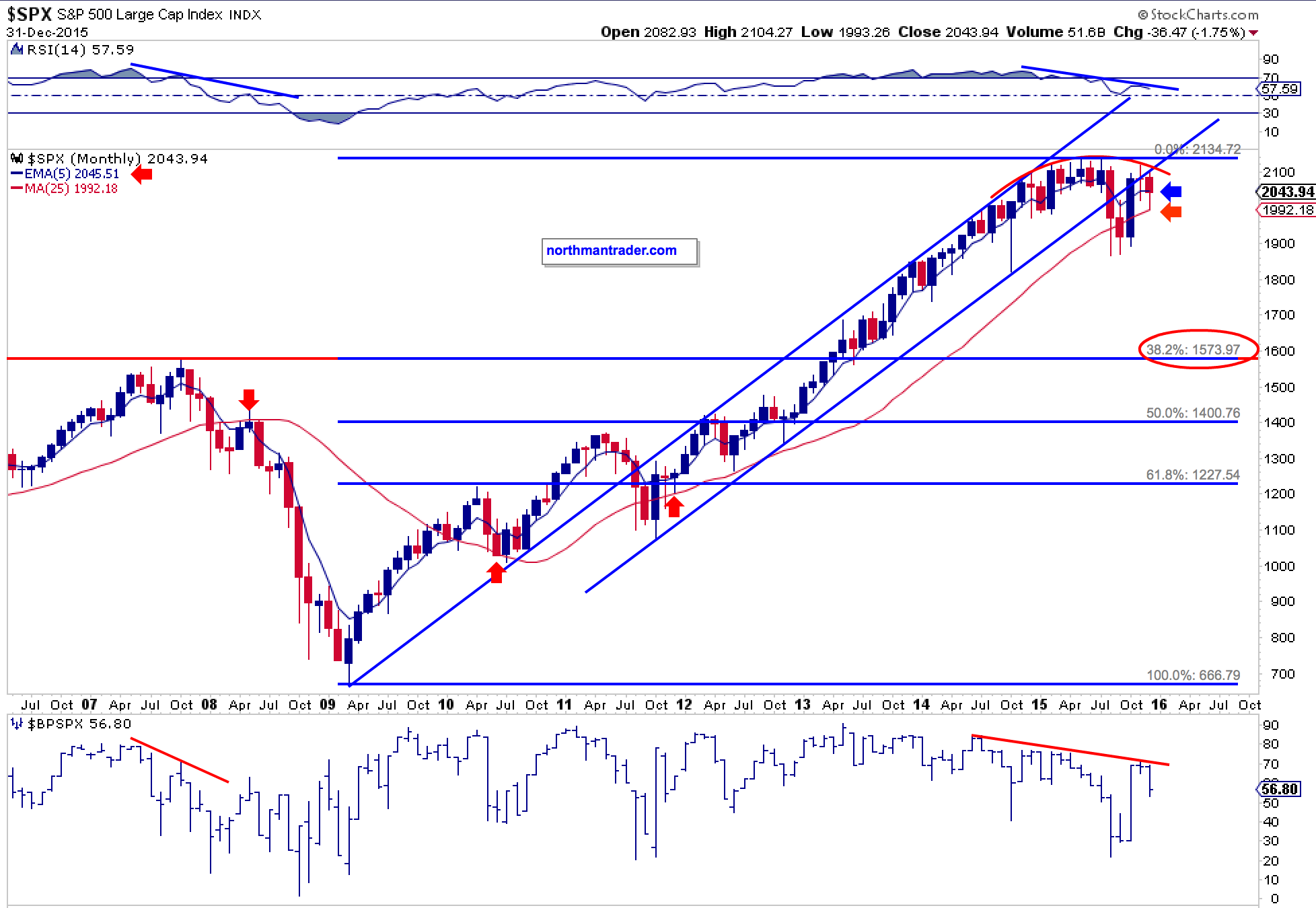
This would constitute a 26.2% correction off the highs. After years of a steady uptrend such a price event seems unfathomable for most investors these days.
What could cause such a break of the various necklines?
Perhaps the very same reason that has prevented markets from breaking down so far: The winners. Much like society the stock market has morphed into a basket of haves and have nots. And while internals are horrid 2015 has seen incredible market cap expansion in several high cap stocks leading them to historically overbought levels with negative divergences on top of it.
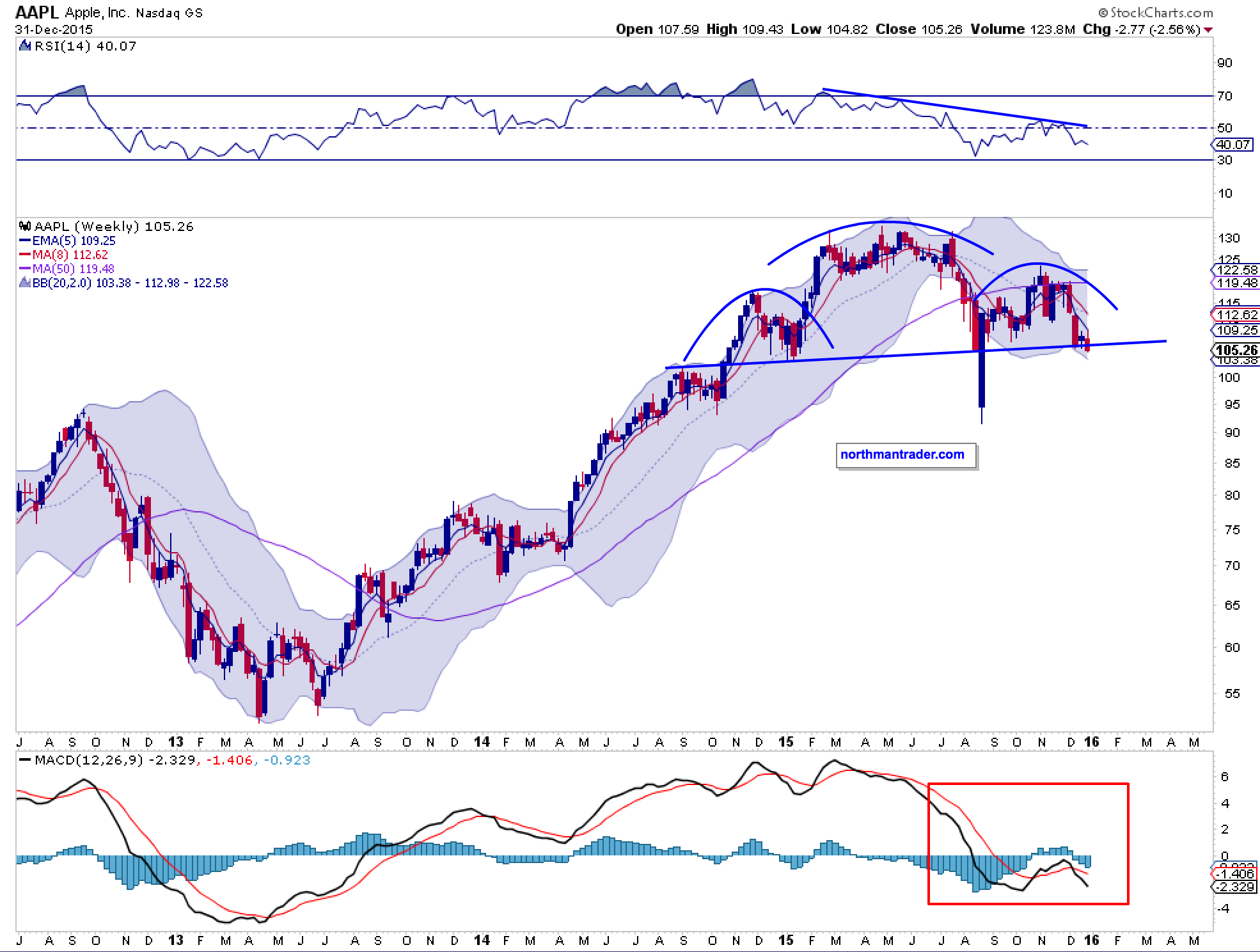
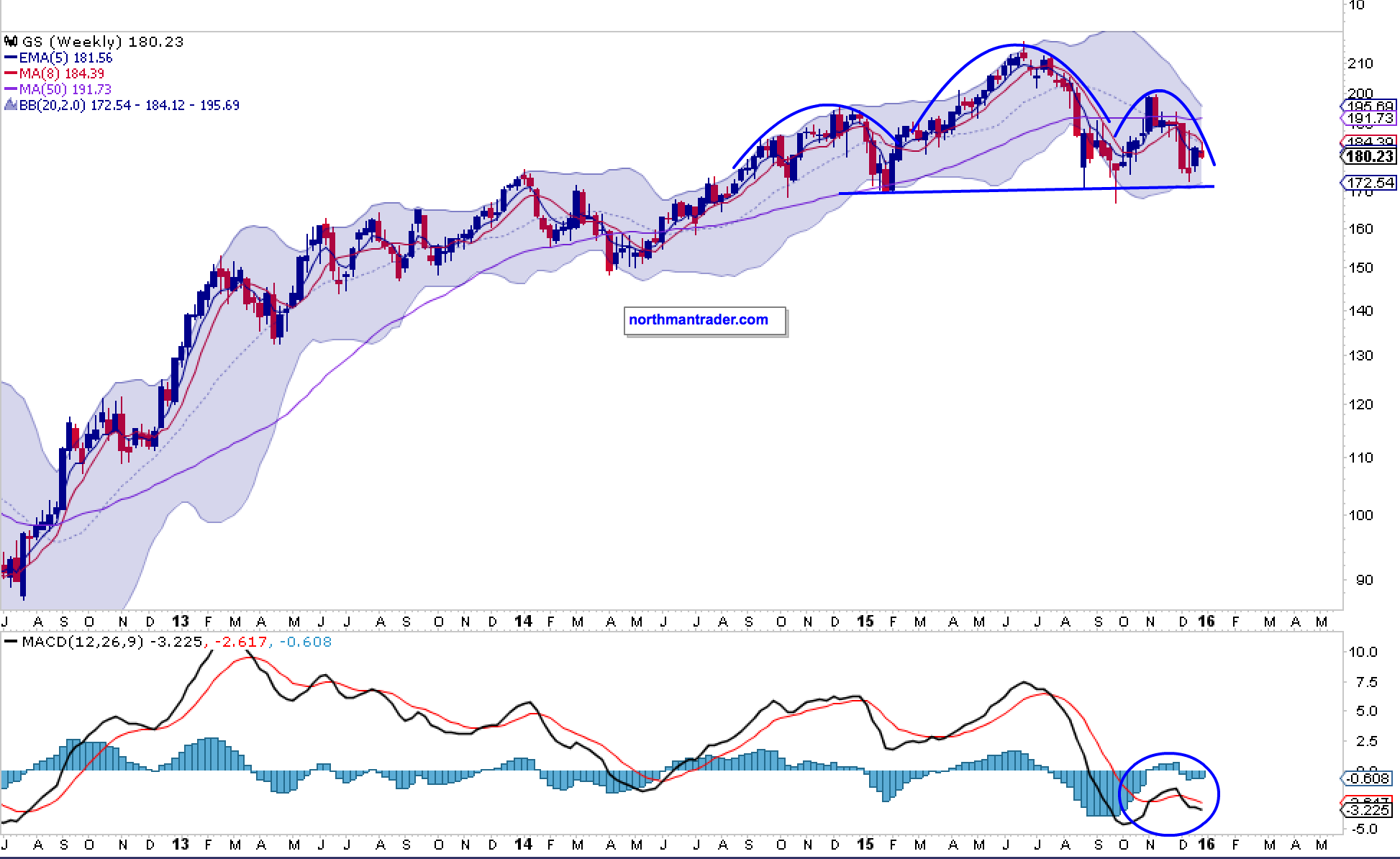
Some familiar examples:
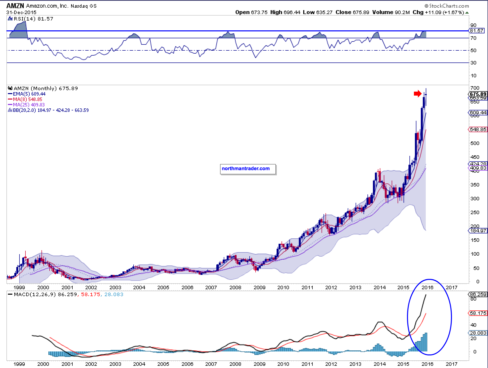
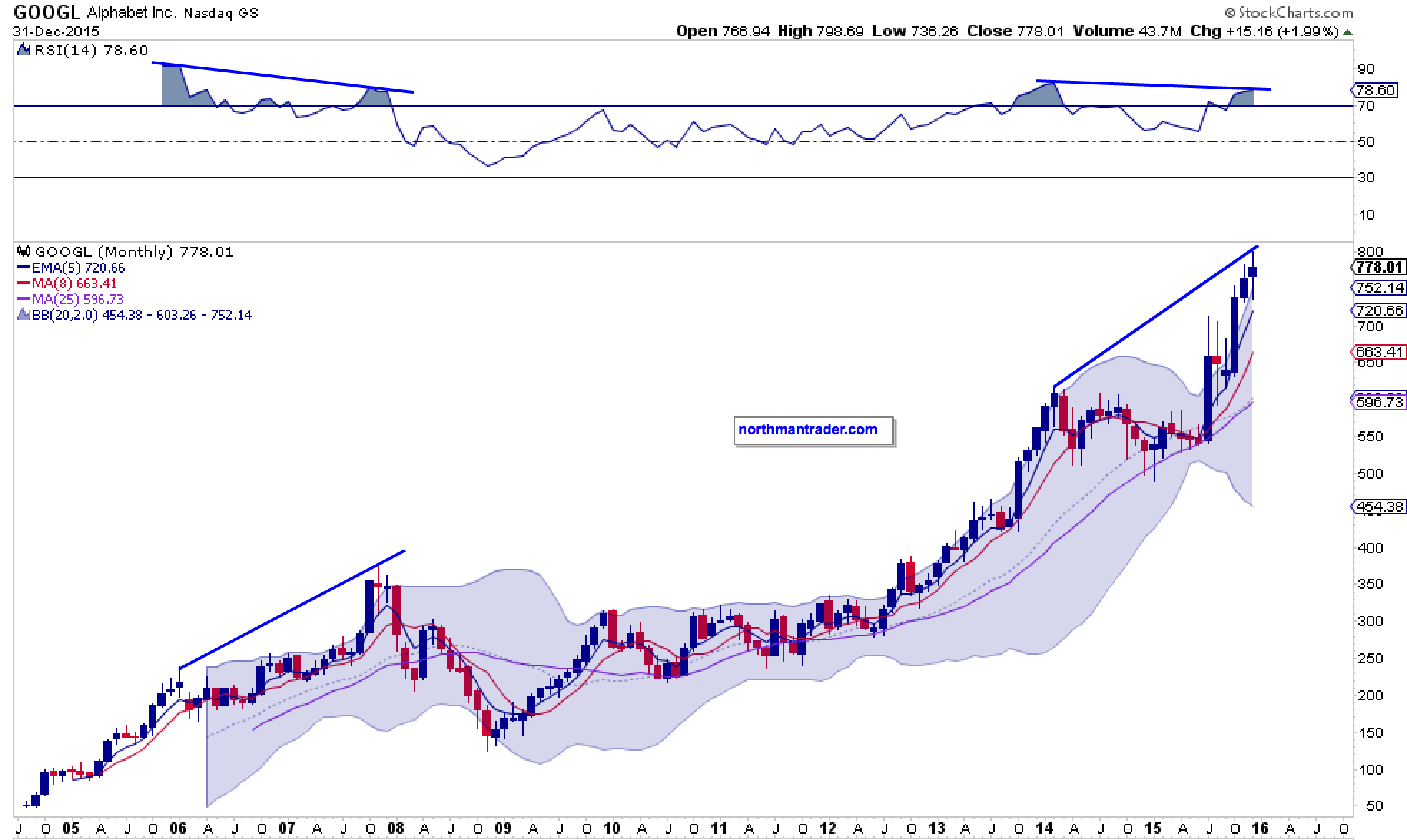
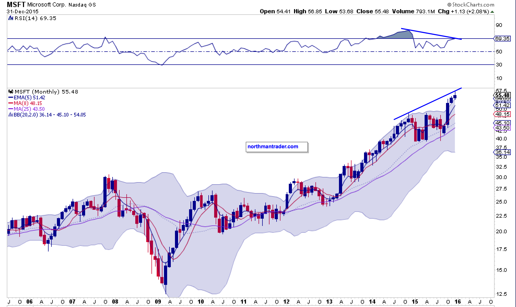
Note all of them are widely disconnected from their monthly 5 EMAs. If market history teaches us anything it is that these disconnects do not last. A simple reconnect would not be a bearish event in itself, but standard market practice, yet as you can see in many cases a simple reconnect could invite a 7-10% correction in just these stocks. How would the market handle such a correction in its leaders?
And if you think I’m perhaps overstating the historic nature of some of these disconnects perhaps a little broader perspective may help.
I won’t mention the names not to cloud your view, but here are the quarterly charts of two major companies with a combined market cap of over $400B. But here’s a hint: One distributes stuff and one sells burgers:
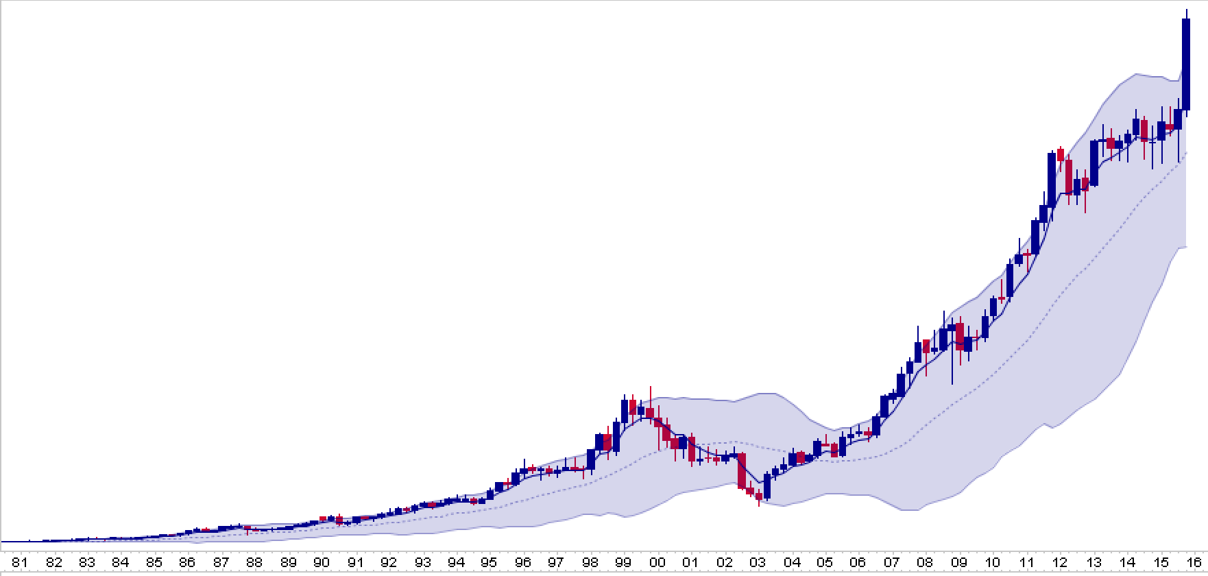
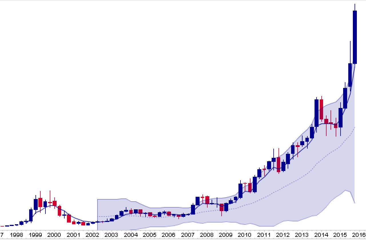
See any corrective potential here? Any excess?
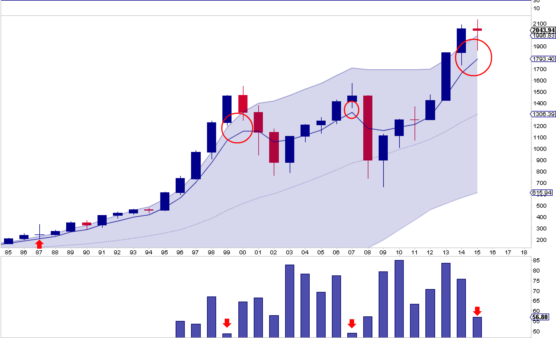
One additional technical perspective: Despite closing slightly down on the year the $SPX is still vastly disconnected from its annual 5 EMA (12.2%) and has not touched it in 2 years now. History suggests it doesn’t like extended disconnects especially on weakening internals:
So admittedly this is all looking rather gloomy and suggests markets are at major risk of a very sizable correction in 2016.
One could argue that the combination of these technical facts support Mella’s $VIX chart she posted a couple of weeks ago:
$VIX monthly. Happy New Year lol pic.twitter.com/5tKch8qzJ9
— Mella (@Mella_TA) December 21, 2015
Wowser.
But as Mella also says: “Generally a bull market just doesn’t roll over and die.” And that’s a fair comment. Where’s the euphoria? Where’s the blow off top?
While one may argue we may see it in some of the individual stocks the vast majority of stocks have corrected and are down. And the very technical issues outlined above may also serve as the foundation for a vastly different technical outlook.
Consider that for the past year the $SPX has really not gone anywhere. Yes we have lower highs for now, but in terms of price we remain stuck in a range, and as pointed out above nothing has really broken yet. This type of consolidation is not unprecedented. In fact, the notion of an aggressively rising $VIX is also not incompatible with rising prices. See what happened in the mid 90s after a lengthy consolidation with a low $VIX: Both rose.
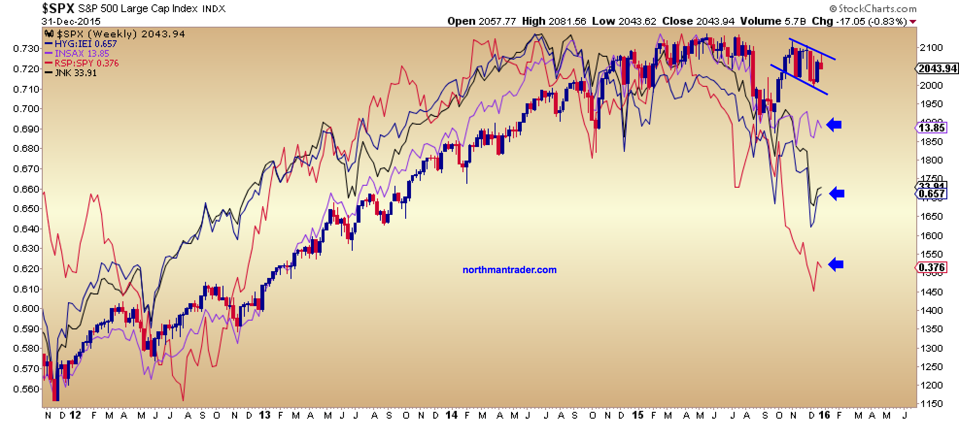
What could prompt a break higher? Consider some of key culprits for the negative divergences in 2015: Energy and high yield. These divergences have been in place for months now. The obvious question: What happens if these things were to improve?
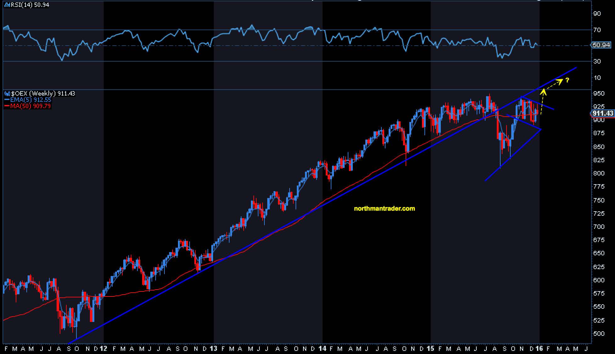
Note, one could view the recent weekly price consolidation to be in context of a bull flag. Should price break above the pattern and make a high above recent highs the technical picture could change rather dramatically and quickly so.
One of the worst performers in 2015: Oil. What does the chart suggest? A descending wedge with a positive RSI, an intrinsically bullish pattern:
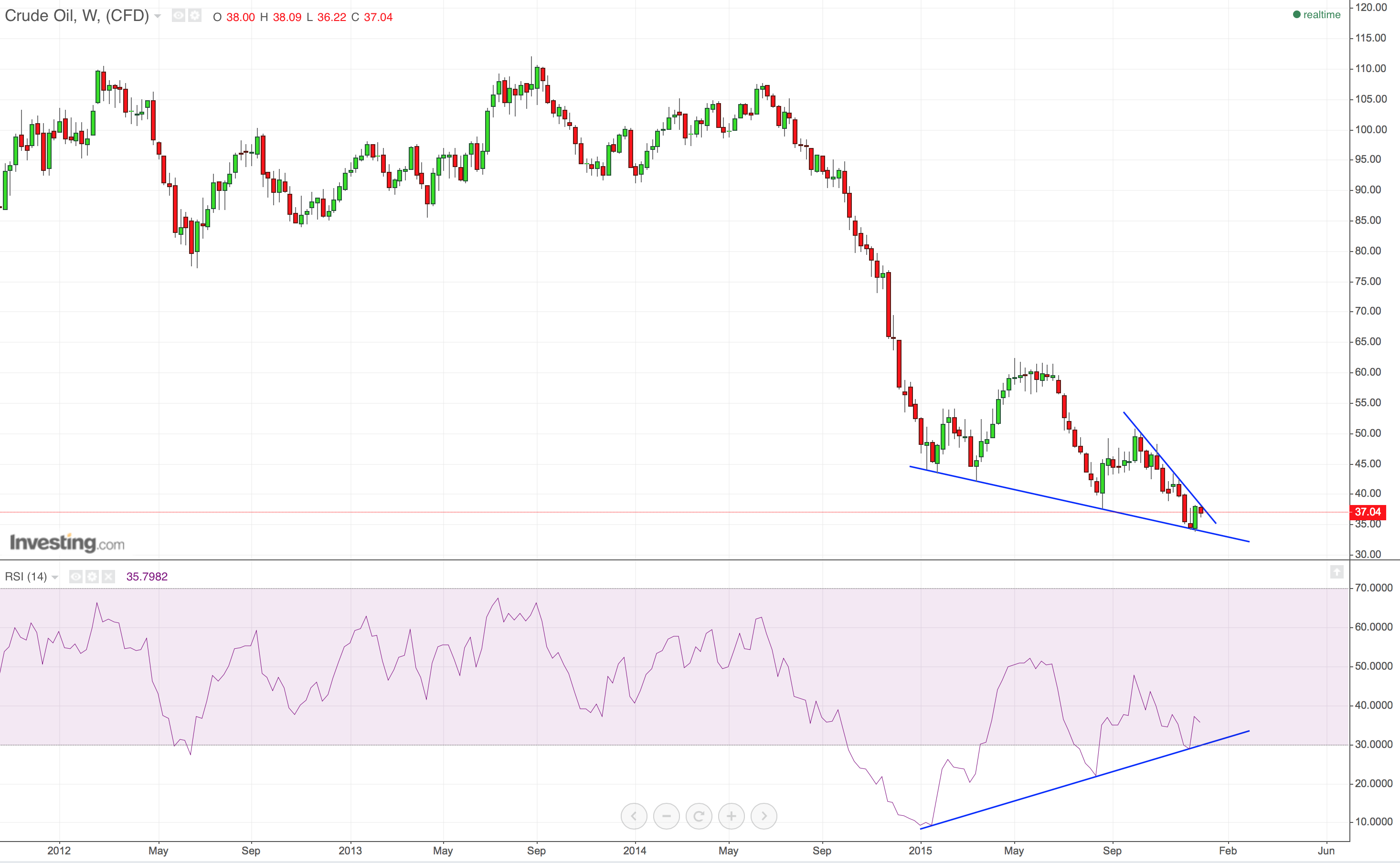
A break higher in oil prices may certainly invite a rally in energy stocks and with it an improvement in high yield and junk. In short, internals could improve quickly and what was a bearish scenario could turn bullish:
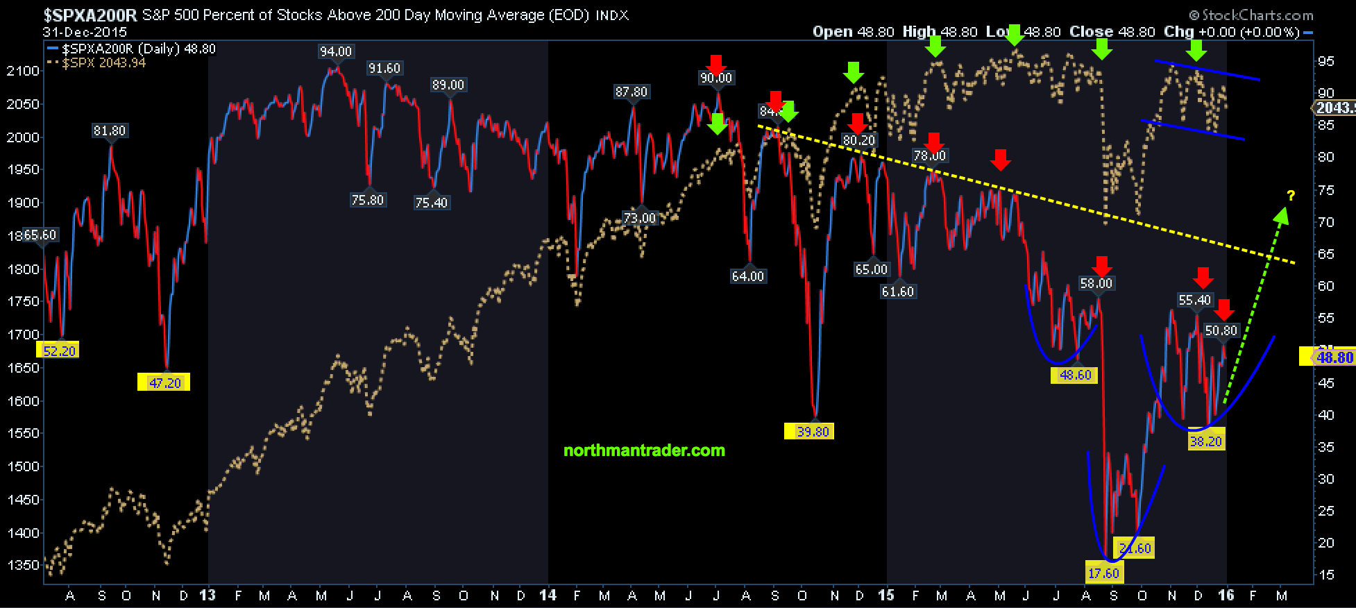
After all markets are generally still oversold:
And such an improvement would bring back the bullish case we recently discussed. Here are the updated charts:
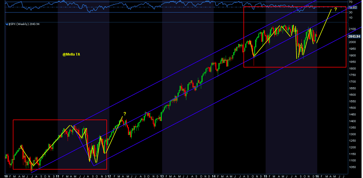
As regular readers know the above pitchfork has been a key technical indicator we’ve been watching since the summer lows. The middle line is clearly now resistance. If markets can break above it then indeed we may see a blow off top along with a rising $VIX.
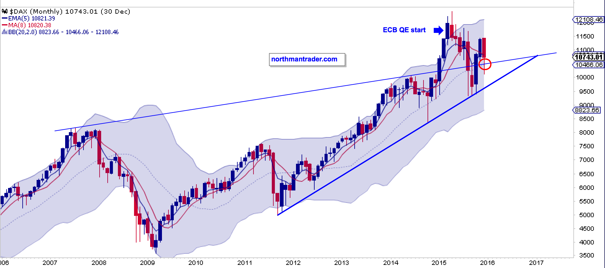
Last but not least: Global central banks remain highly active and despite its difficulties since the spring highs the DAX, for example, as retained its trend line. So far anyways:
Confused yet? It’s actually not confusing. What we are seeing is a market in a consolidation phase and it still is in range and it has to still make its case: To break up or down.
One could even make a case that new highs could be bearish. What would constitute such a scenario? Simply a move to tag along the rising trend line without recapturing it. This scenario may perhaps be the most deceptive as it could capitulate sellers and turn participants bullish, yet be technically very suspect as it could produce new highs on even greater negative divergences:
So which way will this play? The technicals suggest that a break in either direction will produce an outsized move providing significant swing and day trade opportunities in 2016. The $VIX chart suggests that volatility will likely rise either way.
But until we know specifically with what kind of market we are really dealing with perhaps traders and investors may want to heed the words of Walter White:
https://www.youtube.com/watch?v=10czUKzpbgg
Tread lightly indeed. Which is exactly what the technicals are telling me until this market reveals its true character.
Good luck in 2016. It’s shaping up to be a wild one.