Subscribe to the Decarbonization Channel’s free mailing list for more like this
Visualized: Global CO2 Emissions Through Time (1950-2022)
This was originally posted on the Decarbonization Channel. Subscribe to the free mailing list to be the first to see graphics related to decarbonization with a focus on the U.S. energy sector.
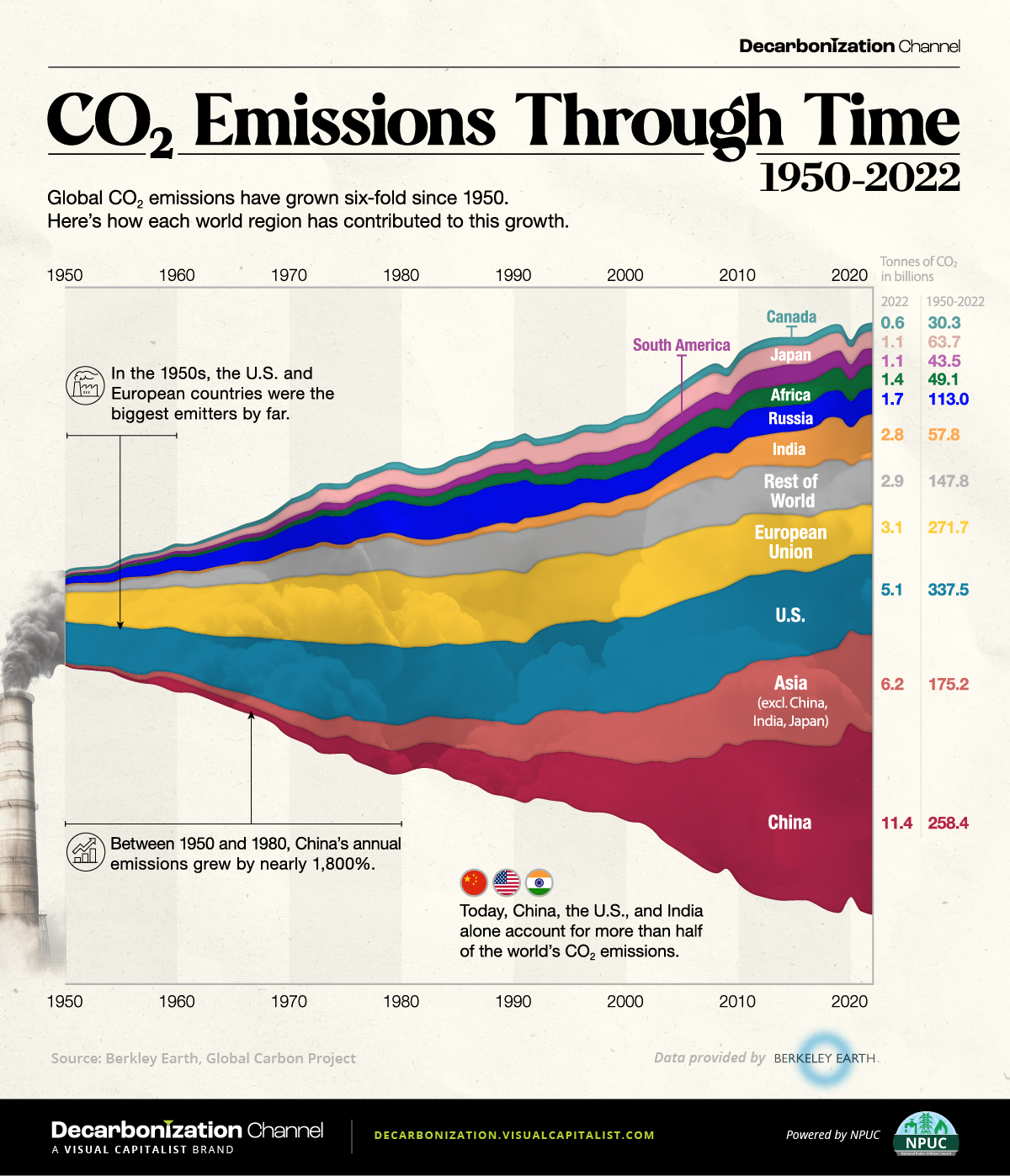
Global CO2 emissions have grown six-fold since 1950.
But which countries have contributed the most to this growth?
In this streamgraph, created in partnership with the National Public Utilities Council, we answer that question using regional emissions data from Berkeley Earth and Global Carbon Project.
Global CO2 Emissions: The Last 70 Years in Review
In the 1950s, the United States and the countries that later formed the European Union (EU) were the biggest emitters in the world, responsible for over 70% of total annual emissions.
However, this trend swiftly changed as other nations entered the fray.
For instance, China’s economic surge in the 1970s, particularly with the advent of Deng Xiaoping’s new economic strategy in 1978, triggered a notable uptick in the country’s CO2 output. From 1950 to 2000, China witnessed a surge of over 4,500% in emissions, reaching an annual 3.6 billion tonnes by 2000.
Similarly, India, Japan, and the broader Asian region all experienced emission growth exceeding 1,000% between 1950 and 2000.
| Metric tons of carbon dioxide (tCO2) | 1950 | 2000 | 2022 | Change 1950–2000 | Change 2000–2022 |
|---|---|---|---|---|---|
| China | 0.1B | 3.6B | 11.4B | 4,529% | 213% |
| Asia (excl. China, Japan, and India) | 0.2B | 3.2B | 6.2B | 1,973% | 95% |
| United States of America | 2.5B | 6.0B | 5.1B | 136% | -16% |
| European Union | 1.8B | 4.2B | 3.1B | 134% | -26% |
| Rest of World | 0.4B | 2.5B | 2.9B | 465% | 16% |
| India | 0.1B | 1.0B | 2.8B | 1,500% | 189% |
| Russia | 0.4B | 1.5B | 1.7B | 256% | 12% |
| Africa | 0.1B | 0.9B | 1.4B | 876% | 52% |
| Japan | 0.1B | 1.3B | 1.1B | 1,132% | -17% |
| South America | 0.1B | 0.8B | 1.1B | 621% | 34% |
| Canada | 0.2B | 0.6B | 0.6B | 268% | -3% |
Data note: 1950 was used as a beginning point for the graph due to the lack of available data for many countries prior to that year.
As illustrated in the table above, the growth in global carbon emissions has slowed since 2000.
With that said, global emissions have still risen from 25 billion tonnes in 2000 to 37 billion in 2022, which is another all-time high. Today, over 40% of emissions come from the U.S. and China, underscoring their pivotal roles in shaping the global emissions landscape.
Where Are We Headed From Here?
The United Nations’ recent Emissions Gap report highlights a concerning reality: the ongoing rate of emissions combined with existing policies steers humanity towards a world that is 3°C warmer than pre-industrial levels. This contrasts starkly with the goals of 1.5–2°C agreed to in 2015.
The Intergovernmental Panel on Climate Change projects that such a degree of warming will potentially result in catastrophic repercussions, from severe changes in weather patterns to rising sea levels, widespread extinctions, and critical disruptions to global food and water systems.
The post Visualized: Global CO2 Emissions Through Time (1950–2022) appeared first on Visual Capitalist.