Visualizing America's Changing Energy Mix

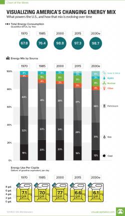
Today’s chart plots data from the Energy Information Administration (EIA) to show America’s changing energy mix, along with their projected mix for 2030.
Visual Capitalist's Jeff Desjardins points out that it shows the total amount of energy used each year, along with energy use per capita. It then breaks down each year’s energy supply by source, which provides another way for us to visualize the decline of coal use, the resurgence in natural gas, and the rise of renewable energy.