![]()
See this visualization first on the Voronoi app.
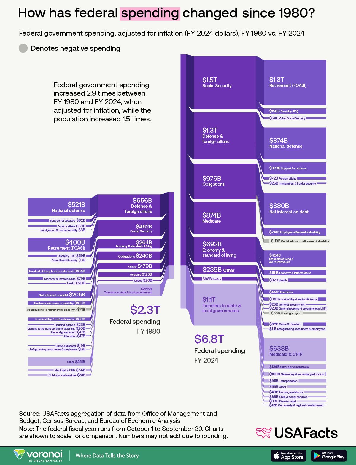
Visualized: U.S. Government Spending (1980 vs. Today)
This was originally posted on our Voronoi app. Download the app for free on iOS or Android and discover incredible data-driven charts from a variety of trusted sources.
- Federal spending rose from $2.3 trillion in FY 1980 to $6.8 trillion in FY 2024 (adjusted for inflation).
- Social Security, Medicare, and debt interest saw the largest dollar increases over the period.
- Spending growth has far outpaced population growth—2.9x vs 1.5x respectively.
How has U.S. federal spending evolved over the past 45 years? Using inflation-adjusted dollars, this visual from USAFacts compares FY 1980 to FY 2024 across all major categories of federal outlays. While the U.S. population only grew by 50%, spending nearly tripled.
FY stands for Fiscal Year, which is a 12-month period used by governments for accounting and budgeting purposes. In the U.S. federal government, the fiscal year runs from October 1 to September 30, meaning FY 2024 covers spending from October 1, 2023 to September 30, 2024.
U.S. Government Spending by Category
The following table summarizes spending shifts across key categories, using inflation-adjusted 2024 dollars:
| Category | FY 1980 Spending (Billions) | FY 2024 Spending (Billions) |
|---|---|---|
| Defense & foreign affairs | $656 | $1,300 |
| Social Security | $462 | $1,500 |
| Economy & standard of living | $264 | $692 |
| Obligations | $240 | $976 |
| Other | $179 | $239 |
| Medicare | $125 | $874 |
| Justice | $26 | $98 |
| Transfers to state & local governments | $356 | $1,100 |
| Total Federal Spending | $2,300 | $6,800 |
Some of the biggest takeaways?
Social Security spending increased by over $1 trillion in real terms. Medicare saw the sharpest percentage jump—up nearly 600%, while transfers to state and local governments also more than tripled. These shifts are indicative of America’s aging population and growing healthcare costs.
Where Spending Has Grown the Most
Despite concerns about discretionary spending, the majority of the long-term growth has come from mandatory programs. Medicare ($874 billion) and interest on the debt ($880 billion) are now among the top spending items. These didn’t dominate the budget back in 1980.
Meanwhile, national defense spending—although still substantial at $874 billion—has not grown nearly as dramatically, and now makes up a smaller share of the overall pie.
The Role of Demographics and Policy
The explosive rise in entitlement programs is largely due to demographic shifts. The U.S. is aging: by 2030, every Baby Boomer will be 65 or older. This increases the number of beneficiaries in both Social Security and Medicare.
Other policy decisions also played a role. Medicaid expansion, stimulus programs, and new tax credits have fueled larger federal transfers and obligations.
How Spending Compares to Revenue
A key question is whether this level of spending is sustainable. As shown in the related Voronoi post How the U.S. Government Generates Revenue, current outlays far exceed receipts, contributing to a rising federal deficit.
This imbalance raises fiscal questions about long-term debt, especially as interest payments become a more significant share of the budget.
For more context on how spending compares to tax contributions, explore our article: Where Does One U.S. Tax Dollar Go?