About 18 months ago, we launched Voronoi, our free new data discovery app.
Believe it or not, there are already more data-driven visuals on Voronoi than on Visual Capitalist (which has been around for 13 years!).
Every day there’s something new on Voronoi to see. And in aggregate, there are roughly 6,000 data stories to explore on the platform from 175+ world-class creators.
Explore Voronoi
Let’s see what captivated users in September.
We’ll take a look at some of the best Voronoi visuals over the last month, including one standout Editor’s Pick, as well as the most discussed, most viewed, and most liked posts.
MOST DISCUSSED
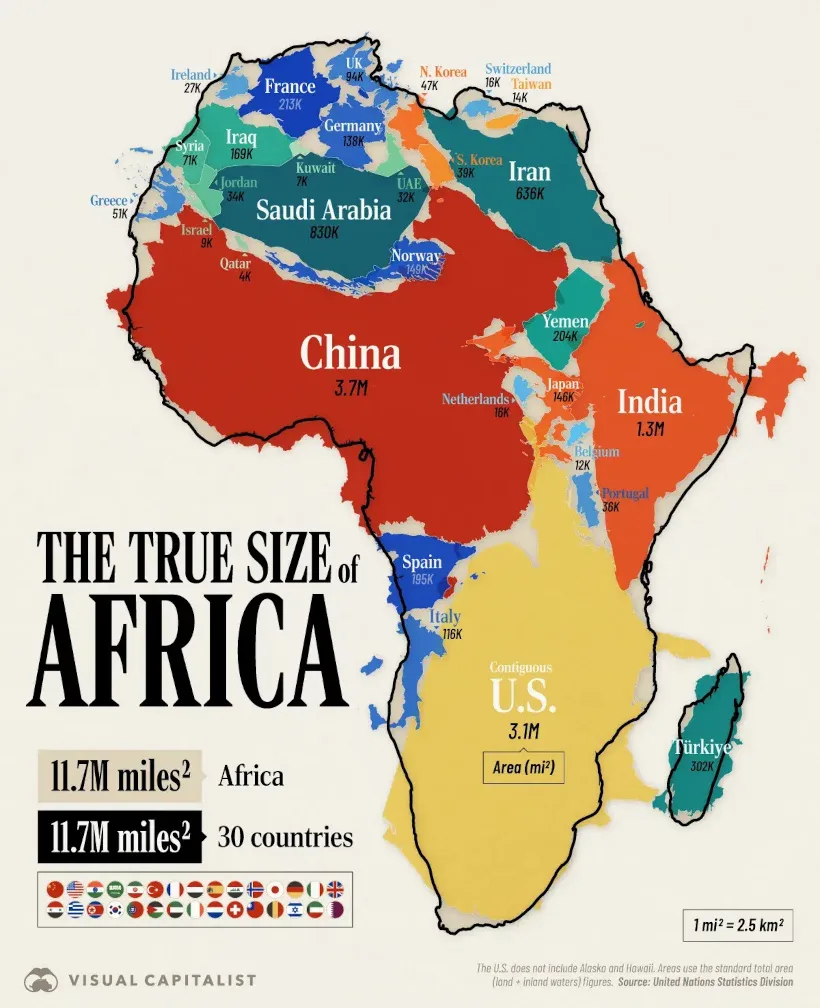
How Many Countries Fit in Africa? The Continent’s True Size
A striking map from Visual Capitalist became the most discussed post of the month, as users debated the distortions of the Mercator projection and Africa’s true scale.
Africa spans 11.7 million mi²—large enough to contain 30 countries, including the U.S., China, and India. Yet on most maps it appears diminished, a distortion that some argue makes the continent seem “marginal” on the world stage. In reality, Africa is the world’s second-largest continent by both area and population (1.6 billion people).
![]() Join the discussion on Voronoi today.
Join the discussion on Voronoi today.
MOST VIEWED
Unstoppable Acceleration: 8 Years of LLM Deployment Visualized
In one of September’s most captivating visuals, MadeVisual compressed eight years of large language model launches into a single sweeping timeline.
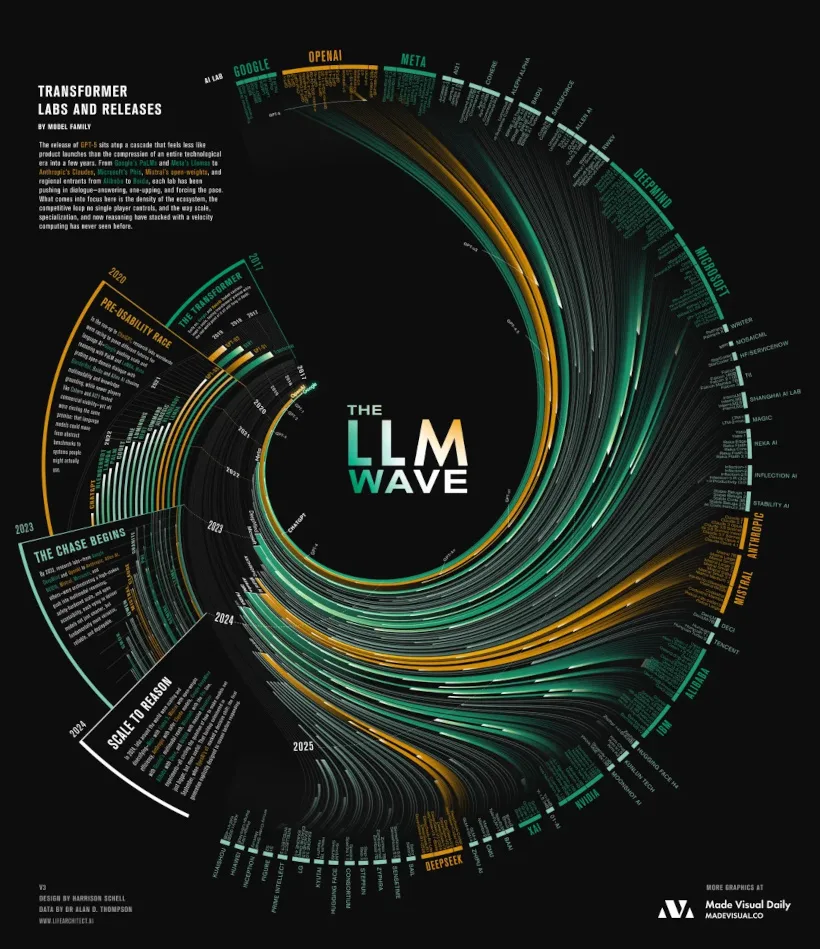
The graphic shows how competition and capital have transformed AI into a self-sustaining system, where each new release accelerates the next. What began with a handful of labs has now become a crowded ecosystem of startups, tech giants, and state-backed projects—all feeding into the accelerating “LLM wave.”
![]() Explore the full timeline on Voronoi today.
Explore the full timeline on Voronoi today.
MOST LIKED
Breaking Down America’s Immigrant Population
This visualization by Visual Capitalist was one of the month’s most liked, unpacking the scale and diversity of immigration to the United States.
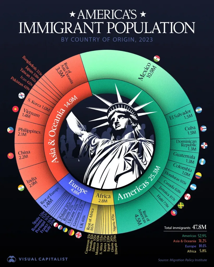
As of 2023, the U.S. had 47.8 million foreign-born residents. Mexico alone accounts for 10.9 million, while other top sources include India (2.9M), China (2.2M), and the Philippines (2.1M). More than half of America’s immigrant population comes from the broader Americas, while Asia & Oceania contribute 14.9 million, reshaping the nation’s demographic and cultural landscape.
![]() See the full breakdown on Voronoi today.
See the full breakdown on Voronoi today.
EDITOR’S PICK
G20 Inflation Tracker: July
For our Editor’s Pick, economist Aneesh Anand examined inflation across the G20, a group of economies that make up 85% of global GDP.
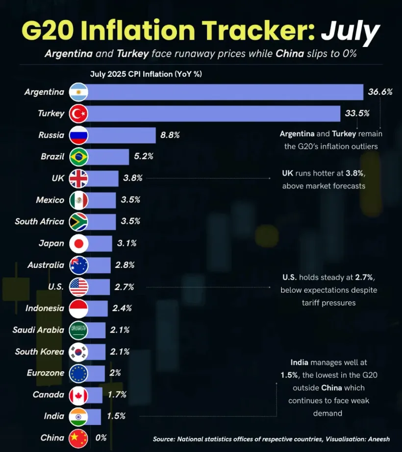
Argentina (36.6%) and Turkey (33.5%) remained extreme outliers, while the U.S. held steady at 2.7% despite tariff pressures. The UK ran hotter than expected at 3.8%, and China’s inflation flatlined at 0%, pointing to persistent weak demand. Meanwhile, India managed just 1.5% inflation, one of the lowest in the G20.
![]() Explore the full dataset on Voronoi today.
Explore the full dataset on Voronoi today.