![]()
See this visualization first on the Voronoi app.
Use This Visualization
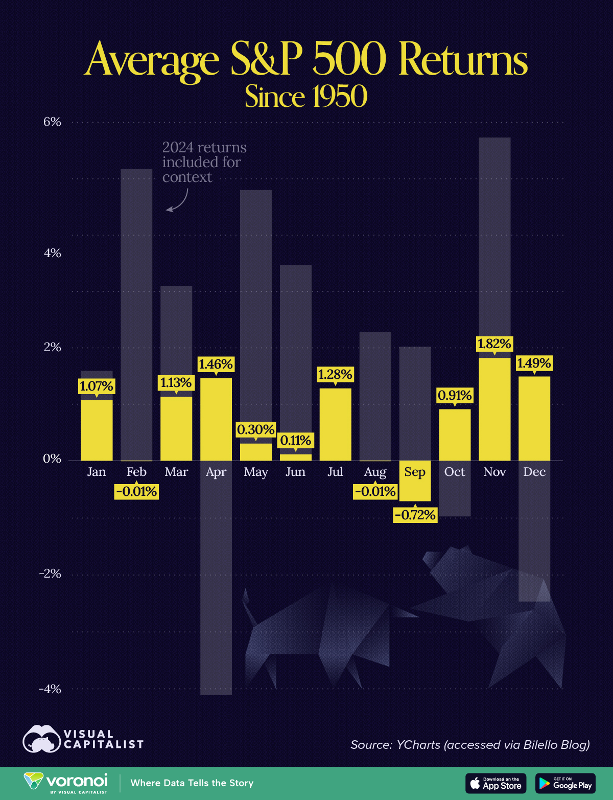
Charted: Average S&P 500 Return by Month Since 1950
This was originally posted on our Voronoi app. Download the app for free on iOS or Android and discover incredible data-driven charts from a variety of trusted sources.
Key Takeaways
- Historical averages since 1950 reveal that some months are better for investors than others
- Actual returns in a given year can differ significantly from historical averages
.key-takeaways {
background: #F8F9FA;
border-left: 4px solid #2A6338;
padding: 15px;
margin: 20px 0;
border-radius: 5px;
}
.key-takeaways h3 {
margin-top: 0;
color: #2A6338;
font-weight: bold;
}
.key-takeaways ul {
padding-left: 20px;
}
.key-takeaways li {
margin-bottom: 5px;
}
Some months are better for investors than others.
Since 1950, historical data reveals distinct patterns in the S&P 500’s average returns by month, showing seasonal trends that investors may want to exploit.
In this infographic, we break down which months have historically been the strongest—and weakest—for U.S. stocks based on data from YCharts (accessed via Bilello Blog)
Sell in May and Go Away
A common phrase in the stock market world is ‘sell in May and go away’, which implies that summer months regularly underperform. But does this have any truth to it?
The table below lists the average S&P 500 return by month. We include monthly returns from 2024 for additional context.
| Month | Average Return (%) | 2024 Return (%) |
|---|---|---|
| January | 1.07 | 1.59 |
| February | -0.01 | 5.17 |
| March | 1.13 | 3.10 |
| April | 1.46 | -4.16 |
| May | 0.30 | 4.80 |
| June | 0.11 | 3.47 |
| July | 1.28 | 1.13 |
| August | -0.01 | 2.28 |
| September | -0.72 | 2.02 |
| October | 0.91 | -0.99 |
| November | 1.82 | 5.73 |
| December | 1.49 | -2.50 |
From this data, we can see that there is indeed a pattern of weaker returns in the months following April (with the exception of July).
At the same time, comparing these figures to 2024 shows why historical averages should be approached with caution. While past trends highlight seasonal tendencies, individual years can deviate due to unique economic conditions or unexpected events.
Time in the Market Beats Timing the Market
Another common phrase is ‘time in the market beats timing the market’, which suggests that over the long term, it’s beneficial to always stay invested.
To learn more about this philosophy, check out our previous graphic, The Cost of Timing the Market.
Learn More on the Voronoi App ![]()
If you enjoy content like this, check out The Best Performing S&P 500 Stocks Over Time on Voronoi, the new app from Visual Capitalist.
The post Charted: Average S&P 500 Return by Month Since 1950 appeared first on Visual Capitalist.