![]()
See this visualization first on the Voronoi app.
Use This Visualization
Charted: The World’s Countries by Income Group (1987-2024)
This was originally posted on our Voronoi app. Download the app for free on iOS or Android and discover incredible data-driven charts from a variety of trusted sources.
Key Takeaways
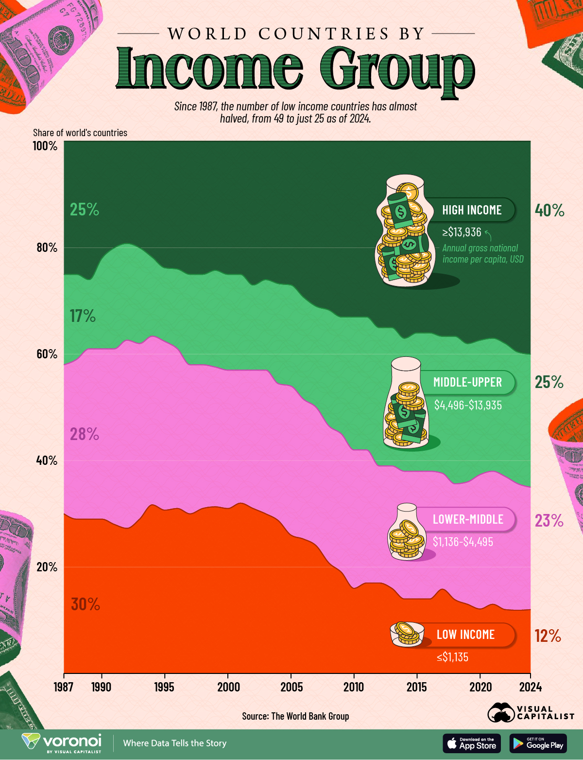
- The number of low-income countries has almost halved, with their global share dropping from 30% in 1987 (49 countries) to 12% in 2024 (25 countries).
- Middle-income is now the plurality.
- Upper-middle (25%) and lower-middle (23%) income groups together account for almost half of the world’s countries in 2024, underscoring a broad shift out of extreme poverty but not yet into the richest tier.
The world’s income landscape has shifted dramatically over the last four decades.
From 1987 to 2024, more of the world’s countries have steadily risen out of the low-income category, reshaping the global distribution of prosperity.
This visualization tracks the shares of the world’s countries by income group over time using data from The World Bank.
The World’s Nations by Income Group Over Time
The World Bank classifies countries by income group annually using gross national income per capita thresholds (Atlas method):
- High Income: ≥ $13,936
- Upper-middle income: $4,496-$13,935
- Lower-middle income: $1,136-$4,495
- Low income: ≤$1,135
You can see the data in the table below of the world’s nations by income group over time.
| Year | Low income share of world's countries | Lower-middle income share of world's countries | Upper-middle Income share of world's countries | High income share of world's countries | Total number of countries |
|---|---|---|---|---|---|
| 1987 | 30% | 28% | 17% | 25% | 163 |
| 1988 | 29% | 30% | 16% | 25% | 164 |
| 1989 | 29% | 32% | 13% | 26% | 168 |
| 1990 | 29% | 32% | 17% | 22% | 175 |
| 1991 | 28% | 33% | 19% | 20% | 193 |
| 1992 | 27% | 35% | 18% | 19% | 201 |
| 1993 | 29% | 33% | 18% | 20% | 202 |
| 1994 | 32% | 32% | 15% | 22% | 203 |
| 1995 | 31% | 32% | 14% | 24% | 203 |
| 1996 | 31% | 30% | 15% | 24% | 204 |
| 1997 | 30% | 28% | 17% | 25% | 204 |
| 1998 | 31% | 27% | 17% | 25% | 204 |
| 1999 | 31% | 26% | 18% | 24% | 204 |
| 2000 | 31% | 26% | 18% | 25% | 205 |
| 2001 | 32% | 25% | 18% | 25% | 206 |
| 2002 | 31% | 26% | 16% | 27% | 206 |
| 2003 | 30% | 27% | 17% | 26% | 206 |
| 2004 | 29% | 26% | 19% | 27% | 206 |
| 2005 | 26% | 28% | 19% | 27% | 206 |
| 2006 | 25% | 26% | 19% | 29% | 208 |
| 2007 | 24% | 26% | 19% | 31% | 208 |
| 2008 | 21% | 26% | 22% | 32% | 209 |
| 2009 | 19% | 26% | 22% | 33% | 212 |
| 2010 | 16% | 26% | 25% | 33% | 215 |
| 2011 | 17% | 25% | 25% | 33% | 215 |
| 2012 | 17% | 22% | 26% | 35% | 215 |
| 2013 | 16% | 23% | 26% | 35% | 215 |
| 2014 | 14% | 24% | 25% | 37% | 215 |
| 2015 | 14% | 24% | 26% | 36% | 218 |
| 2016 | 14% | 24% | 26% | 36% | 218 |
| 2017 | 16% | 22% | 26% | 37% | 218 |
| 2018 | 14% | 22% | 28% | 37% | 218 |
| 2019 | 13% | 23% | 26% | 38% | 218 |
| 2020 | 12% | 25% | 25% | 37% | 217 |
| 2021 | 13% | 25% | 25% | 37% | 217 |
| 2022 | 12% | 25% | 25% | 38% | 217 |
| 2023 | 12% | 24% | 25% | 40% | 217 |
| 2024 | 12% | 23% | 25% | 40% | 216 |
Since the total number of countries in the dataset rises from 163 in 1987 to 216 in 2024, it’s useful to look at both percentages and the overall direction of change.
The big picture: fewer countries are low income, more are high income, and the middle remains the largest cohort.
Low-Income Countries Nearly Halved Since 1987
In 1987, low-income countries made up 30% of the world. By 2024, that share is down to 12%.
The decline is notable as it has occurred even as the count of countries has expanded over time.
The trend underscores decades of progress in lifting countries above the lowest rung. As a result, the two middle income groups account for almost half of all countries (48%) in 2024, reflecting broad development progress from the 1990s and onwards.
A larger middle-income cohort points to expanding consumer bases and manufacturing capacity across emerging markets.
The Growth in the World’s High-Income Countries
High-income economies increased from about 25% of countries in 1987 to roughly 40% in 2024.
That rise captures steady upgrades in global wealth as economies have crossed income thresholds over time.
At the same time, the smaller low-income share highlights long-term gains in poverty reduction—though the remaining group still faces structural constraints that require targeted policy and investment.
Learn More on the Voronoi App ![]()
If you enjoyed today’s post, check out the countries with the most wealth per person on Voronoi, the new app from Visual Capitalist.