Explore the full-size version (19mb) of this visualization.
Today, highly detailed maps of our planet’s surface are just a click away.
In times past, however, access to information was much more limited. It wasn’t until the 1800s that comparison diagrams and maps became widely accessible, and people found new ways to learn about the world around them.
The image above, published by J.H. Colton in 1849, is believed to be the first edition of the iconic mountains and rivers infographic map. This comparison chart concept would see a number of iterations over the years as it appeared in Colton’s world atlases.
Inspiring a Classic Infographic Map
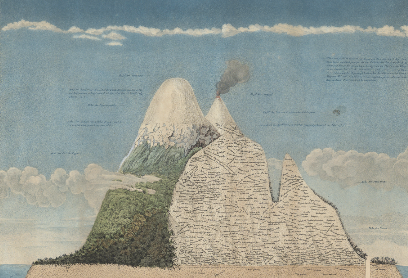
A seminal example of this style of infographic was produced by Alexander von Humboldt in 1805. The diagram below is packed with information and shows geographical features in a way that was extremely novel at the time.
In 1817, the brothers William and Daniel Lizars produced the first comparative chart of the world’s mountains and rivers. Breaking up individual natural features into components for comparison was a very innovative approach at that time, and it was this early French language prototype that lead to the Colton’s versions we’re familiar with today.
Digging into the Details
As is obvious, even at first glance, there is a ton of detail packed into this infographic map.
Firstly, rivers are artificially straightened and neatly arranged in rows for easy comparison. Lakes, mountain ranges, and cities are all labeled along the way. This unique comparison brings cities like New Orleans and Cairo side by side.
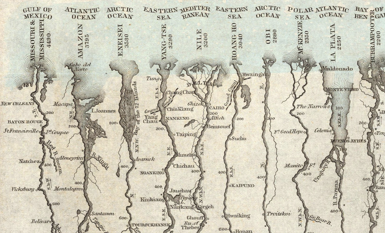
Of course, this visualization was based on the best available data at the time. Today, the Nile is widely considered to be the world’s longest river, followed by the Amazon and Yangtze.
Over on the mountain side, there are more details to take in. The visualization includes volcanic activity, notes on vegetation, and even the altitude of selected cities and towns.
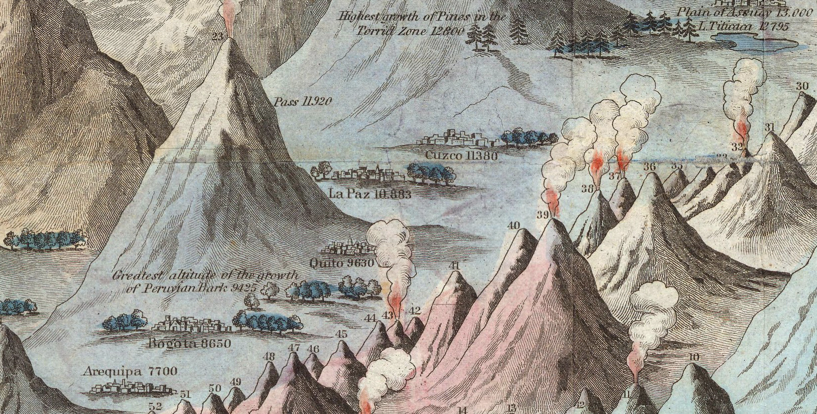
Above are a few of South America’s high-altitude population centers, including La Paz, which is the highest-elevation capital city in the world.
In the legend, many of the mountains are simply named “peak”. While this generic labeling might seem like a throwback to a time when the world was still being explored, it’s worth noting that today’s second tallest mountain is still simply referred to as K2.
What details do you notice while exploring this iconic infographic map?
The post Iconic Infographic Map Compares the World’s Mountains and Rivers appeared first on Visual Capitalist.