![]()
See this visualization first on the Voronoi app.
Use This Visualization
Every Country’s Top Employment Sector
This was originally posted on our Voronoi app. Download the app for free on iOS or Android and discover incredible data-driven charts from a variety of trusted sources.
Key Takeaways
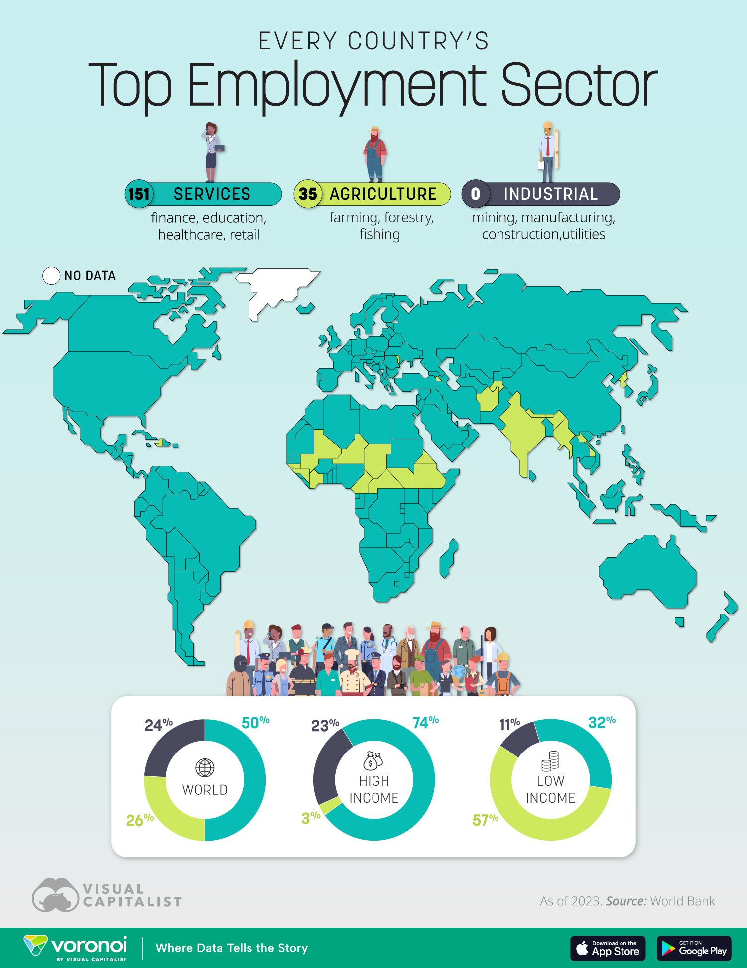
- In low-income countries, most people work in farming, while in rich countries three-quarters are in services.
- Industry is no longer the main employer in any country. For comparison, in the 1970s it accounted for 46% of the workforce in the UK.
Employment patterns vary greatly depending on a country’s level of development. This map highlights the dominant employment sector in each nation, based on the most recent data from the World Bank. It breaks down employment by sector: services, agriculture, and industry.
Globally, services now employ half of the world’s workers, but agriculture and industry remain crucial sources of jobs in many regions.
Services Dominate in High-Income Countries
In wealthy economies, services employ nearly three-quarters (74%) of the workforce. This includes jobs in healthcare, education, retail, finance, and technology. Agriculture, by contrast, accounts for just 3% of workers in these nations.
The shift reflects decades of industrialization and the transition toward knowledge- and service-based economies. In addition, countries with high urbanization rates almost always show services as the top employer.
Agriculture Still Central in Low-Income Countries
In low-income countries, 57% of workers are employed in agriculture, making it the largest sector by far. Farming provides food security and livelihoods, though it often reflects limited industrial growth. Services employ only about one-third of workers, while industry remains relatively small at 11%.
A Global Split Between Sectors
Looking at the world overall, the employment distribution is more balanced: 50% in services, 26% in agriculture, and 24% in industry.
| Employment type | Services | Agriculture | Industrial |
|---|---|---|---|
| World | 50% | 26% | 24% |
| High income | 74% | 3% | 23% |
| Low income | 32% | 57% | 11% |
Learn More on the Voronoi App ![]()
If you enjoyed today’s post, check out 63 Countries Have Already Reached Peak Population on Voronoi, the new app from Visual Capitalist.