Click to view a larger version of the graphic.
Mapped: Average Wind Speed Across the U.S.
Wind energy is a hot topic in North America and around the world as a decarbonization tool, but full utilization requires a lot of wind.
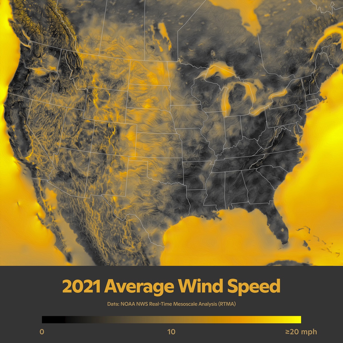
This graphic from the team at the Woodwell Climate Research Center maps the average wind speed of the continental U.S. based on NOAA data from 2021.
Zooming in, you can examine North America’s wind regions and patterns in great detail. Clearly visible is the concentration of high wind speeds in the Great Plains (known as the Prairies in Canada), which has the greatest potential for wind power. You can also follow westerly winds traveling through the North American Cordillera of mountains, including the Rocky Mountains and Cascades.
Meanwhile, the Eastern U.S. and Canada have significantly lower average wind speeds, especially in the American South. That’s despite hurricanes with extremely high winds occasionally moving northward along the Eastern Seaboard towards the North Atlantic.
For more on on U.S. energy, head to Visualizing the Flow of U.S. Energy Consumption.
The post Mapped: Average Wind Speed Across the U.S. appeared first on Visual Capitalist.