Zinc: A Life Saving Commodity
The following content is sponsored by the Teck
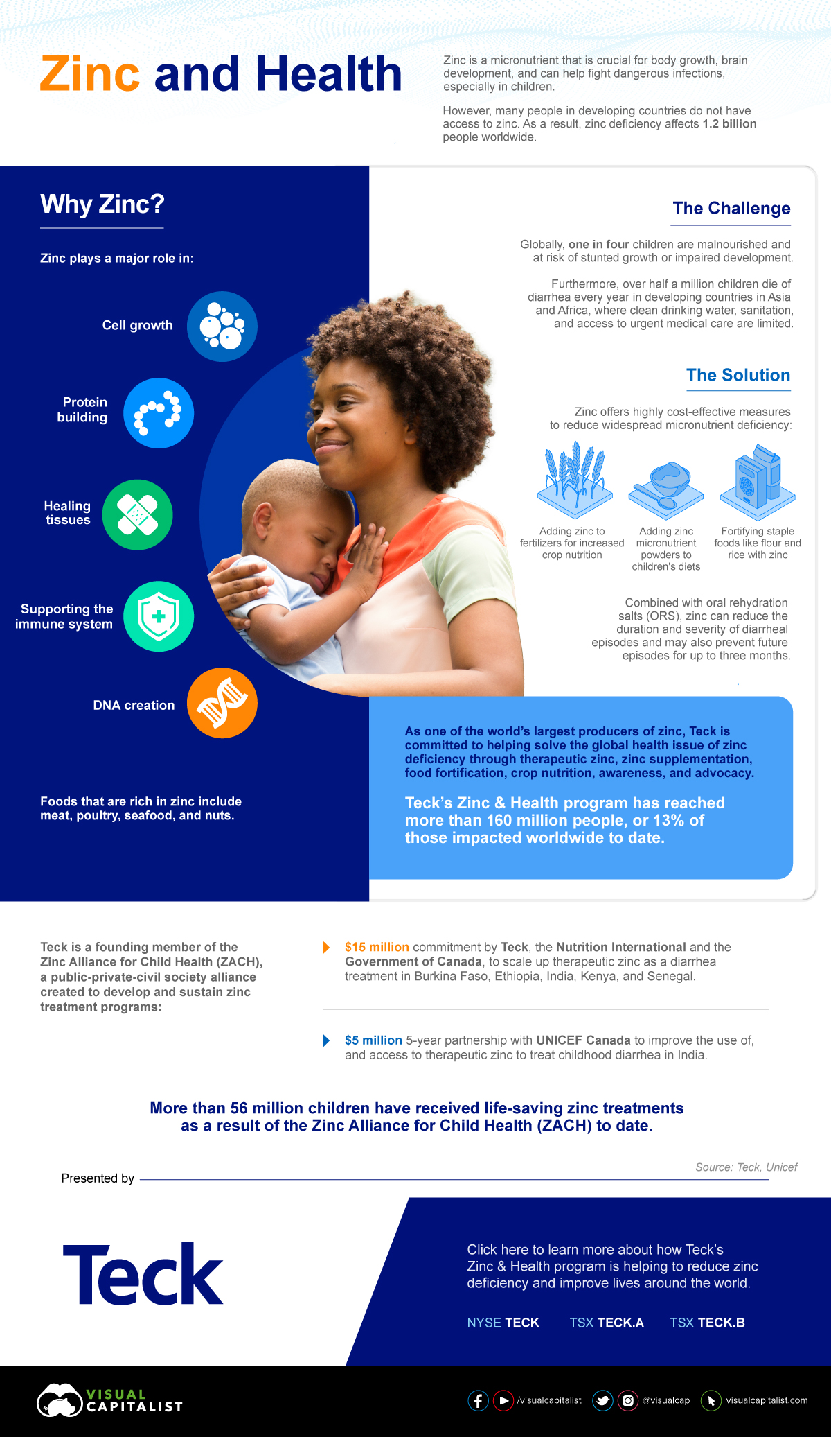
Zinc: A Life Saving Commodity
Zinc is crucial for body growth, brain development, and helps fight dangerous infections, especially in children.
However, the reality is that millions around the world lack sufficient zinc in their diets in order to live healthy lives.
This graphic, sponsored by Teck, shows how zinc supplementation could save millions of lives.
Why Zinc?