You are here

Business

The $100 Trillion Global Economy in One Chart

Explore the full-size version of this visualization.

Can I share this graphic?Yes. Visualizations are free to share and post in their original form across the web—even for publishers. Please link back to this page and attribute Visual Capitalist.

When do I need a license?Licenses are required for some commercial uses, translations, or layout modifications. You can even whitelabel our visualizations. Explore your options.

Interested in this piece?Click here to license this visualization.

BlackRock MyMap: Designed for First-Time Investors

Whether you’re sending your kids to university or preparing for retirement, meeting future financial needs can be a mighty challenge.

This is due to the many economic issues that eat away at your savings. Inflation, for example, is increasing the cost of gas, groceries, and other daily necessities. The COVID-19 pandemic, on the other hand, has thrown a wrench into many people’s personal finances.

Starting Your Investment Journey

Charted: Four Decades of U.S. Inflation

Charted: Four Decades of U.S. Inflation

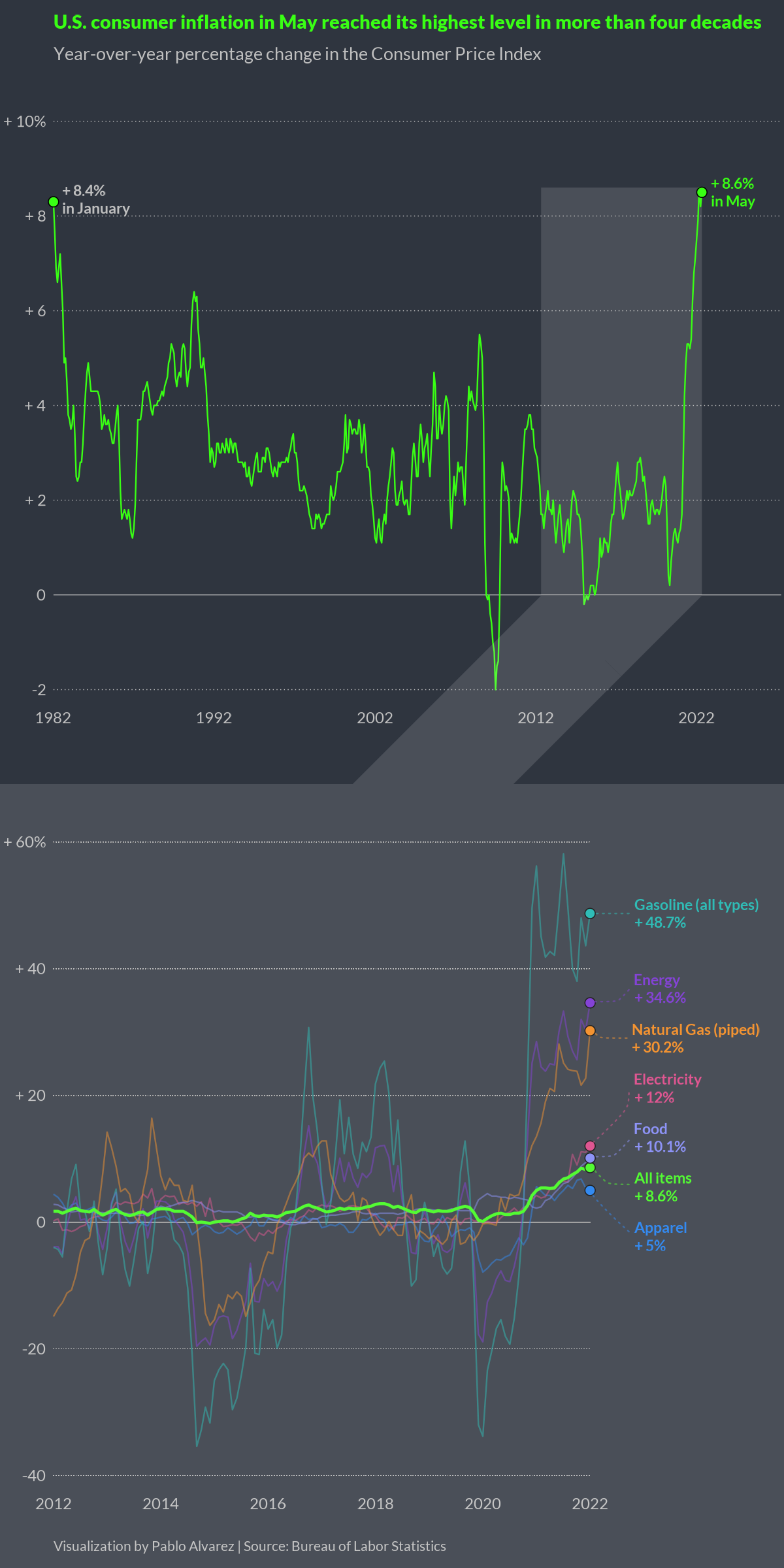
In May 2022, the annual rate of U.S. inflation grew to 8.6%—the highest it’s been in four decades, according to the Bureau of Labor Statistics.

What’s driving this surge, and what products are seeing the most significant price jumps?

This visualization by Pablo Alvarez shows U.S. inflation levels since 1982 and highlights a few product categories that have seen the biggest year-over-year increases.

Pages