Will A Dark Omen On Election Day Be A Sign That The United States “Is On The Eve Of Destruction”?

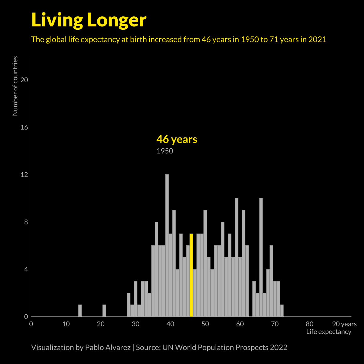
Animated Chart: Global Life Expectancy (1950-2021)
At a glance, life expectancy has been increasing worldwide over the last 70 years. But when you break it down by region and by sex, a clear yet variable gap in life expectancy emerges.
VC+ members will be receiving our World at 8 Billion Report. To gain access to this exclusive report and webinar, all you have to do is become a VC+ member.
Get Access to 8 Billion Report
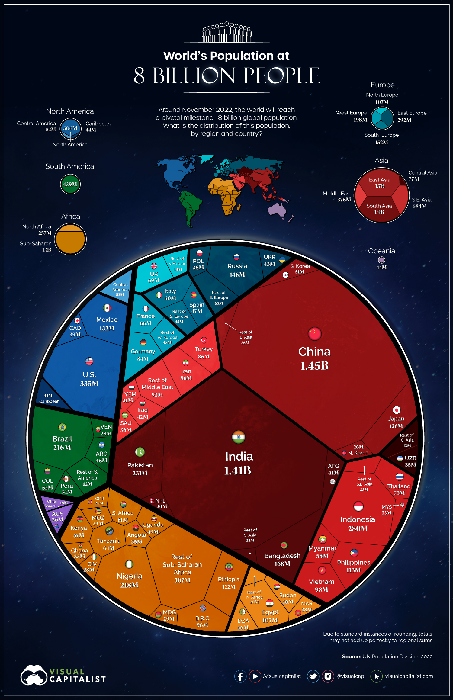
Visualized: The World’s Population at 8 Billion
Can I share this graphic?Yes. Visualizations are free to share and post in their original form across the web—even for publishers. Please link back to this page and attribute Visual Capitalist.
When do I need a license?Licenses are required for some commercial uses, translations, or layout modifications. You can even whitelabel our visualizations. Explore your options.