Just over a year ago, we launched Voronoi, our free new data discovery app.
Believe it or not, there are already more data-driven visuals on Voronoi than on Visual Capitalist (which has been around for 13 years!).
Every day there’s something new on Voronoi to see. And in aggregate, there are around 4,500 data stories to explore on the platform from more than 140 world-class creators.
Explore Voronoi
Let’s see what captivated users in April.
We’ll take look at some of the best of Voronoi over the last month, including a creator worth profiling, a top “Editor’s Pick” visual, and also the most popular, most commented on, and most timely posts.
POPULAR CREATOR
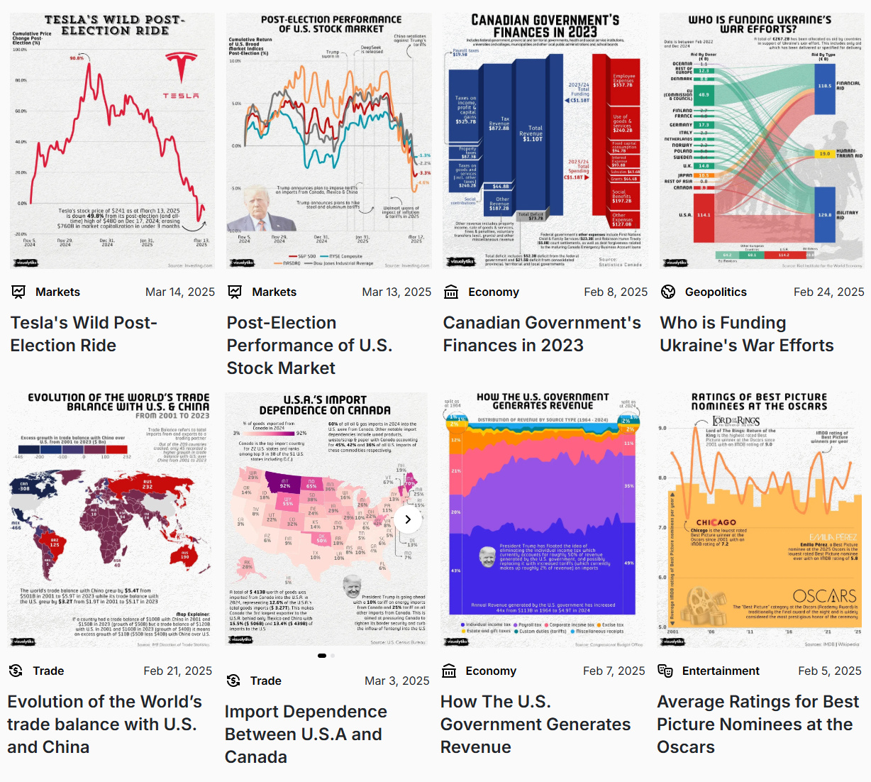
Vizualytiks
Visual Capitalist is just one of many creators on Voronoi.
In fact, the data storytelling platform has many world-class creators with insightful visualizations, including Vizualytiks.
Vizualytiks has posted all sorts of interesting visuals since joining in February, including on topics like:
- The evolution of the world’s trade balance with the U.S. and China
- How the U.S. government generates revenue
- Who is funding Ukraine’s war efforts
- U.S. import dependence on Canada
![]() View all visuals from Vizualytiks on Voronoi today.
View all visuals from Vizualytiks on Voronoi today.
MOST VIEWED
Visualizing China’s $18.6 Trillion Economy
How big is the Chinese economy? And what sectors make up the biggest chunk of it?
Visual Capitalist visualized the second largest economy in the world in this visual:
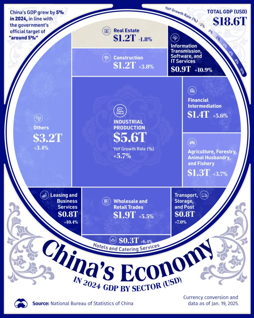
Not surprisingly, industrial production is the sector that drives the Chinese economy, making up about $5.6 trillion (30%) of the whole. It’s also growing at about an 5.7% annual clip.
![]() Get the data behind this on Voronoi today.
Get the data behind this on Voronoi today.
MOST DISCUSSED
How U.S. Medicare Prices Compare to Other Rich Nations
Our most discussed post of the month came from Visual Capitalist and contrasts drug prices between the U.S. and other rich nations.
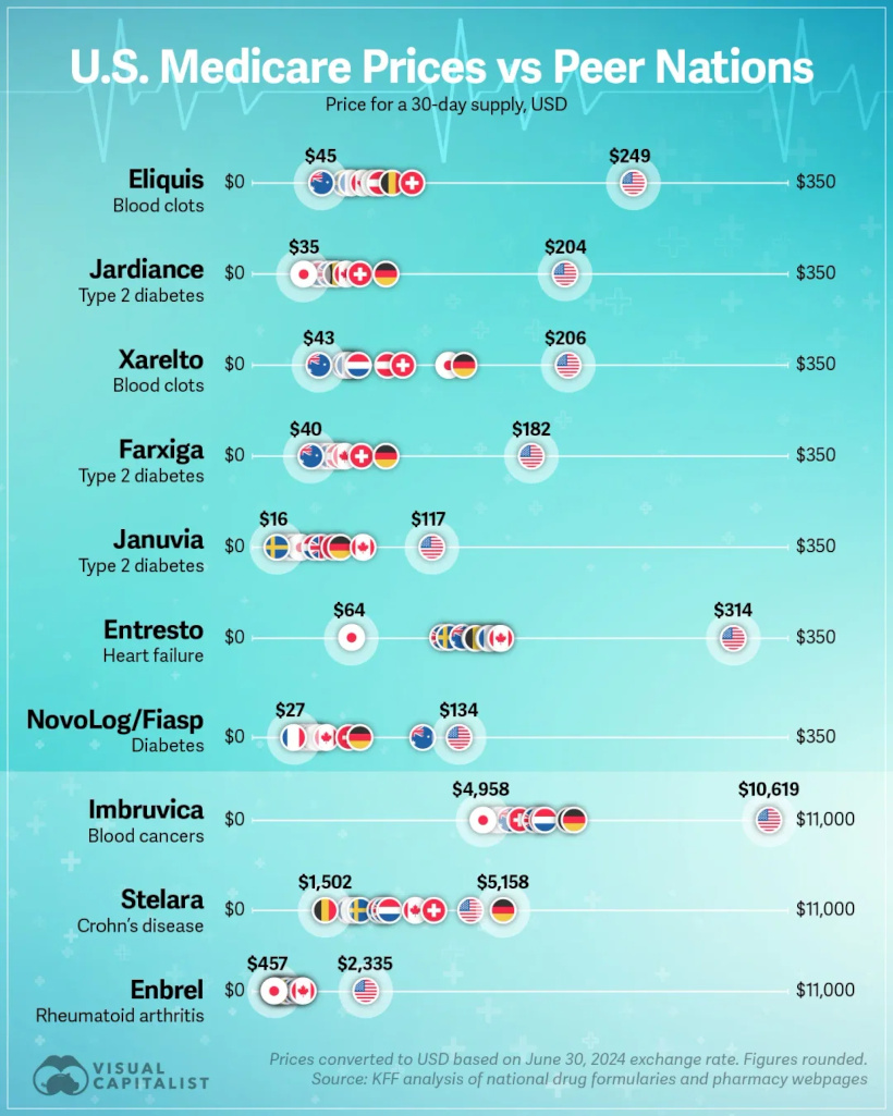
Many commenters debated whether high U.S. drug prices are a necessary result of capitalism incentivizing innovation and recouping R&D costs, or a product of systemic issues like patent protectionism, lack of price negotiations, and crony capitalism.
Either way, visualizing the stark price disparities got people talking. What side are you on?
![]() To join the discussion, get on Voronoi today.
To join the discussion, get on Voronoi today.
EDITOR’S PICK
Minerals and Gems Ranked by Hardness
Creator Julie Peasley visualized the Mohs hardness scale for minerals and gems, creating an interesting learning experience for many on the app.

Everyone knows diamonds are the hardest, but what’s next up in the hardness ranking?
Turns out it’s corundum (aluminum oxide) which forms as rubies and sapphire crystals—two gemstones you are more likely to know!
Either way, this circular visualization by Julie really helps put these gems and minerals in context.
![]() Dive into the data on Voronoi today.
Dive into the data on Voronoi today.