At the end of 2023, we publicly launched Voronoi, our free new data discovery app!
The initial response from both users and creators has been incredible. Just days ago, we hit a milestone of 1 million in-app views, and there are already hundreds of interesting visualizations to discover, many of which will not be published on Visual Capitalist.
For that reason, we’ve chosen to highlight some of the most popular visualizations and creators from January in this roundup. To see them and many others, make sure to download the app!
Download Voronoi Now
Let’s take a look at a popular creator worth highlighting, as well as the most viewed, most discussed, and most liked posts of the month.
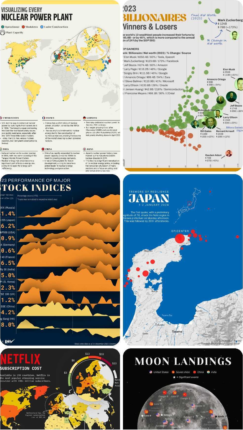
POPULAR CREATOR
Preyash Shah
Visual Capitalist isn’t the only creator on the Voronoi app.
Instead, it features incredible data-driven charts and stories from many of the world’s best creators, like Preyash Shah.
Preyash has been sharing many interesting datasets on Voronoi so far, including:
- The billionaire winners and losers of 2023
- A map of the world’s nuclear reactors
- Mapping the price of Netflix subscriptions by country
- A chart of the performance of major stock indices
Preyash is definitely worth a follow on the app, and we can’t wait to see what he posts next!
![]() View all of Preyash’s visuals on Voronoi today.
View all of Preyash’s visuals on Voronoi today.
MOST DISCUSSED
The Most Valuable Brands in 12 Countries
The most commented on visualization from Visual Capitalist broke down the most valuable brands in key countries globally.
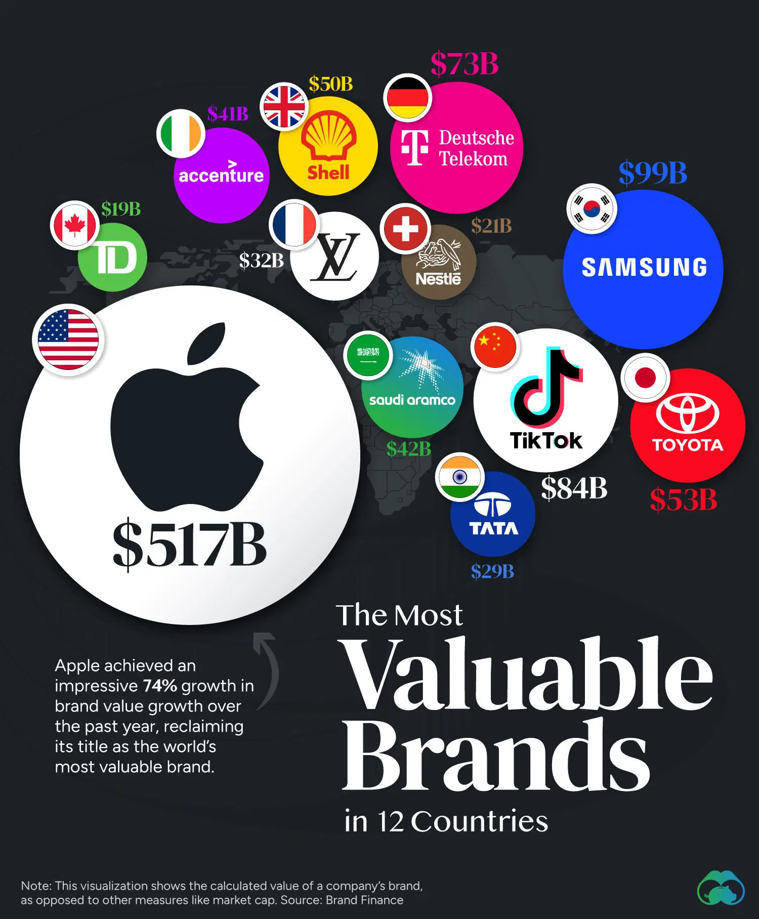
Users remarked at the prevalence of technology brands on the map, and were surprised that traditional brands didn’t take the top spots in many countries.
Commenters also noted that TikTok is more valuable than Toyota, and that Apple is five times more valuable than the next biggest brand on the map, Samsung.
![]() To join the conversation, download Voronoi today.
To join the conversation, download Voronoi today.
MOST VIEWED
Largest Company in U.S. Every Year Since 1995
In the business, few things are constant.
This visualization from Visual Capitalist shows how the most valuable company, in terms of market capitalization, has changed over time.
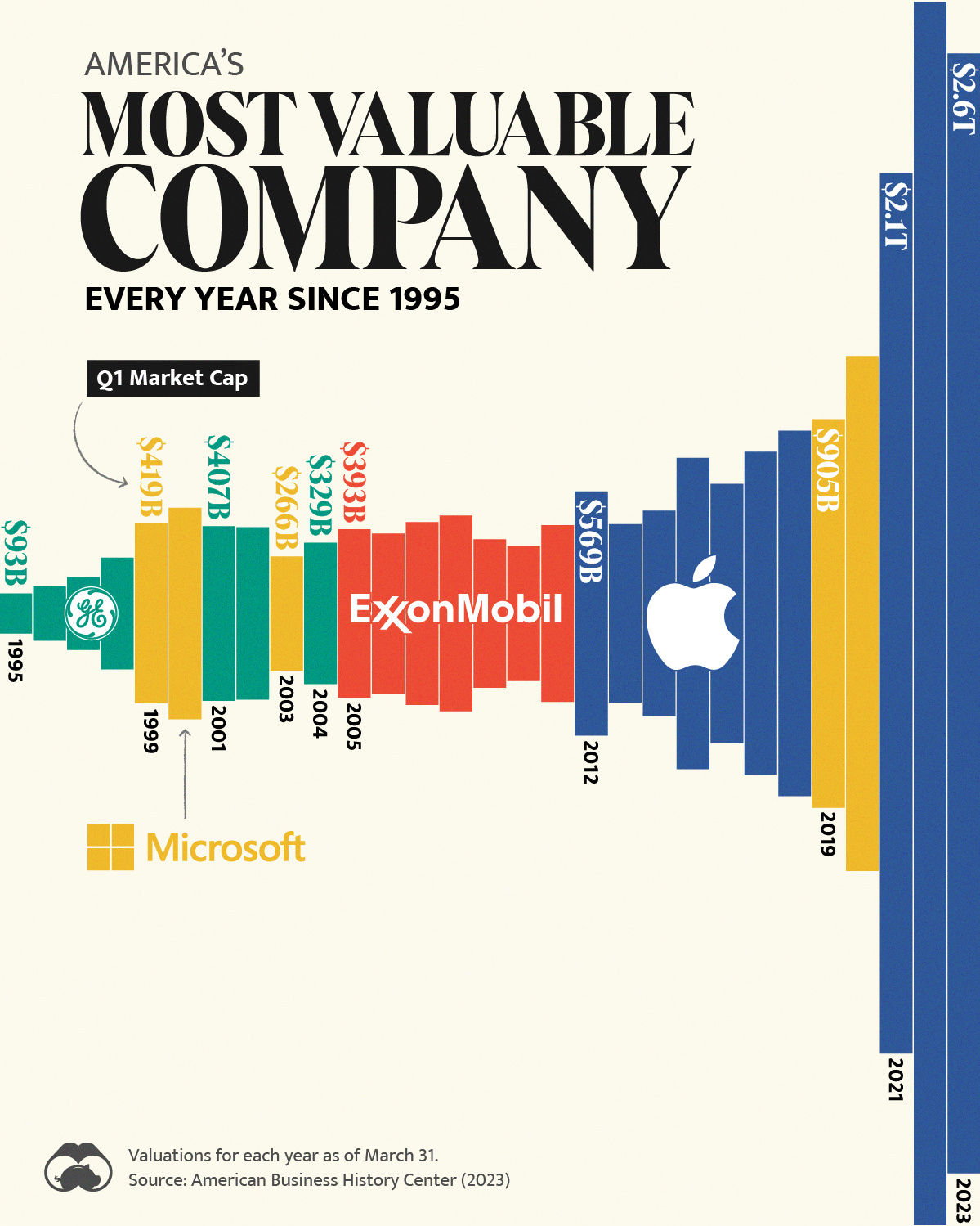
Racking up 31,000 views on Voronoi over the course of the month, this visualization takes a unique approach that enables you to see the explosive growth and evolution of the most valuable company each year.
![]() Get the data behind this visual on Voronoi today.
Get the data behind this visual on Voronoi today.
MOST LIKED
The Global Risks Report 2024
The most liked visual on Voronoi in January came from Visual Capitalist, showing the highlights of the 2024 Global Risks Report from the World Economic Forum.
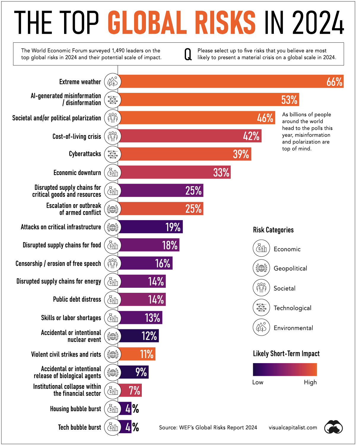
This annual survey of leaders, which focuses in on the global risks that could impact the economy in the coming year, is always widely watched and discussed.
In this edition, top risks included extreme weather, the cost-of-living crisis, and AI-generated misinformation.
![]() Get the data behind this visual on Voronoi today.
Get the data behind this visual on Voronoi today.
The post The Best Visualizations of January on the Voronoi App appeared first on Visual Capitalist.