![]()
See this visualization first on the Voronoi app.
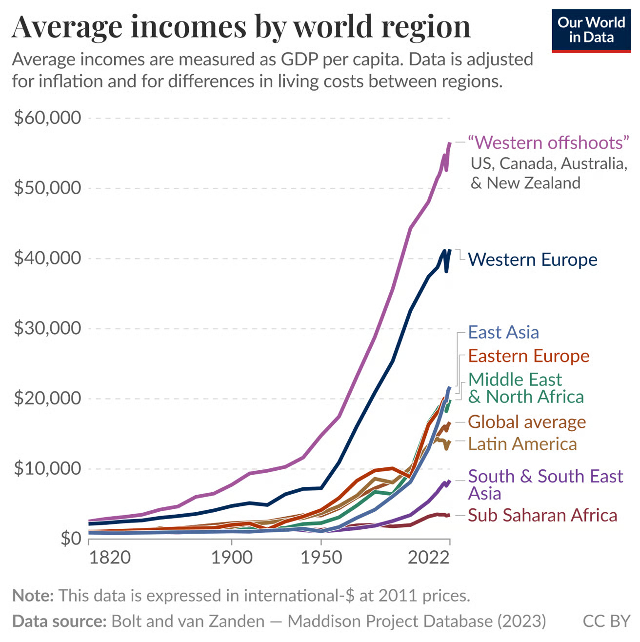
Charted: Average Income by Global Region, Over 200 Years
This was originally posted on our Voronoi app. Download the app for free on iOS or Android and discover incredible data-driven charts from a variety of trusted sources.
- In 1820, average incomes were low and relatively equal across all world regions.
- Today, “Western offshoots” earn on average 13 times more than Sub-Saharan Africa.
- Rapid growth in East Asia and parts of the Middle East shows signs of economic convergence.
How did global income inequality come to be? The chart above, created by Our World in Data, uses long-term GDP per capita data from the Maddison Project Database to track average incomes by world region from 1820 to 2022.
This massive dataset, updated in 2023, spans 169 countries and estimates income adjusted for inflation and cost-of-living differences across time and geography.
The source methodology is laid out in Bolt and Van Zanden (2024), offering one of the most comprehensive looks at global economic development in history.
Charting 200 Years of Global Income Divergence
| Region | GDP per Capita (2022, int-$ at 2011 prices) |
|---|---|
| Western offshoots | 55,000 |
| Western Europe | 42,000 |
| East Asia | 18,000 |
| Eastern Europe | 15,000 |
| Middle East & North Africa | 15,000 |
| Global average | 17,000 |
| Latin America | 14000 |
| South & South East Asia | 9000 |
| Sub Saharan Africa | 4000 |
The chart shows a staggering income gap: “Western offshoots” like the U.S., Canada, and Australia now top $55,000 in average income, while Sub-Saharan Africa lags at just $4,000.
Western Europe follows close behind the offshoots at $42,000, while East Asia and Eastern Europe hover between $15,000–18,000.
Why Did These Gaps Emerge?
Two hundred years ago, nearly all regions were equally poor. Life was marked by subsistence living, high child mortality, and food insecurity. But the Industrial Revolution changed the trajectory for parts of the world.
Western Europe and its offshoots capitalized early on industrialization, financial markets, and capitalism, leading to explosive and sustained growth. By contrast, regions like South Asia and Sub-Saharan Africa lacked the infrastructure or institutional stability to follow suit until much later.
This divergence laid the foundation for modern global inequality—a trend still visible in data like the World Bank’s global income classifications or GDP per capita rankings.
Signs of Convergence?
Although wide gaps remain, there are hints of change. East Asia has seen rapid catch-up growth over the last 50 years, largely driven by China’s economic reforms and export-led growth. Similarly, parts of the Middle East and North Africa have surpassed the global average.
Still, true convergence is far from guaranteed. Many low-income regions continue to face hurdles, from political instability to climate challenges. But as the chart reveals, long-term progress is possible—even transformative.
Learn More on the Voronoi App
Explore more insights into income inequality and economic growth on the Voronoi app, including how daily incomes have changed across the top 20 economies since 1994.