![]()
See this visualization first on the Voronoi app.

Use This Visualization
Infographic: How Many Active Funds Beat the S&P 500?
This was originally posted on our Voronoi app. Download the app for free on iOS or Android and discover incredible data-driven charts from a variety of trusted sources.
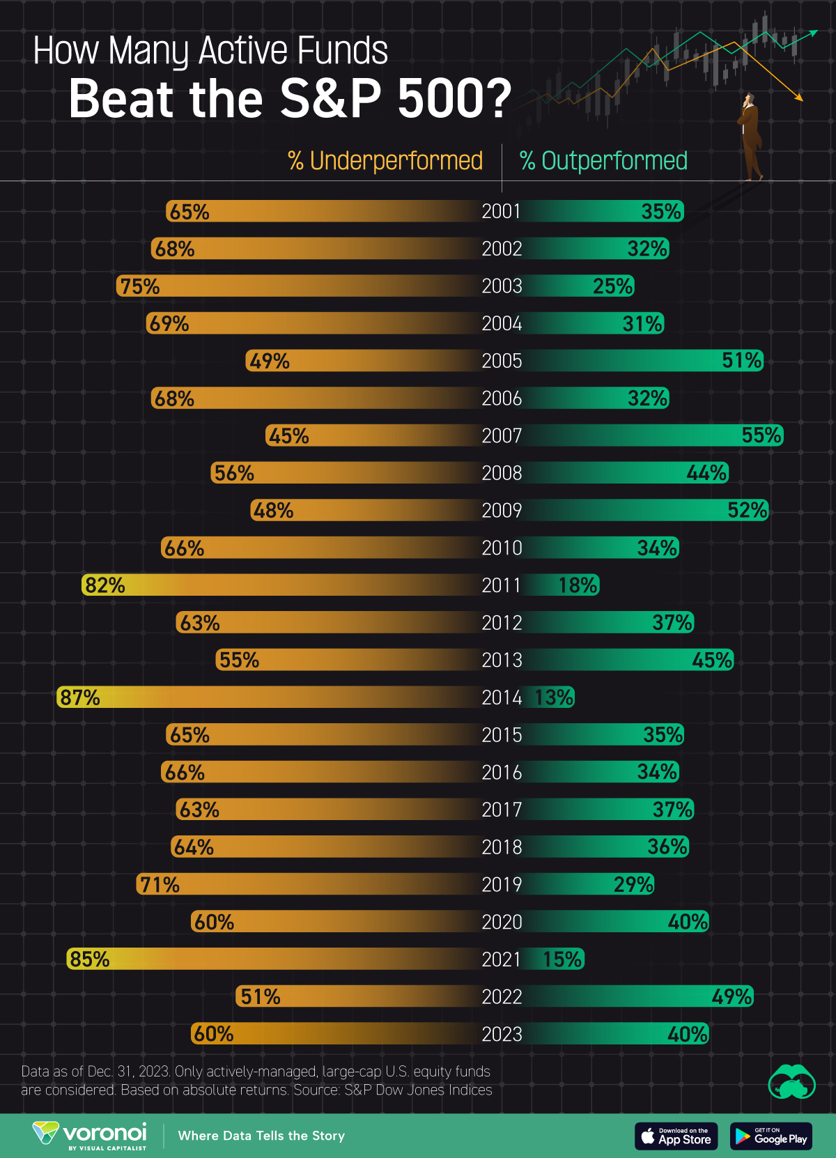
This graphic shows the percentage of actively-managed large-cap U.S. equity funds that have outperformed or underperformed the S&P 500 index, based on data compiled by S&P Dow Jones Indices as of Dec. 31, 2023.
It highlights how in almost every year since 2001, a majority of active funds have failed to beat the index.
Active vs Passive
Actively-managed equity funds are managed by professional fund managers who aim to outperform the market by selecting specific stocks, often incurring higher fees and trading costs.
Passive equity funds, on the other hand, track a specific index (like the S&P 500) to mirror market performance.
While active funds can potentially generate market-beating returns, passive funds tend to deliver more consistent returns with lower fees.
Geographically speaking, passive funds are more popular in the U.S., representing 50% of total mutual fund and ETF assets. Across the rest of the world, passive funds account for only 26%.
Data and Highlights
The data visualized in this graphic is also listed in the table below.
| Year | % Underperformed | % Outperformed |
|---|---|---|
| 2001 | 65 | 35 |
| 2002 | 68 | 32 |
| 2003 | 75 | 25 |
| 2004 | 69 | 31 |
| 2005 | 49 | 51 |
| 2006 | 68 | 32 |
| 2007 | 45 | 55 |
| 2008 | 56 | 44 |
| 2009 | 48 | 52 |
| 2010 | 66 | 34 |
| 2011 | 82 | 18 |
| 2012 | 63 | 37 |
| 2013 | 55 | 45 |
| 2014 | 87 | 13 |
| 2015 | 65 | 35 |
| 2016 | 66 | 34 |
| 2017 | 63 | 37 |
| 2018 | 64 | 36 |
| 2019 | 71 | 29 |
| 2020 | 60 | 40 |
| 2021 | 85 | 15 |
| 2022 | 51 | 49 |
| 2023 | 60 | 40 |
According to this data, there have only been three years since 2001 where a majority of active funds beat the S&P 500 index: 2005, 2007, and 2009.
This highlights the difficulty of beating the market, and why you should always do your research before investing in an actively-managed fund.
Referencing our past infographic which plotted 150 years of S&P 500 returns, we can see that 2005 and 2007 were both normal years for the index, logging a +4.9% and +5.5% gain respectively.
2009 was a relatively stronger year, with a +26.5% gain. A majority of active funds beat the index during this year due to the market volatility that followed the 2008 financial crisis.
High volatility can create opportunities for skilled fund managers to pick undervalued stocks and adjust their portfolios quickly.
Learn More on the Voronoi App ![]()
If you enjoyed this post, check out this graphic that shows the average annual return of the S&P 500 by presidential cycle year.
The post Infographic: How Many Active Funds Beat the S&P 500? appeared first on Visual Capitalist.