By the SRSrocco Report,
Investors need to be concerned that the U.S. Stock Market is well beyond bubble territory as it has now entered into the final stage of a Super-Charged Tulip Mania. Not only are stock prices inflated well above anything we have ever seen before, but valuations are also reaching heights that are totally unsustainable. Unfortunately, these highly inflated share prices and insane valuations seem normal to investors who are suffering from brain damage as years of mainstream propaganda have turned the soft tissue in their skulls to mush.
Also, we are way beyond "Boiling Frogs" now. Yes, we passed that stage a while back. Today, the typical U.S. investor has been fried to death. Investors now resemble a super-crisp chicken-wing with very little meat on it but at least will offer, one hell of a crunch. Please realize I don't mean to be harsh about my fellow investor. However, when I look around and see what 99% of the market is doing, it reminds me of a famous line from the movie Aliens. The star of the movie, after being found lost in deep space for many years, said the following in a meeting, "Did IQ's drop sharply while I was away?"
We find out in the rest of the movie that the so-called Mainstream experts were totally wrong about their assessment of the situation. However, billions of dollars were still spent and many lives lost because high-level individuals infected with stupidity (in the Aliens Movie) still controlled the shots. No different than today.
Regardless, the U.S. Stock Market has entered into the last stage, which I call the Super-Charged Tulip Mania. In this stage, it wouldn't matter if the North Koreans launched a nuclear missile and declared war on the rest of the world, the universe and all Aliens floating around in space. By God, the Dow Jones Index would look at these as a catalyst to reach the next important psychological level of 25,000 points. Reaching that new level wouldn't really be that hard as the Fed would just need to hire a few dozen more trading geeks and provide them with an endless supply of Hot Pockets and Starbucks. Easy-peasy.
Okay... it's time to get serious. Here are a group of charts that show just how insane the markets and valuations have become today.
JP MORGAN & CATERPILLAR: Exponential Share Price Increase & Insane Valuation
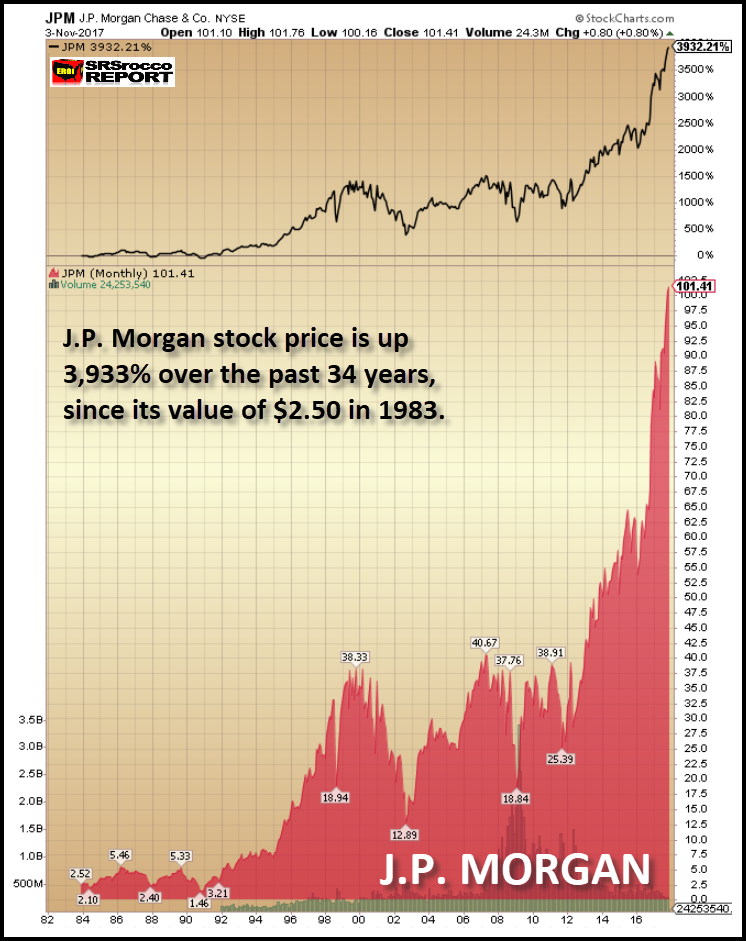
Let's take a look at two of the companies listed in the Dow Jones Index. JP Morgan Chase has benefited immensely from the U.S. Government bailout of the garbage assets such as Mortgaged Back Securities after the housing and banking collapse in 2008. JP Morgan has seen its share price surge four times from $25 in 2012 to over $100 currently:
Furthermore, if an investor was lucky enough to buy a bunch of JP Morgan stock back in 1983 at $2.50 a share, he or she wouldn't be complaining a bit today. JP Morgan's stock price is up a stunning 3,933% over the past 34 years. If we look this chart, we can see that the share price is now moving up in an exponential trend. Sadly for JP, all exponential trends never last. While they may continue higher a bit longer, all will collapse sooner or later.
Another stock that has moved into the exponential territory, is Caterpillar. After years of falling sales, Caterpillar has emerged out from the ashes to increased sales, profits and with it... a skyrocketing share price:
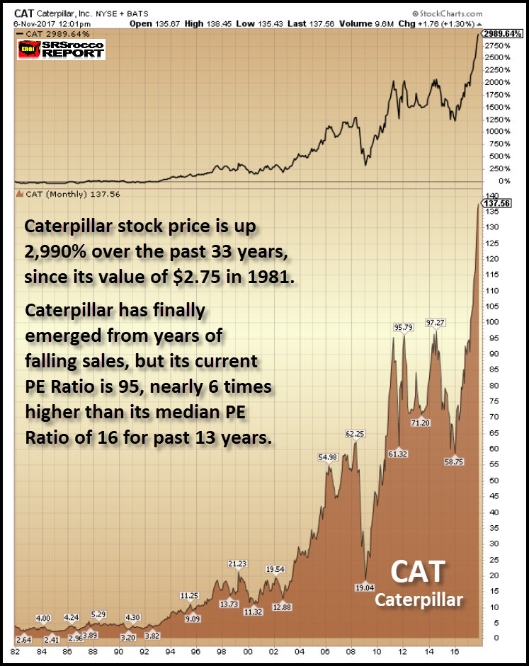
Not only is Caterpillar's share price up more than double to $137 since the beginning of 2016, but its current PE Ratio (Price to Earnings) is also at a staggering 95. Let me tell you, Caterpillar's PE Ratio of 95 is nearly six times higher than its median PE Ratio over the past 13 years. Moreover, Caterpillar's net income Q1-Q3 2007 was higher ($2.5 billion) than Q1-Q3 2017 ($2 billion), but its stock price was only $55 in 2007 versus the $137 today. So, what gives?
Again... these stock prices may continue higher for a while, but nothing heads up in a straight line for long.
APPLE STOCK: From Nose-Bleed To Outer-Space Brain Crushing Levels
It's no surprise that Apple's share price has reached a level that would make any Las Vegas bookie extremely jealous. And why shouldn't it? What other company has actually brainwashed people into believing that they need to stand in line overnight to purchase the newest I-phone model at $1,000 a pop? Even though Caterpillar's share price is up almost 3,000 percent over the past 36 years, who stands in line for a new Caterpillar Earth Moving machine? Or how about the latest Nike sneaker?
Amazingly, Apple's stock price is up an earth-shattering 46,648% since it starting trading at $0.40 in 1984:

It is also quite astonishing to see Apple's stock up more than 15 times at $172 compared to its low set in 2009 at $11. We must remember what was going on in the first quarter of 2009. The Dow Jones Index was falling to a gut-wrenching low of $6,600 as CNBC's Mad Money, Jim Cramer was telling everyone that "There's no end in sight to how far the market would fall." Ole Jim was finally throwing in the towel. Back then, I also wondered how the hell did the CNBC talking heads could continue to get out of bed, get in front of the camera, and deal with what looked like the end of the world. What a difference in eight years... ah?
Today at CNBC land, there's nothing but BIG SMILES and BACK SLAPS. Everyone is wondering when the Dow Jones will finally reach the 25,000 level. I gather all it would take to get us there would be the following three incidents; 1) A war with North Korean, 2) A Saudi Arabia Royal Government Coup and, 3) A tidal wave that floods New York City.
THE DOW JONES & EXXONMOBIL: Watch Out Below!!
The Dow Jones and ExxonMobil are two of my favorite indicators which show that something is seriously wrong in the market. First, let's look at ExxonMobil. While ExxonMobil's stock isn't moving up exponentially, as is Caterpillar, JP Morgan, and Apple, its share price is still well above its ratio to the oil price. If we go back to 2005, when the oil price was trading at the same as it is today, ExxonMobil's share price was only $35. However, ExxonMobil's share price is over $83. You can see the oil price (BLACK line) versus ExxonMobil's share price (PURPLE area):
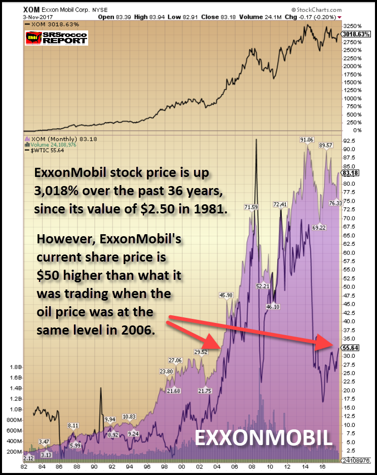
While it's true that ExxonMobil's share price has increased as a result of its massive stock-repurchasing program over the past decade, the company also spent over $220 billion in profits to reduce its outstanding shares from 6.3 billion in 2005 to 4.2 billion currently. Thus, company management thought it was a better decision to spend nearly a quarter of a Trillion Dollars to buy back its stock, rather than to use it for exploring, developing and producing more oil.
For ExxonMobil to finally be able to enjoy a tiny bit of free cash flow this year after it paid its shareholder dividends, it had to gut its capital expenditures by nearly two-thirds since 2012. By cutting its capital expenditures by $22+ billion, how does it expect to replace its oil reserves going forward? Good question. However, there isn't a good answer as the low oil price has put the U.S. oil industry into a horrible predicament with no real solution.
If Americans understood how dire the situation has become in the domestic oil industry, they wouldn't be pushing up the value of the Dow Jones to new record highs. Why? Without energy, there is no economy or financial assets. Sure, if we went back to using human and animal labor, there would still be some small valuations. Maybe the Dow Jones Index would be trading at say 100-200 points, but nowhere near the 23,500 level today.
The Dow Jones Index chart below shows how one index can become a Super-Charged Tulip Mania while the other index can be driven down to bottom-basement cesspool levels:

First, can you imagine owning the Dow Jones Index trading at a measly 850 points in 1981? It took the Dow nearly a century to reach 850 points in 1981, but it was able to increase 850 points in the past two months. Amazing things can happen to market prices and valuations when we have massive Central Bank money printing, Mainstream propaganda and societal brain damage.
Second, as the Dow Jones Index reached 23,500 points, the VIX Index (volatility) fell to a new record low of 9.14 (shown at the bottom right-hand side of chart). Think of these two indexes as an oversized stretched rubber band. At some point, the rubber band will snap back, and the fun will begin.
THE UNLOVED METALS: No Bubble Here... Just A Lot Of Frustration
While the first group of charts provides clear evidence of bubbles and tulip manias, this last group reveals quite the opposite. And out of the three following metal charts, silver is by far, the most unloved. Yes, that's correct. A metal that has been money for more than 2,000 years has performed the worst when we compare it to copper and gold. Let's take a look at copper first.
Even though the copper price fell from its high back in 2011, it has surged over 50% in the past two years. However, if we go back to 1981, the copper price is only up 312% over the 36-year period:
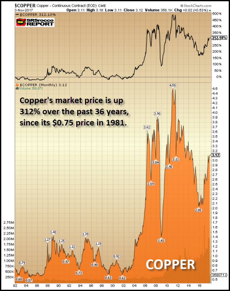
In 1981, the copper price was trading at $0.75, but today with all the massive money printing, the king base metal is only trading at $3. Now compare the 312% copper price increase versus the Dow Jones Index at 2,548% and Caterpillar at 2,990%. Thus, an investor was paid much more handsomely to invest in industrial stocks than in copper over this 36-year period.
Now, if you think copper under-performed the stock market, wait until you see gold. The gold price today is only up 207% since it was traded for $400 in 1981:
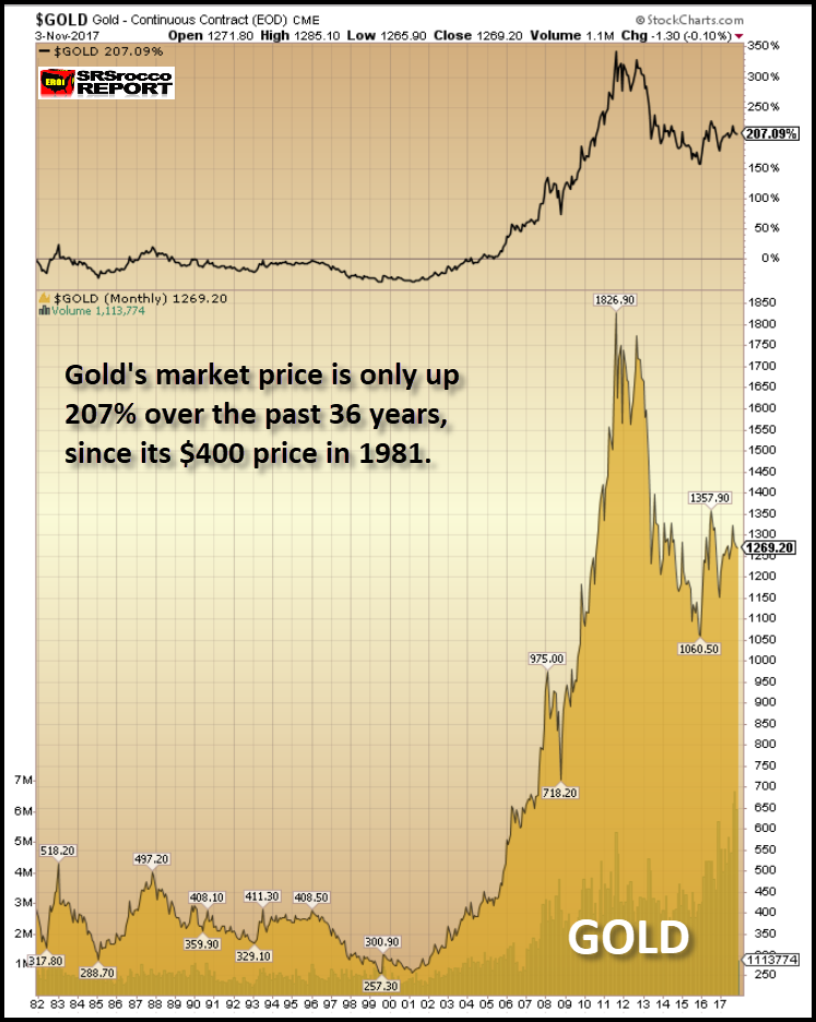
I would imagine some precious metals investors would claim that taking the $400 figure (1981) as a baseline would be disingenuous as gold was coming off its high in 1980. Okay, I will give you that. But, even if we used the low of $275 reached in 2001, the increase would still only be 350% during that 16-year period. Thus, gold's 350% increase from its low in 2001 is still anemic compared to gains made by the Dow Jones Index or the other stocks mentioned above.
Either way, both copper, and gold have severely underperformed the gains experienced in the broader markets. Sadly, it's even worse when we look at the last metal in this group. While copper and gold at least enjoyed triple-digit percentage gains over the past 36 years, the current silver price hasn't even surpassed double-digit gains. As of the end of trading last week, the silver price only gained a paltry 99% from its trading level of $8 in 1981:
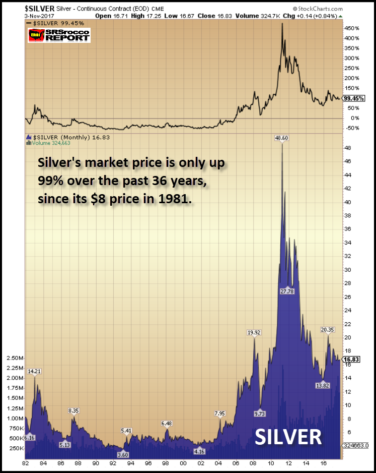
This chart reveals the frustration felt by many silver investors. However, there is a good side to this story. And that is... BUBBLES POP while DEPRESSED ASSETS SURGE. You have to think about the metals in this fashion. Gold and silver are behaving like the VIX. The more the VIX index goes down, the more the stock market rises. But, when the bubble markets finally pop, then the VIX will shoot back higher (as seen in the RED SPIKES in the DOW chart above), taking the precious metals prices up with it.
This next market crash will not resemble anything similar to what took place during the 2008-2009 U.S. banking and housing market collapse. When the markets cracked in 2008, EVERYTHING went down together. Instead this time around, as the markets tank the precious metals will surge to new highs. We must remember, there really isn't much in the way of safe assets to move into during the next market crash. So, as investors flee from bloated STOCKS, BONDS, and REAL ESTATE, to the tiny gold and silver market, fundamentals won't matter either... LOL. Yeah... we could see some ridiculous high gold and silver prices as investors finally receive precious metals religion.
Lastly, if you haven't checked out our new PRECIOUS METALS INVESTING section or our new LOWEST COST PRECIOUS METALS STORAGE page, I highly
Check back for new articles and updates at the SRSrocco Report.