![]()
See this visualization first on the Voronoi app.

Use This Visualization
Visualizing S&P 500 Performance by Presidential Year
This was originally posted on our Voronoi app. Download the app for free on iOS or Android and discover incredible data-driven charts from a variety of trusted sources.
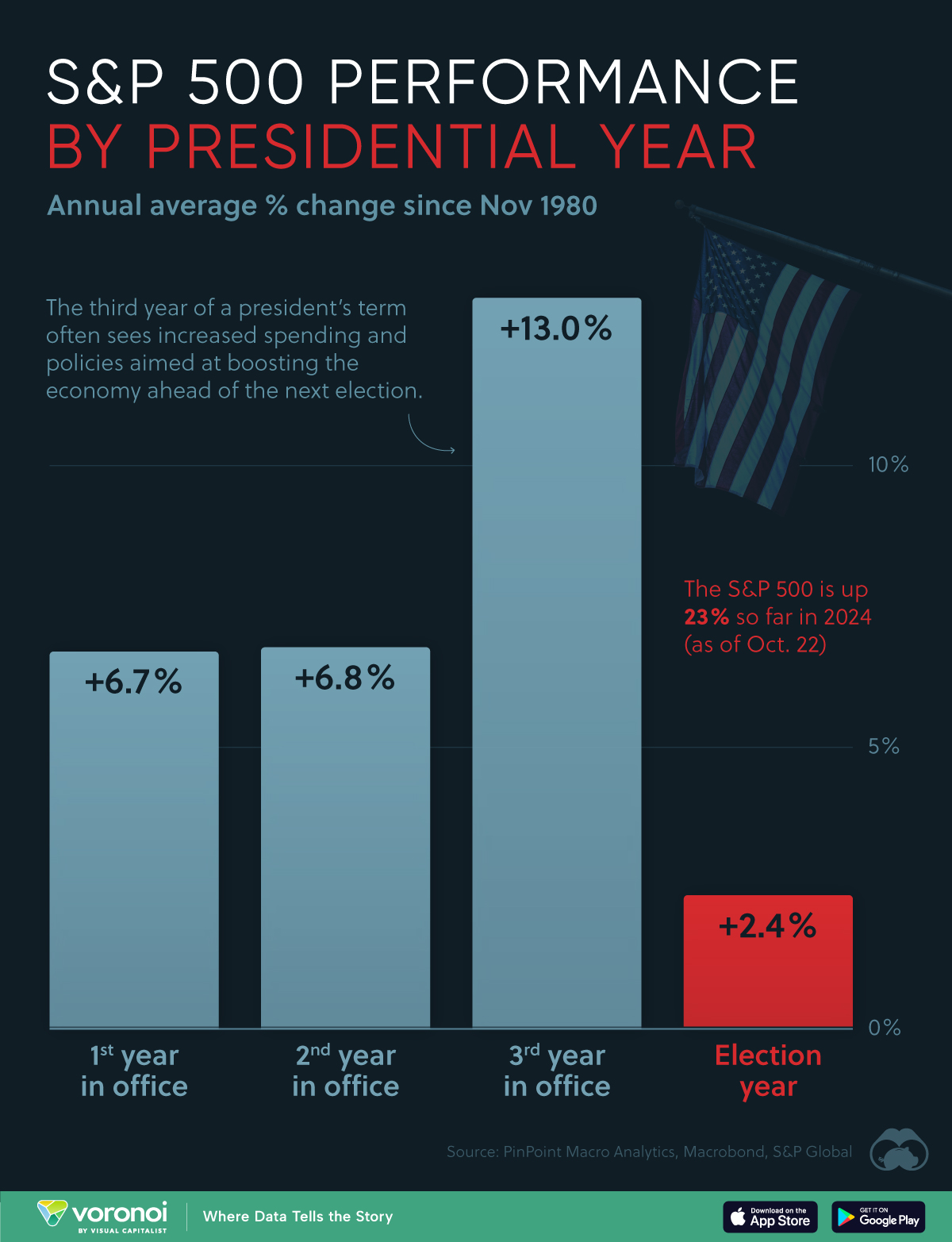
This graphic visualizes the average annual percentage change of the S&P 500, by year in the presidential cycle using data sourced from PinPoint Macro Analytics.
It highlights how the third year of a president’s term has historically been the best year for the U.S. stock market.
Data and Key Takeaway
The data we used to create this graphic is listed in the table below. This analysis is based on averages dating back to November 1980 (Jimmy Carter’s last year as president).
| Presidential Year | Annual Average % Change of S&P 500 |
|---|---|
| First | 6.7% |
| Second | 6.8% |
| Third | 13.0% |
| Election Year | 2.4% |
It’s clear from these numbers that the third year of a president’s term has historically been the best year. This could be due to policies enacted during these years that aim to boost the economy ahead of the next election.
Meanwhile, the fourth year (election year) is often the worst year for the S&P 500. This could be due to heightened political and economic uncertainty leading up to an election, which likely weakens investor confidence.
Past Performance is Not Indicative of Future Results
When reading historical averages, it’s important to remember that past results don’t necessarily predict the future. There are also many factors that determine market returns, which are independent from U.S. government policies.
As an example, consider the S&P 500’s performance over the four years of Biden’s presidential term.
| Year | S&P 500 % Change | Annual Average % Change of S&P 500 |
Presidential Year |
|---|---|---|---|
| 2021 | 28.7% | 6.7% | First |
| 2022 | -18.1% | 6.8% | Second |
| 2023 | 26.3% | 13.0% | Third |
| 2024 (YTD as of Oct. 28) | 22.8% | 2.4% | Election Year |
We can see that every year of Biden’s term has been significantly different from the historical average.
2021 outperformed due to low interest rates and COVID-related stimulus, while 2022 underperformed as the Federal Reserve began to aggressively raise interest rates to fight inflation.
2023 and 2024 have both been very strong years for the S&P 500 due to the ongoing tech rally centered around artificial intelligence.
Learn More on the Voronoi App ![]()
If you enjoyed this post, check out Gold Prices by U.S. President on Voronoi, the new app from Visual Capitalist.
The post Visualizing S&P 500 Performance by Presidential Year appeared first on Visual Capitalist.