You are here

Business

What The Smart Money Is Most Worried About: This Is The Biggest "Tail Risk" Keeping Traders Up At Night
What The Smart Money Is Most Worried About: This Is The Biggest "Tail Risk" Keeping Traders Up At Night

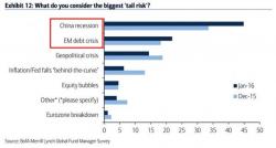
When BofA's Michael Hartnett releases his monthly Fund Managers' Survey, the one chart we always head straight to is the one showing what the "smart money" investors, aka those polled clients who make up the survey (and the same ones who we reported earlier have been selling this bear market rally for the past seven straight weeks) are most worried about, or as they put it: what are the biggest "tail risks."

A brief walk down memory lane. 
Silver "Longs" Near Record Highs As ETF Holdings Surge

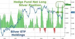
Silver "Longs" Near Record Highs As ETF Holdings Surge

It's not just gold that has been in great demand. As Bloomberg notes, investors own the most silver in exchange-traded products in seven months, boosting holdings from a three-year low. The rebound comes as hedge funds and other money managers hold a near-record bet on further price gains.


Source: Bloomberg

The precious metal, which also has wide industrial uses, is up 11% this year.

Why Oil Prices May Not Move Higher

Submitted by Arthur Berman via OilPrice.com,

The oil-price rally that began in mid-February will almost certainly collapse.

It is similar to the false March-June 2015 rally. In both cases, prices increased largely because of sentiment. As in the earlier rally, current storage volumes are too large and demand is too weak to sustain higher prices for long.

WTI prices have increased 47 percent over the past 20 days from $26.21 in mid-February to $38.50 last week (Figure 1).

US Business Inventory-Sales Ratio Jumps To Post-Crisis (7 Year) High

Following the recessionary surge in Wholesale Inventories-to-Sales ratio, this morning's Total Business inventories-to-sales rose to 1.40x - the highest since May 2009. With a 0.4% slump in sales and 0.1% rise in inventories, the smell of recession lays heavy on US businesses... but then again - who cares if Draghi can keep buying 'assets' and saving the world?

Look at this chart!


And this...


Do these look like the charts of a "recovering" economy?

Here's the Bounce... Is the REAL Collapse Just Around the Corner?

When it comes to analyzing long-term trends, the 10-month moving average has been a great metric for charting long-term bull market vs. bear market changes.


Generally speaking (there are of course exceptions) when stocks break above this line, they’re in a bull market. When they break below it, they’re entering a bear market.


However, when you’re transitioning from a bull to a bear market, stocks usually follow a specific pattern in which there is a bounce to “kiss” former support as the bulls attempt to reignite the lost momentum.


Pages