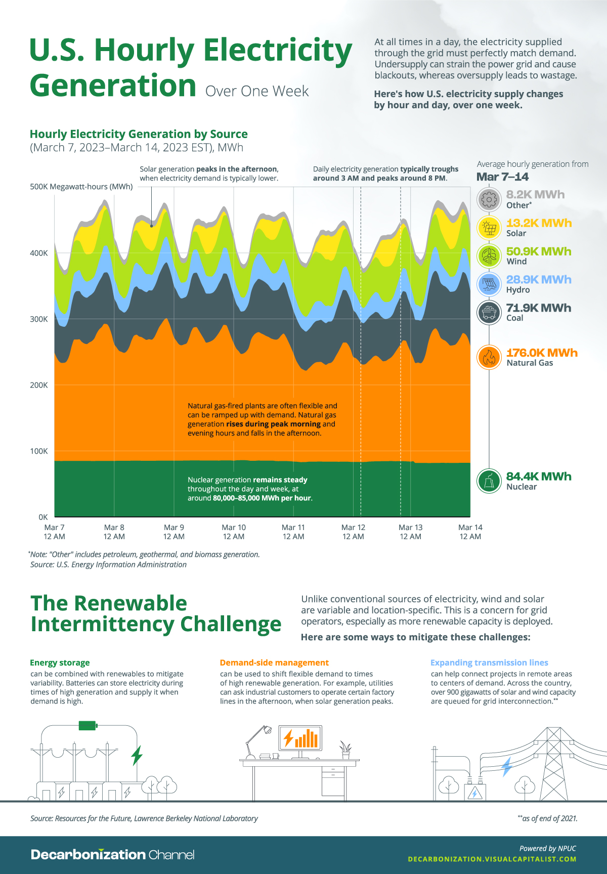
You are here

Environment

Animation: The Global Population Over 300 Years, by Country

http://player.vimeo.com/video/723334738
Animation: The Global Population Over 300 Years, by Country

Since the 1800s, our global population has grown from 984 million people to almost 8 billion—an increase of more than 700%.

Which regions around the world have led this growth, and what’s expected for the rest of the century? This animated visualization by James Eagle shows 300 years of population growth, including historical figures as well as projections up to the year 2100.

Asia’s Current Dominance

Visualizing the Range of Electric Cars vs. Gas-Powered Cars

Subscribe to the Elements free mailing list for more like this

The Range of Electric Cars vs. Gas-Powered Cars

This was originally posted on Elements. Sign up to the free mailing list to get beautiful visualizations on natural resource megatrends in your email every week.

EV adoption has grown rapidly in recent years, but many prospective buyers still have doubts about electric car ranges.

Charted: 40 Years of Global Energy Production, by Country

Energy was already a hot topic before 2022, but soaring household energy bills and a cost of living crisis has brought it even more to the forefront.

Which countries are the biggest energy producers, and what types of energy are they churning out? This graphic by 911 Metallurgist gives a breakdown of global energy production, showing which countries have used the most fossil fuels, nuclear, and renewable energy since 1980.

Pages