Via NorthmanTrader.com,
Nice rally off the lows in the past week just in time for OPEX. Yes the OPEX game is back in full swing and brought back hope amongst signs of bullish capitulation everywhere. Market bulls had gotten so clobbered that Morgan Stanley even felt compelled to admit their calls had been horrendous. In addition, 2016 end of year price targets just issued in late 2015 had to be dialed back rather dramatically by major Wall Street firms (by 10% in some cases) only a few weeks into the year:
Barely a month into 2016 Bank of America Merrill Lunch on Friday cut its full-year S&P 500 forecast from 2,200 to 2,000. Wells Fargo on Tuesday followed by slicing its range from 2,230-2,330 to 2,000-2,100, a 10 percent reduction.
Wall Street is not alone in big U-turns as plenty of Fed speakers are also back peddling on the 4 rate hike pace they had planned for 2016. All in all a very rough start to the year with the average investor’s portfolio down over 10% in just a few weeks, not to mention hedge funds getting severely pressured.
The OECD’s assessment this week was quite sobering:
The world economy is likely to expand no faster in 2016 than in 2015, its slowest pace in five years. Trade and investment are weak. Sluggish demand is leading to low inflation and inadequate wage and employment growth. Financial instability risks are substantial, as demonstrated by recent falls in equity and bond prices worldwide, and increasing vulnerability of some emerging economies to volatile capital flows and the effects of high domestic debt.
Bottom line: Unless people are effective in trading this action their net worth is getting eroded which could quickly spill over into consumer confidence and the Fed knows this and Janet Yellen pretty much admitted it.
It is then with this backdrop I wanted to provide an update to the 2016 technical outlook from January 2nd where I had outlined many of the downside risks.
Reviewing charts this weekend a story containing 3 distinct themes is emerging: The good, the bad and the ugly:
Let’s start with the good:

If anything positive can be gleaned for investors it’s the fact that support held again near 1810 $SPX forming what can be construed as a double bottom:
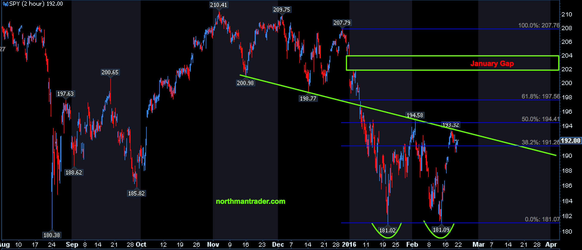
Certainly the price reaction, so far, supports this notion or at least made for a good long trade.
And principally the rally was no surprise as it fit again with the so often seen pre-OPEX rally pattern:

The Januarys of 2015 and 2016 had no such magic OPEX ramps, neither did last August, but the trend of pre-OPEX ramps remains strong.
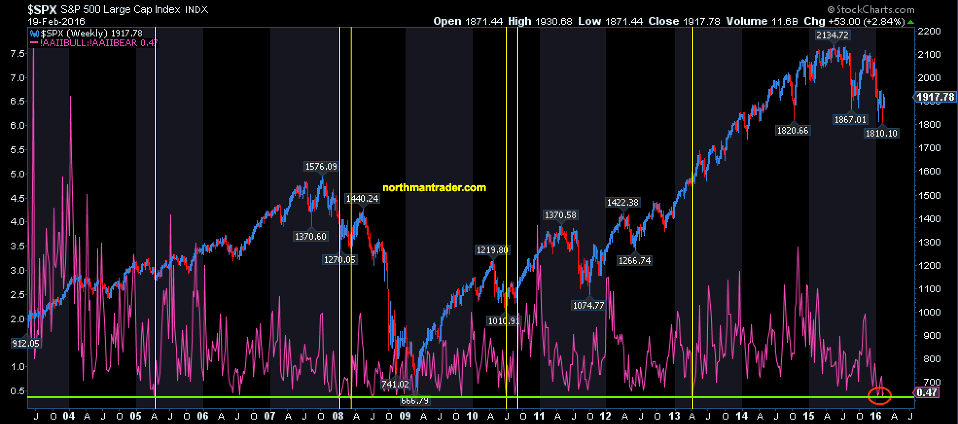
Further potential good news for markets it that sentiment not only stinks but in fact is commensurate with previous, at least short term, lows:
And investors have pulled a lot of bullish allocated cash out of the market and that is reflected in the allocation data:
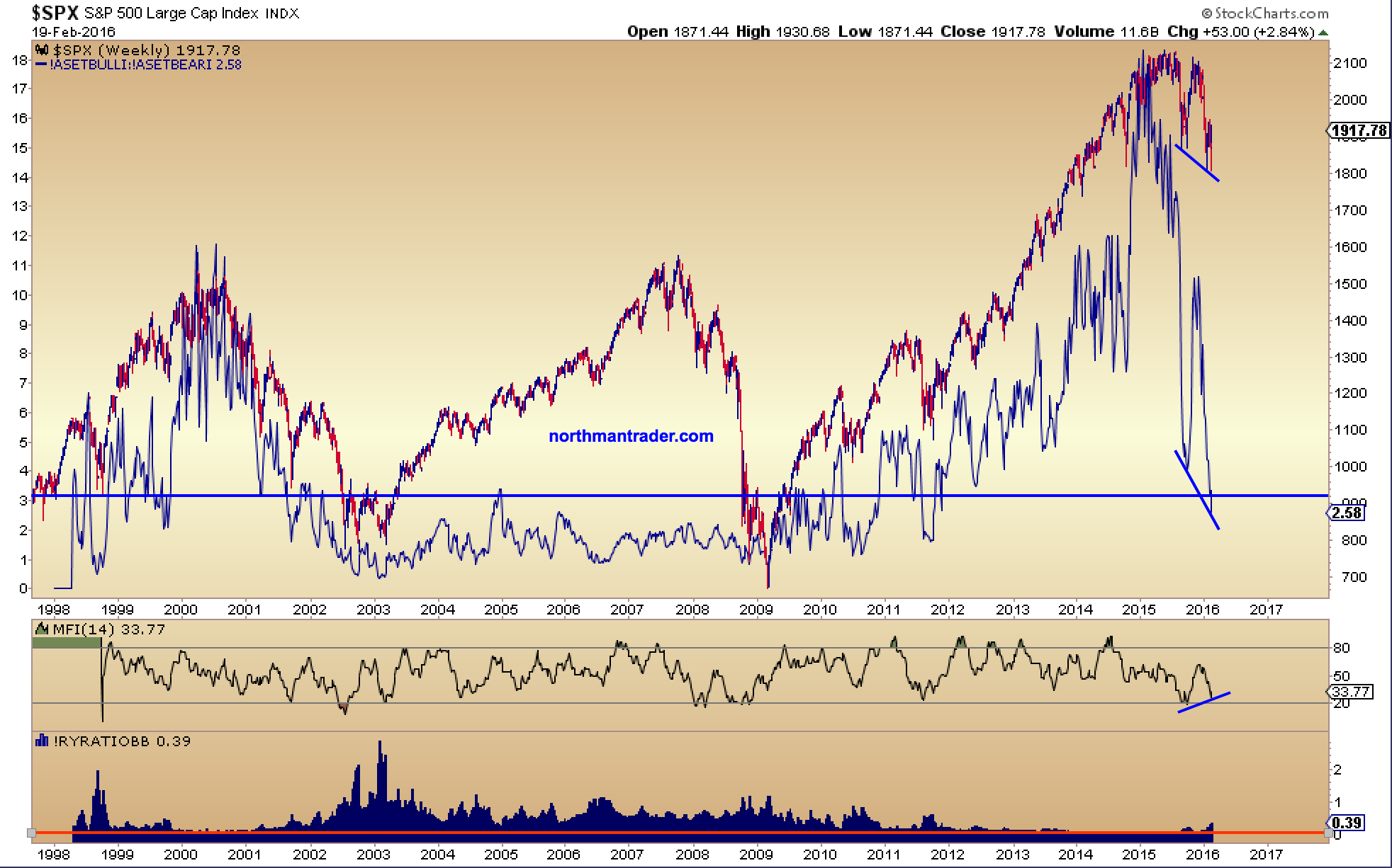
The implication: A lot of fluff has come out of this market, a meaningful correction has taken place, in fact on many levels this has been the worst start to any trading year on record. The damage has been so deep that despite a strong rally into OPEX markets remain far from medium term overbought:

Also potentially further supporting the “good” is the $BXSPX which continues to follow the script seen in September/October last year and has proved to be a great guiding post for us in supporting our recent trade buy weakness strategy:
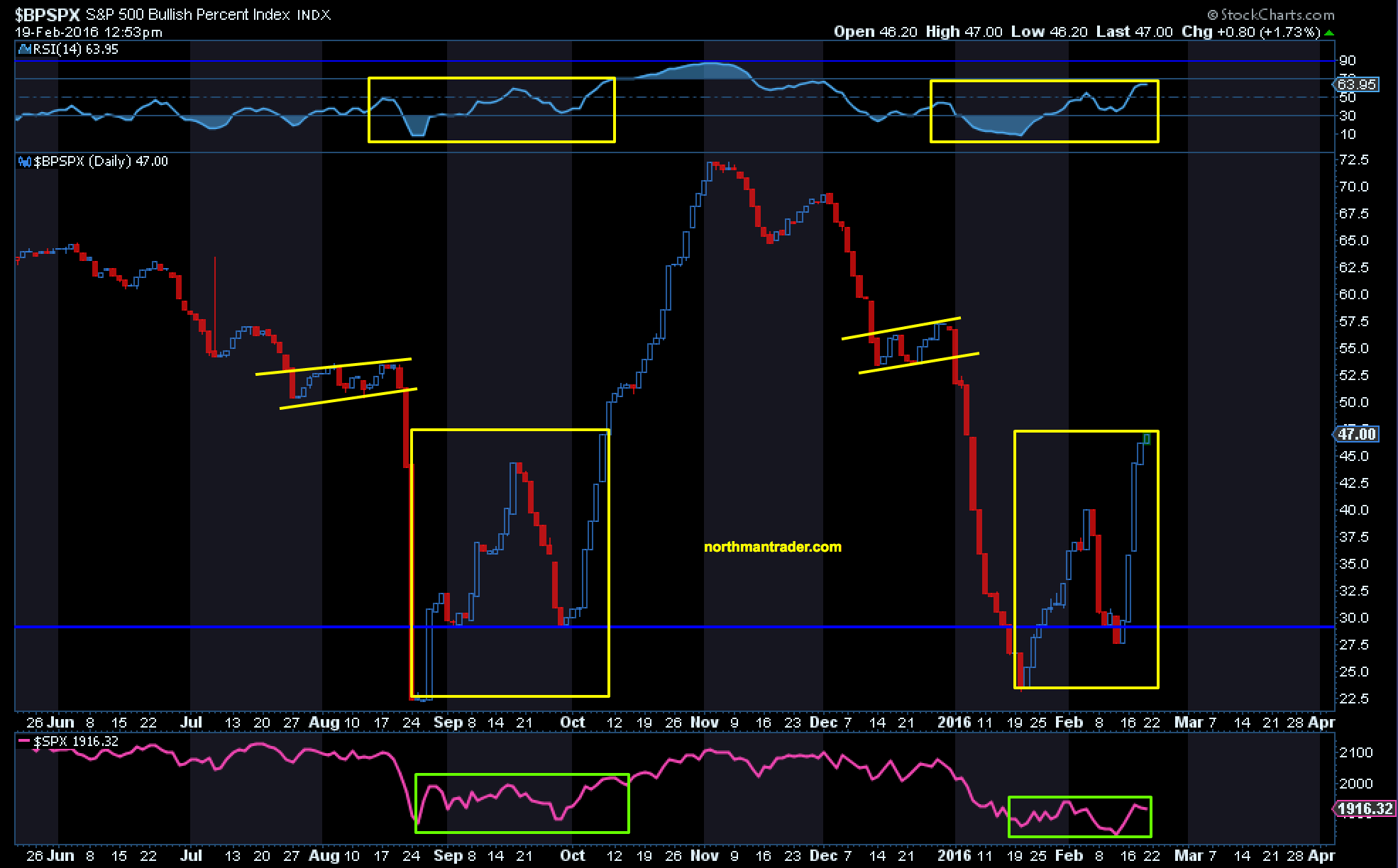
Were it to continue on the same path plenty more upside could be seen in this market in the weeks to come.
Keep also in mind the context in which recent lows were made: Key long term moving averages were tested while positive RSI divergences were put in place in many cases while support has held across the board:
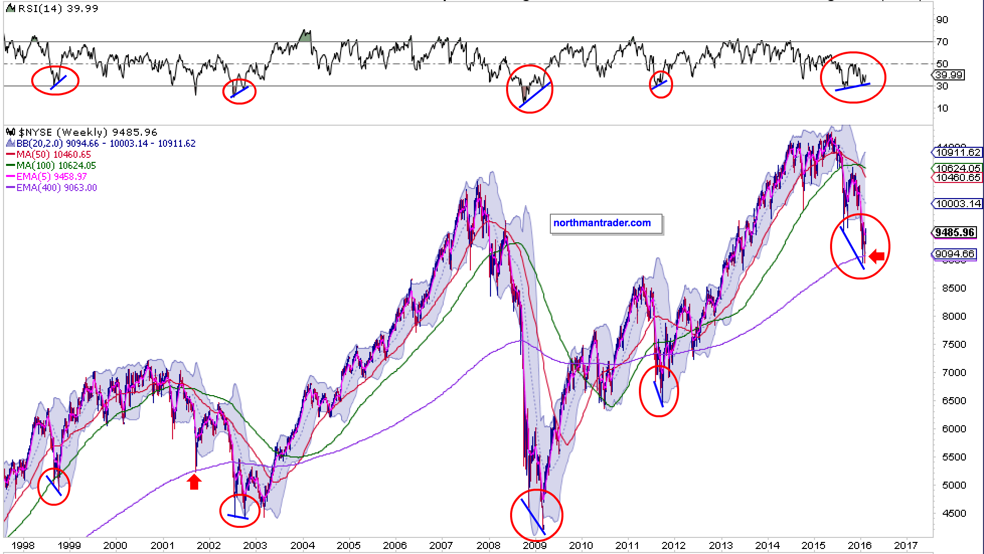
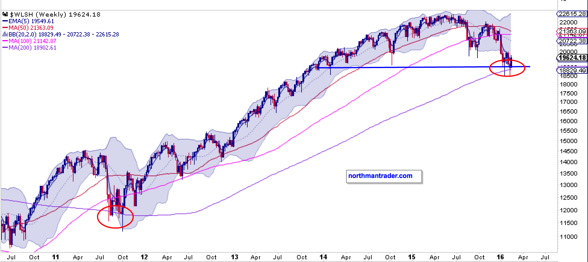
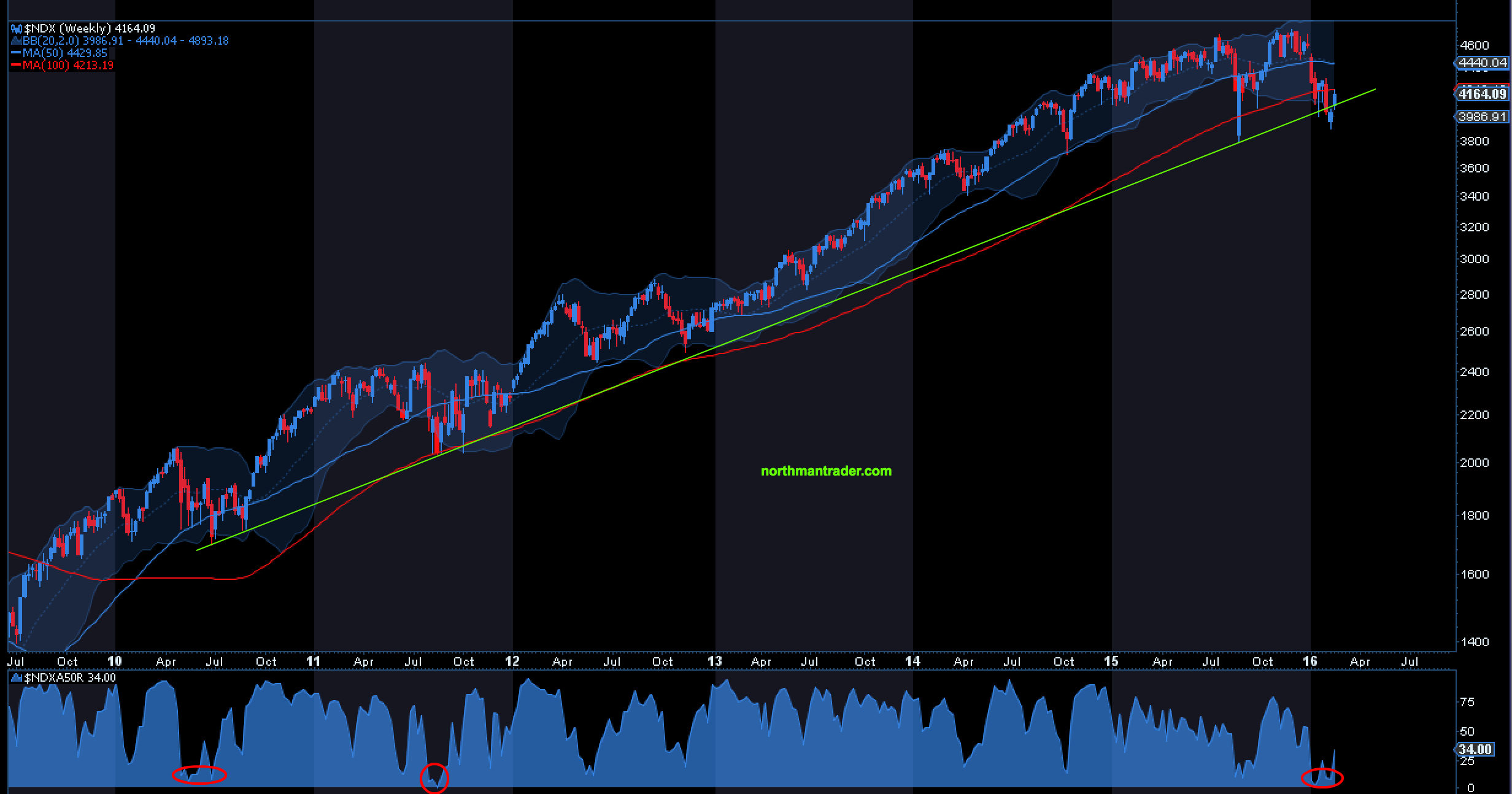
This not only applies to US charts, but key MA tests can be seen in international charts, take the German #DAX or the global Dow Jones Index as examples:
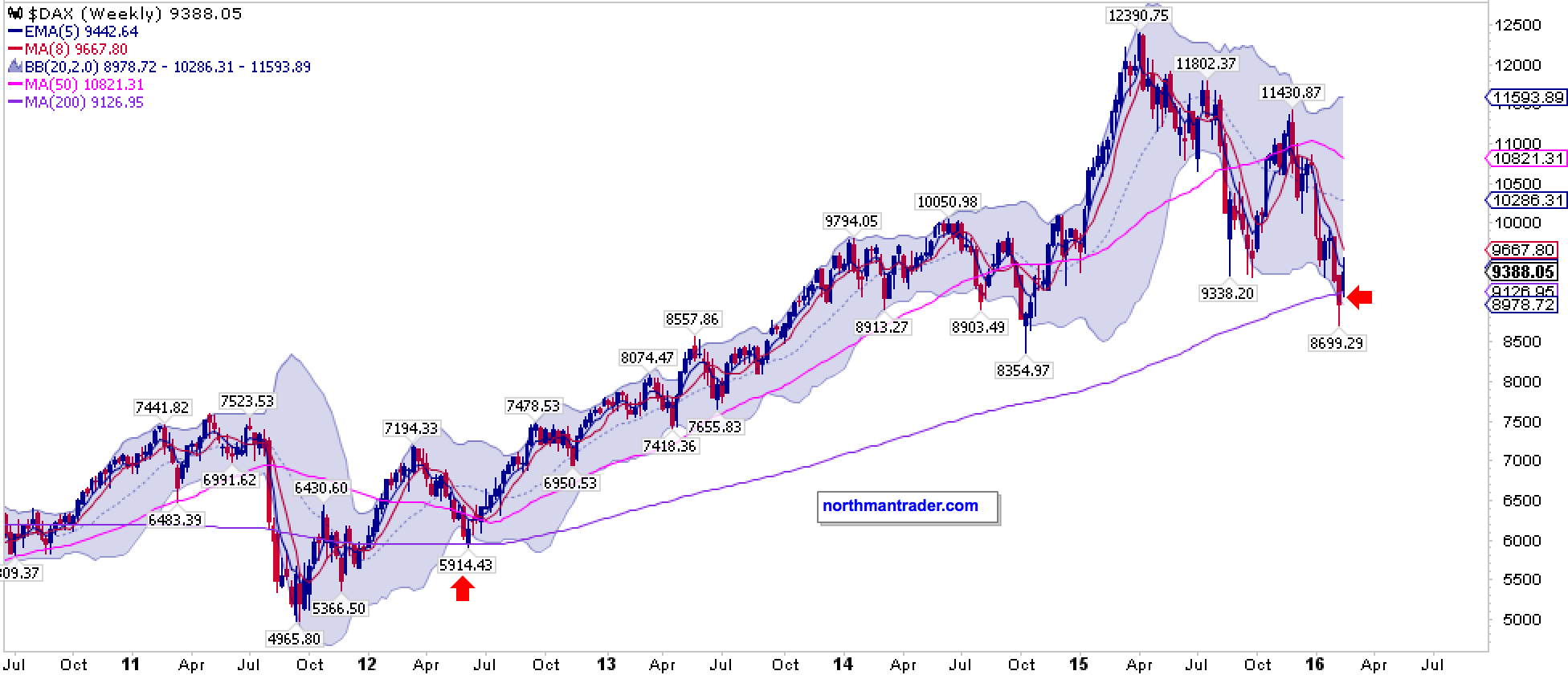
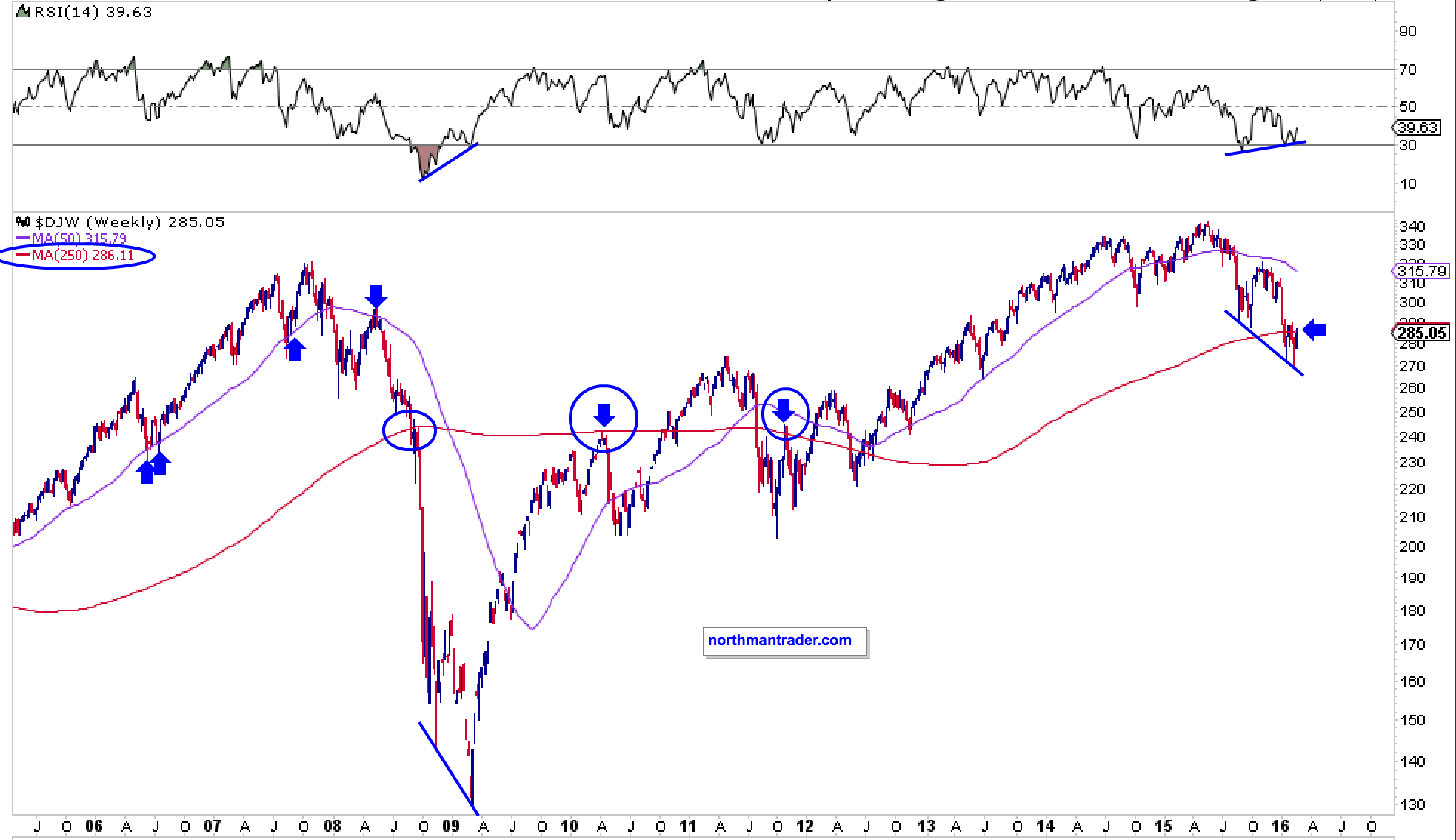
In summary, many charts show deep corrections having taken place with investor sentiment extremely poor and lots of cash either taken out of markets or now allocated bearishly as opposed to bullish.
Historically the combination of these factors could form the basis of a much larger rally yet to come.
But then there are the bad factors to consider:

Despite popular belief this correction did not start in January 2016. It started much, much earlier and it was largely ignored by all the bullish narrative on Wall Street and much of the financial media aided by $FANG stocks pretending to hold up what was already breaking down.
Ponder this:
The last time more than 50% of $NYSE stocks were above their 200 day moving average was in late June of 2015:
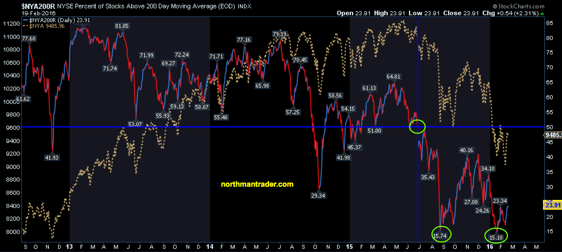
Here too we can observe a recent potential double bottom, yet 76% of $NYSE stocks remain below their 200 day moving averages. In summary: A lot of technical damage has been inflicted with much overhead supply presenting a major challenge to future rallies.
The picture is not much prettier on the $SPX:
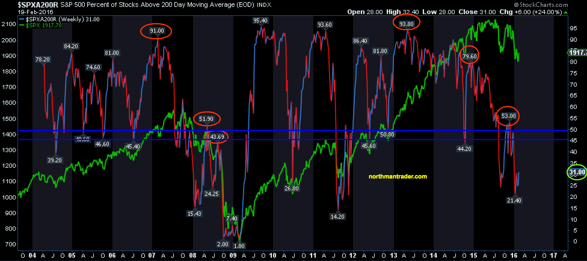
How bad has 2016 been so far? This bad:
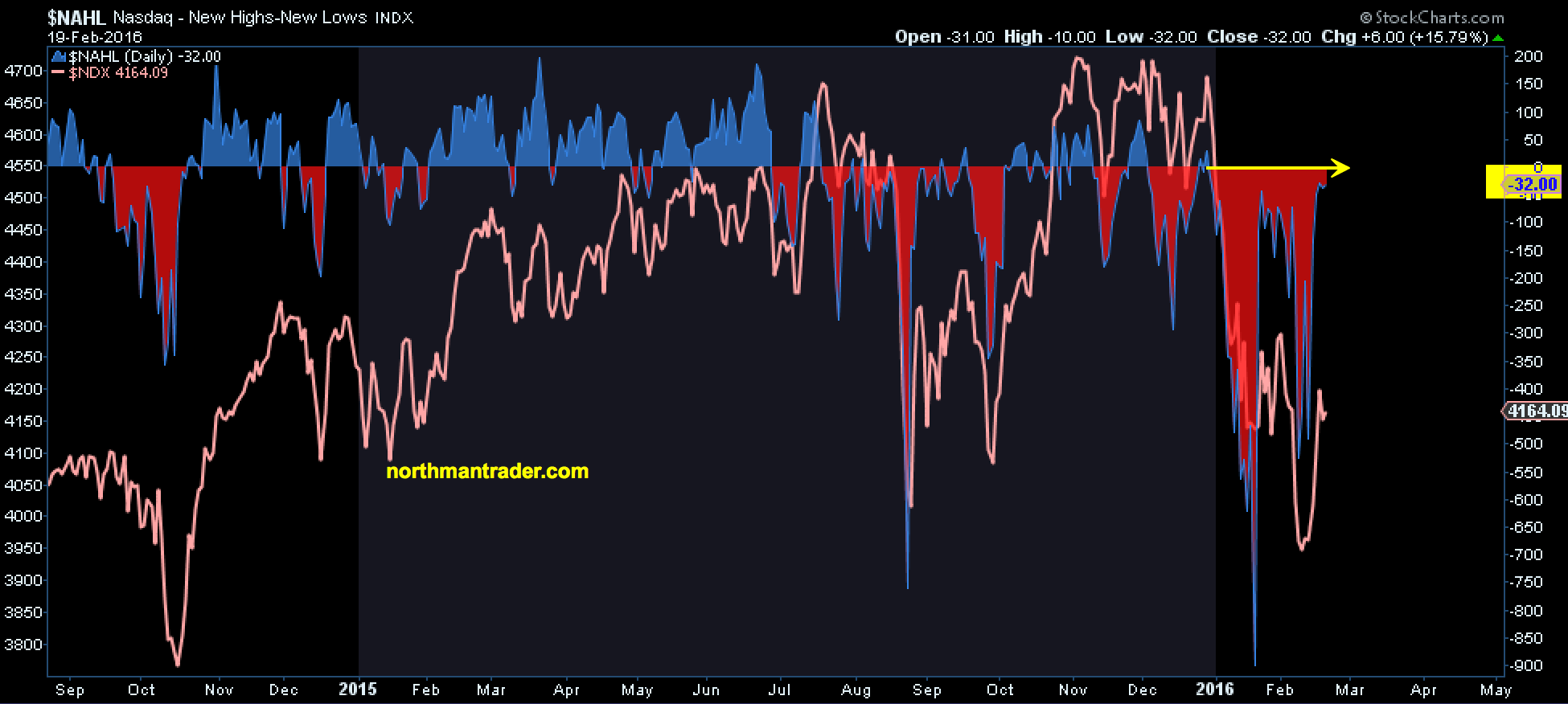
The internals have been so poor that the $NDX not once saw new highs exceed new lows this year. Not once:
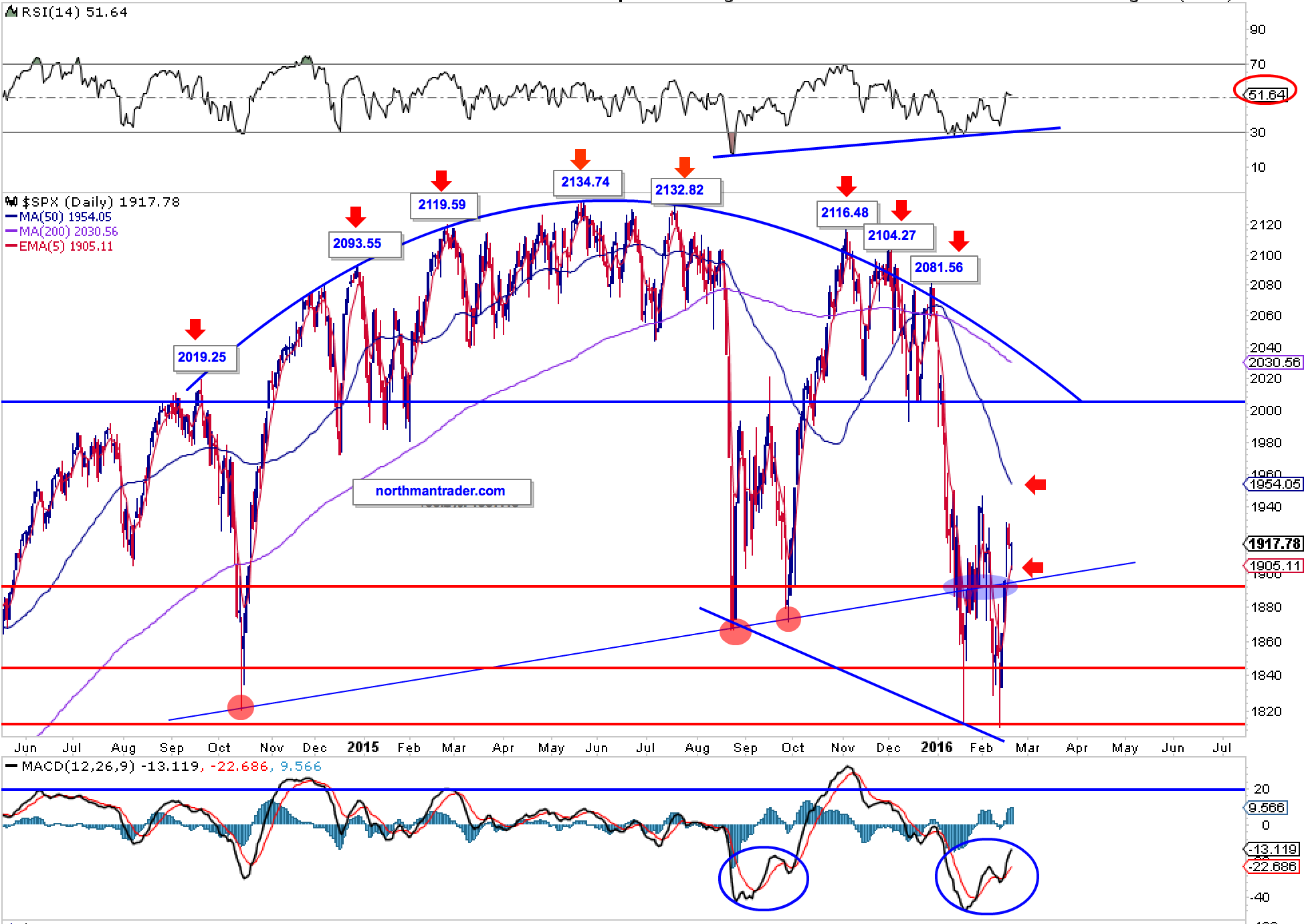
The $SPX hasn’t even managed to tag its 50MA in all of 2016:
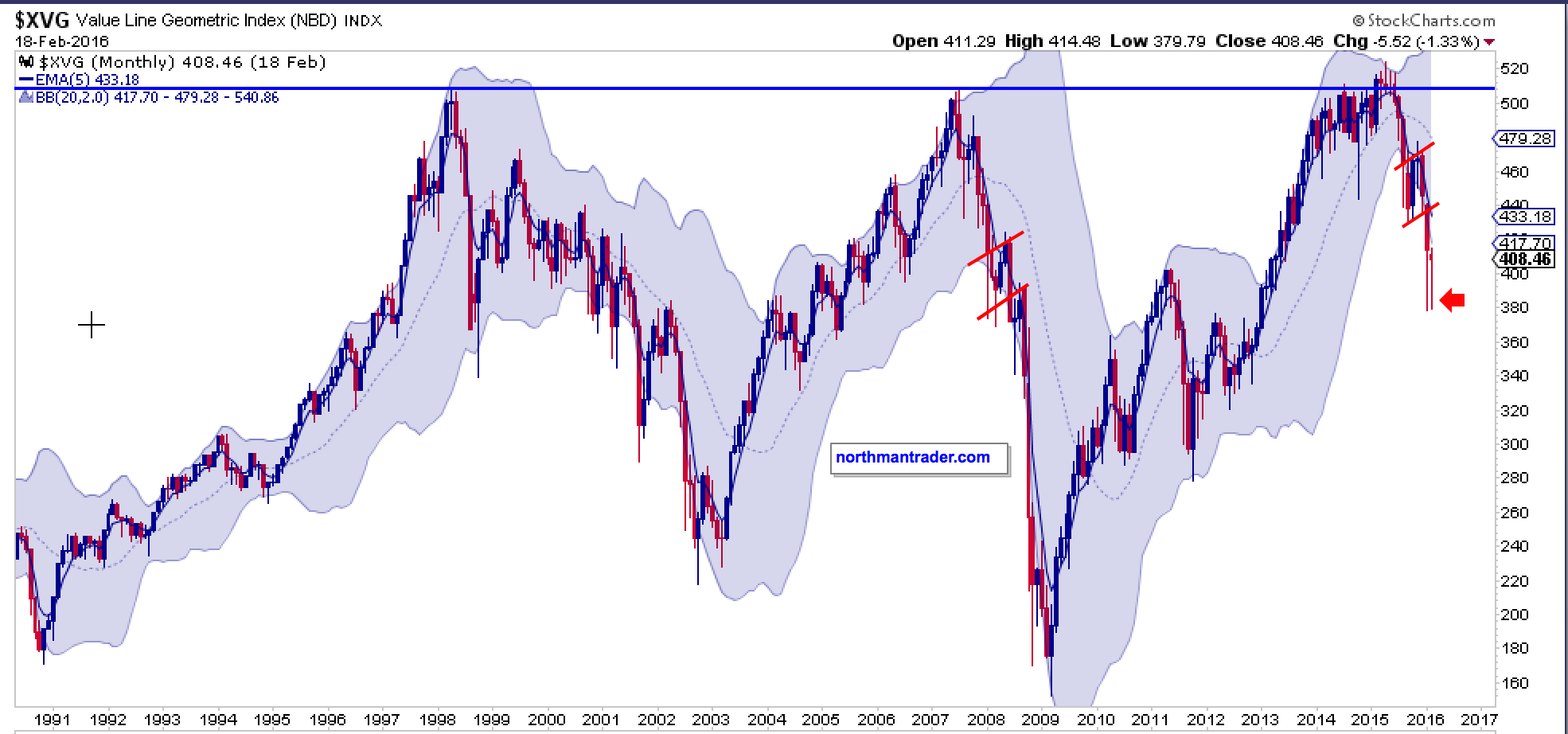
Also bad: Equal weight as expressed in the geometric index below remains a dreadful picture, in fact the chart is eerily commensurate with the action in 2008:
We’ve been talking a lot about 2008 lately as the price structure indeed has been following the 2008 script very closely. It still does in principle, but we have also observed even more volatility in 2016 compared to 2008:
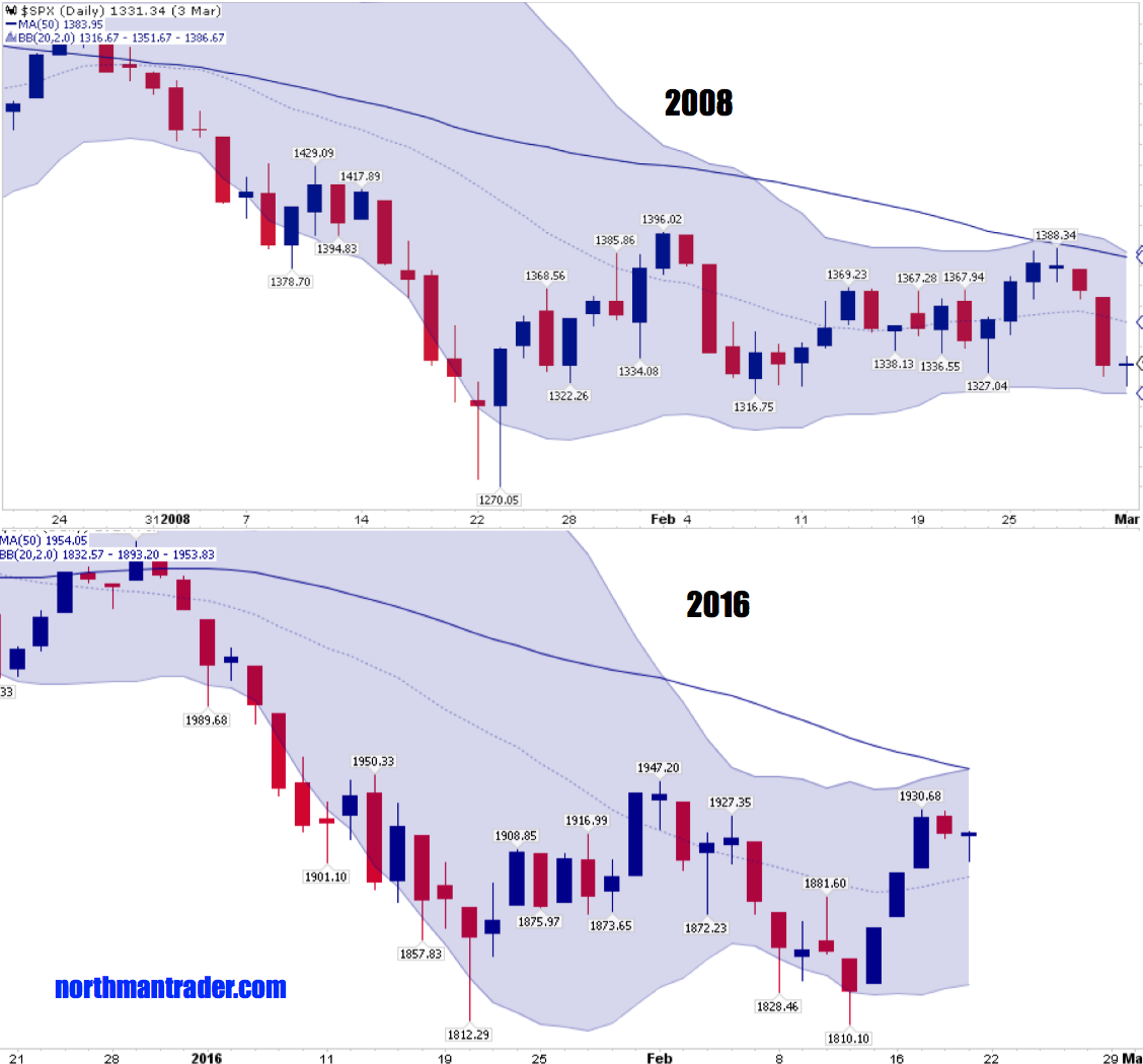
This analog structure remains valid until it deviates which it could at any time, or it could continue for months to come.
What does the structure suggest going forward? Well, it introduces our 3rd character in this story, the ugly:

The fact that the recent correction has been so deep and persistent has technical consequences. The most pronounced is that this correction can not easily resolve positively like previous larger corrections.
The reason for this is the threat of long term moving averages at risk of crossing over each other. History suggests that these crossovers are rare, but when they happen they have deep and meaningful consequences suggestive of much more downside to come:
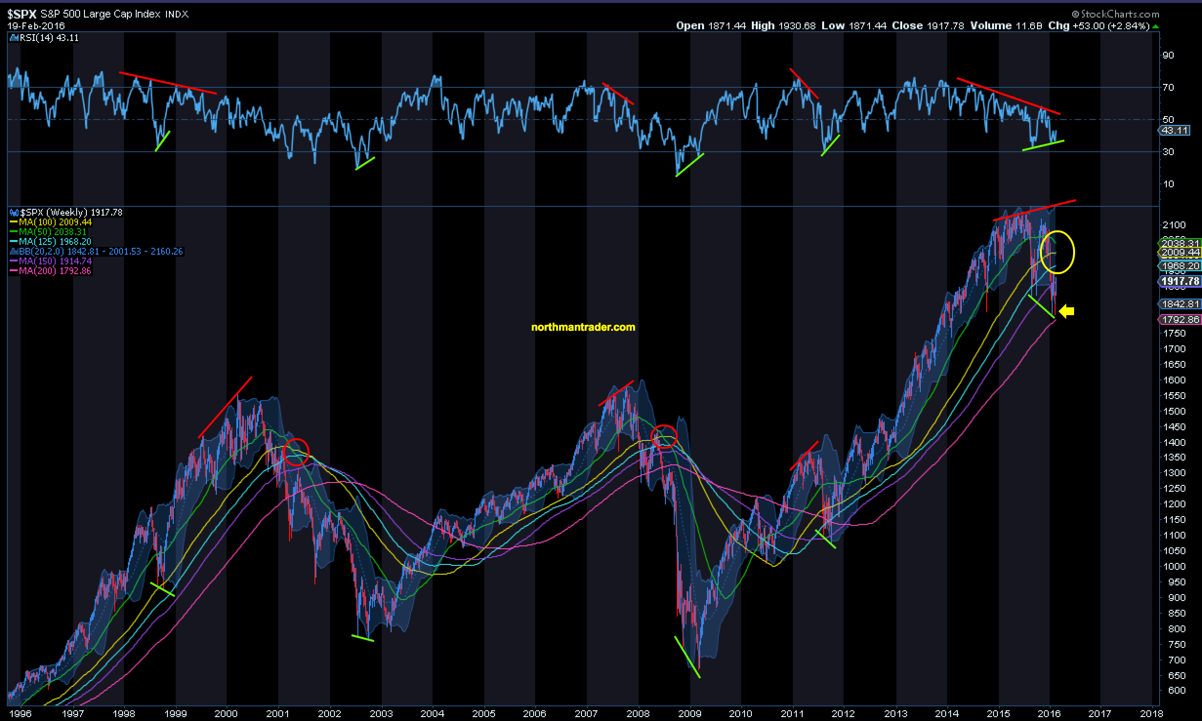
The $SPX still has more time before such a crossover will occur compared to other indices hence one could easily imagine a massive rally yet to come aiming to prevent such a cross over.
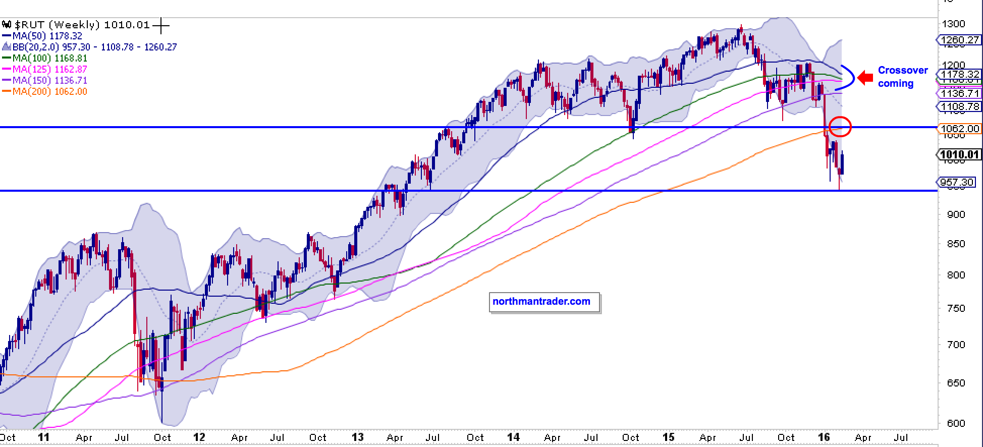
However, note that the turn has already started to happen which makes this correction different than previous ones. Take 2011 as an example. It was actually steeper and faster in price correction but its major moving averages stayed generally positive and did not cross over each other. This correction here suggests that such a repeat will be extremely difficult, if not impossible.
Take the $RUT for example. The crossover is indeed coming in the next few weeks and hence the structure is very different than 2011:
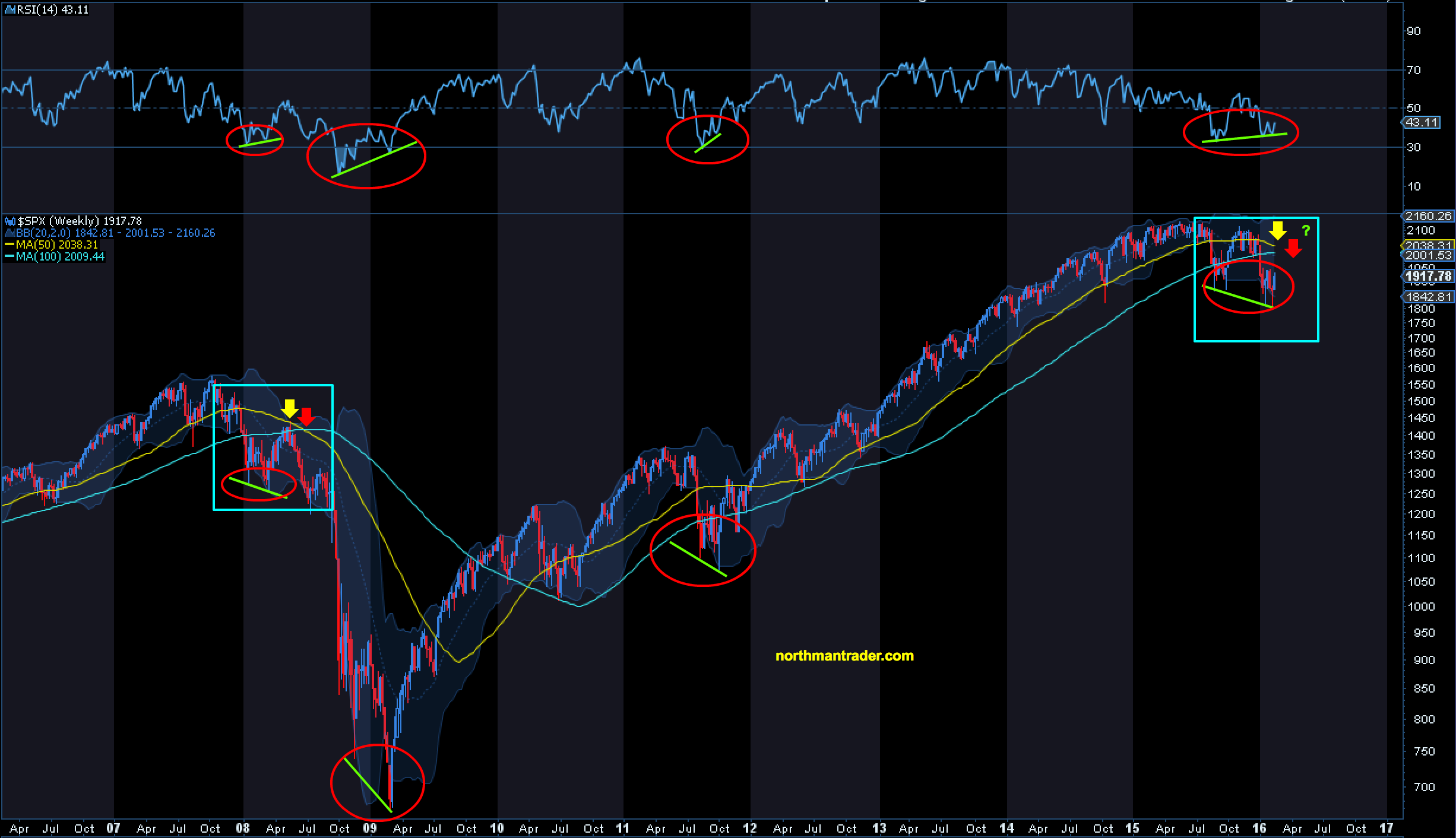
No, even if you zoom in on the $SPX it should be clear structurally so far this is not a 2011 repeat, but very much like 2008:
Another very big difference to corrections like 2011: The trend in key monthly moving averages has fundamentally changed. For years the monthly 5 EMA and 8MA were key support averages. So far in February we haven’t even touched them from the downside:
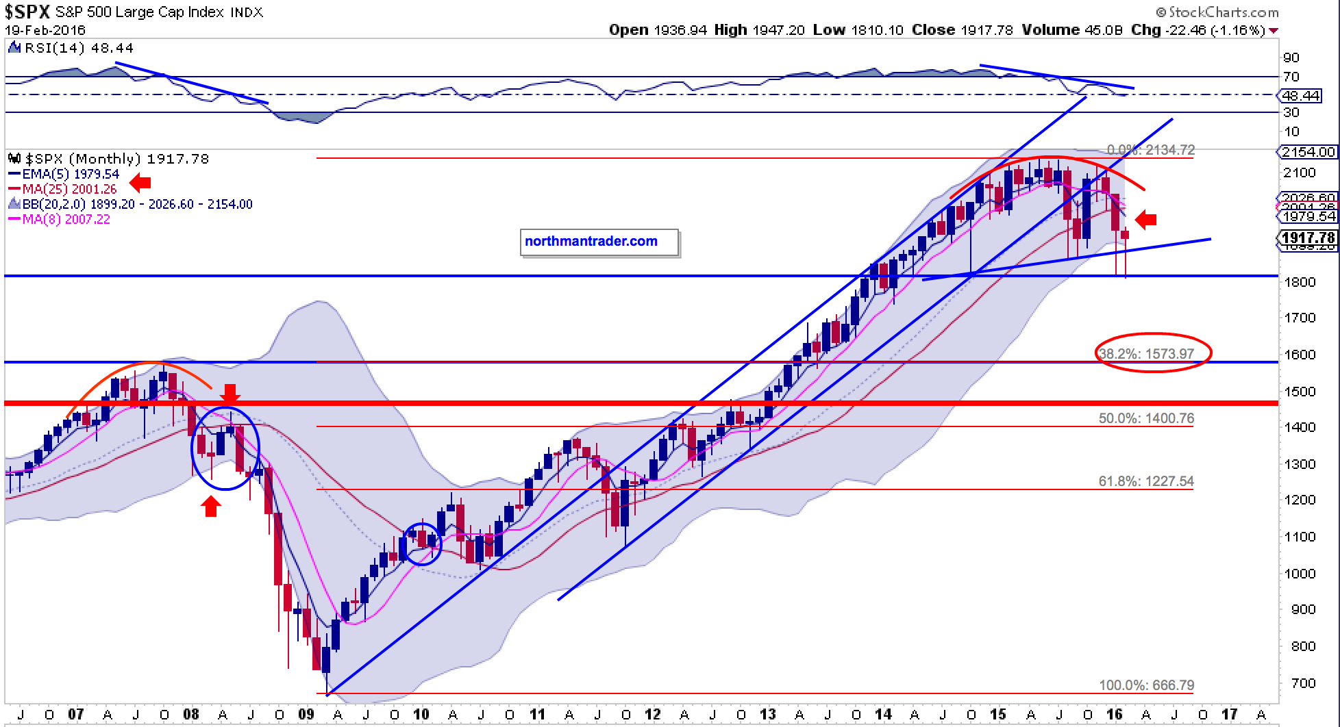
The ugly reality is that the $SPX is faced with a multi-year rounding top structure with the 1810-1820 area presenting a major support line, neckline if you will. Many of us technicians have identified the .382% fib zone at 1574 as a potential technical target which represents convenient confluence with the 2007 highs. Hence it remains an attractive target on a break of support.
However the topping structure also offers something more sinister: Taking the distance from the 2015 highs (2135) to the support line (1810-1815) and subtracting it from the support line you end up with a technical downside target as low as 1486.

Ugly enough? Such a move would represent an almost 30% correction off the highs.
Supporting such a move? The inherent inverse structure of the $VIX, and here is a potential $VIX roadmap from Mella:
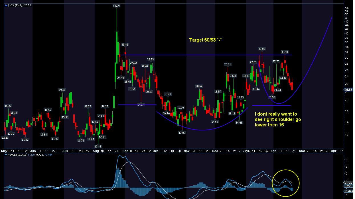
Her $VIX chart incidentally also aligns with her weekly $SPX chart which also supports the 1486 target:

But in order for this technical target to be eventually reached the neck/support must be broken first and so far sellers have failed in doing so.
So how will this fight turn out?

The good guy always wins right?
Sounds good until one realizes that even the good guy in this story is dangerous:

Here’s the problem with the good guy:
Even 2008 had a massive rally first. Referencing the analog structure we can see continued volatility, even a potential new low into March, before a move to rally into the open January gap and a tagging of the 200MA takes place. In 2008 it was this technical event that took place before the real carnage began:
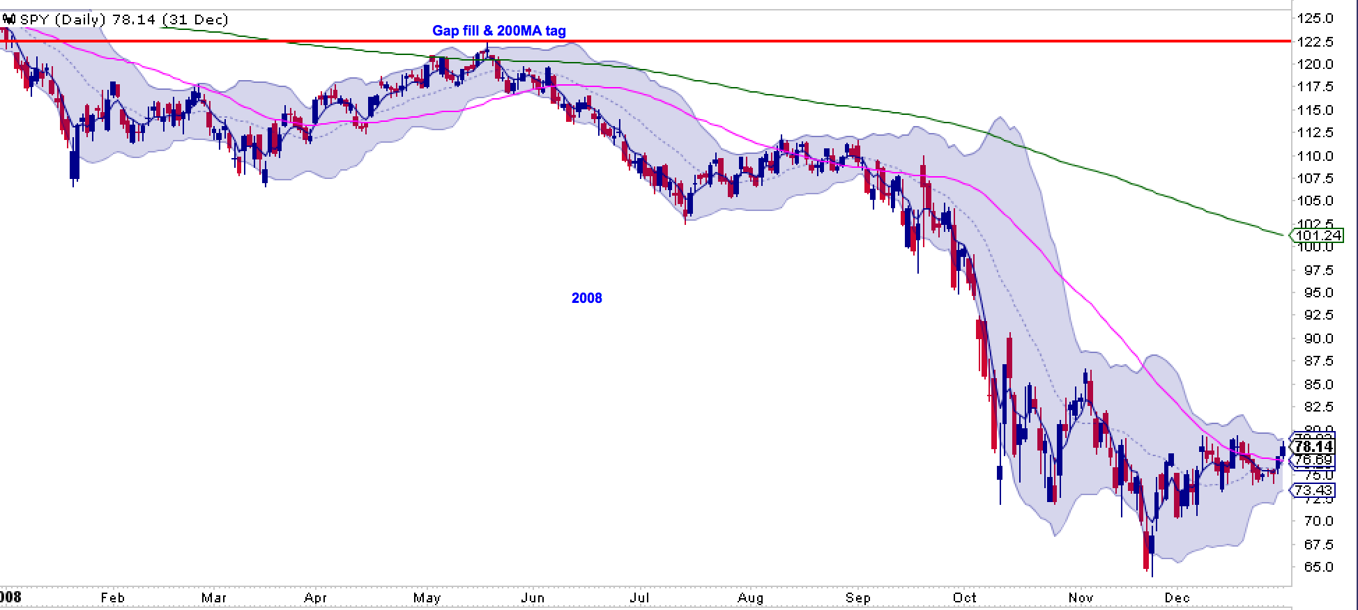
And this is the fundamental problem investors face right now. Even the good guy scenario outlined at the beginning of this post may not provide a happy ending for investors.
Hey, even in the original movie “The Good, the Bad and the Ugly” the good guy was a robber after all :-)
Hence a filling of the January gap may provide a great opportunity to raise more cash as the ONLY move invalidating these ugly set-ups is a sustained close above the January gap. But by the time markets fill this gap they will likely no longer be oversold, but vastly overbought. You get the drift.
Predictably in 2016 we see central banks extremely active again trying to save the day and preventing markets from finding their natural equilibrium. China is already flushing the system with liquidity, the BOJ went interest rate negative, the ECB wants to introduce more action at its March meeting and the US Fed is licking its wounds from the violent global reaction its rate hike has produced. See the financials:
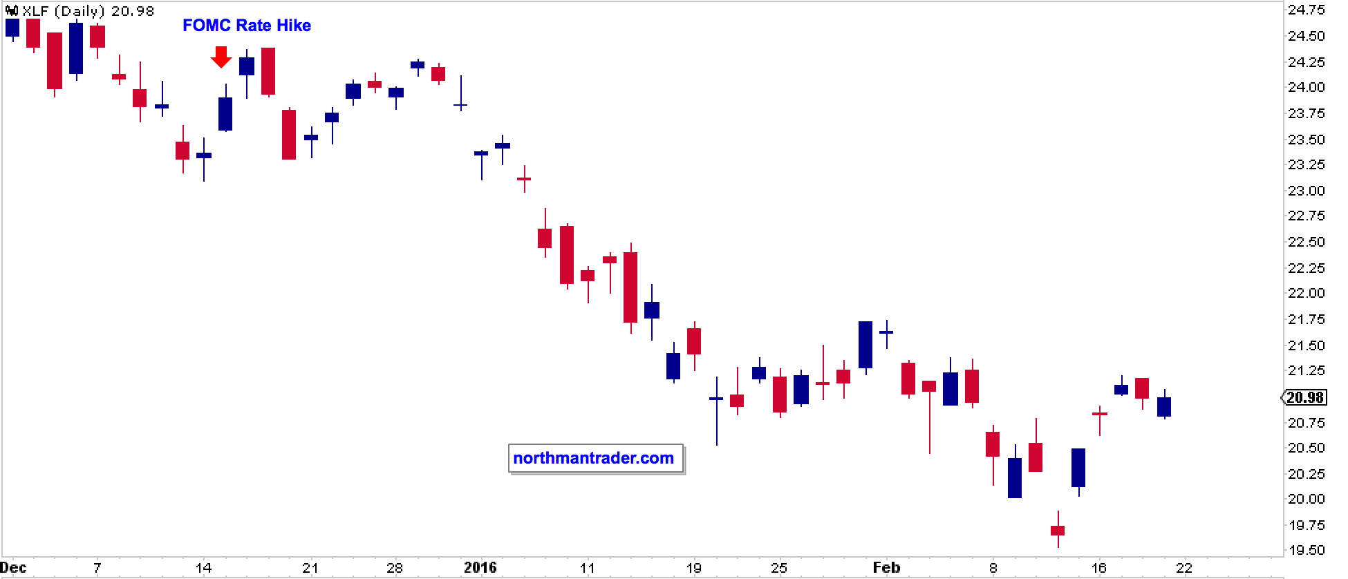
So one has to recognize that while global GDP, earnings and revenue growth remain elusive central banks remain accommodative and highly active.
The message is clear: This will be a long battle:

And for this reason this market will remain an intense trading environment requiring a keen eye on technicals.