![]()
See this visualization first on the Voronoi app.
Use This Visualization
Net Migration: Which Regions are Gaining or Losing People?
This was originally posted on our Voronoi app. Download the app for free on iOS or Android and discover incredible data-driven charts from a variety of trusted sources.
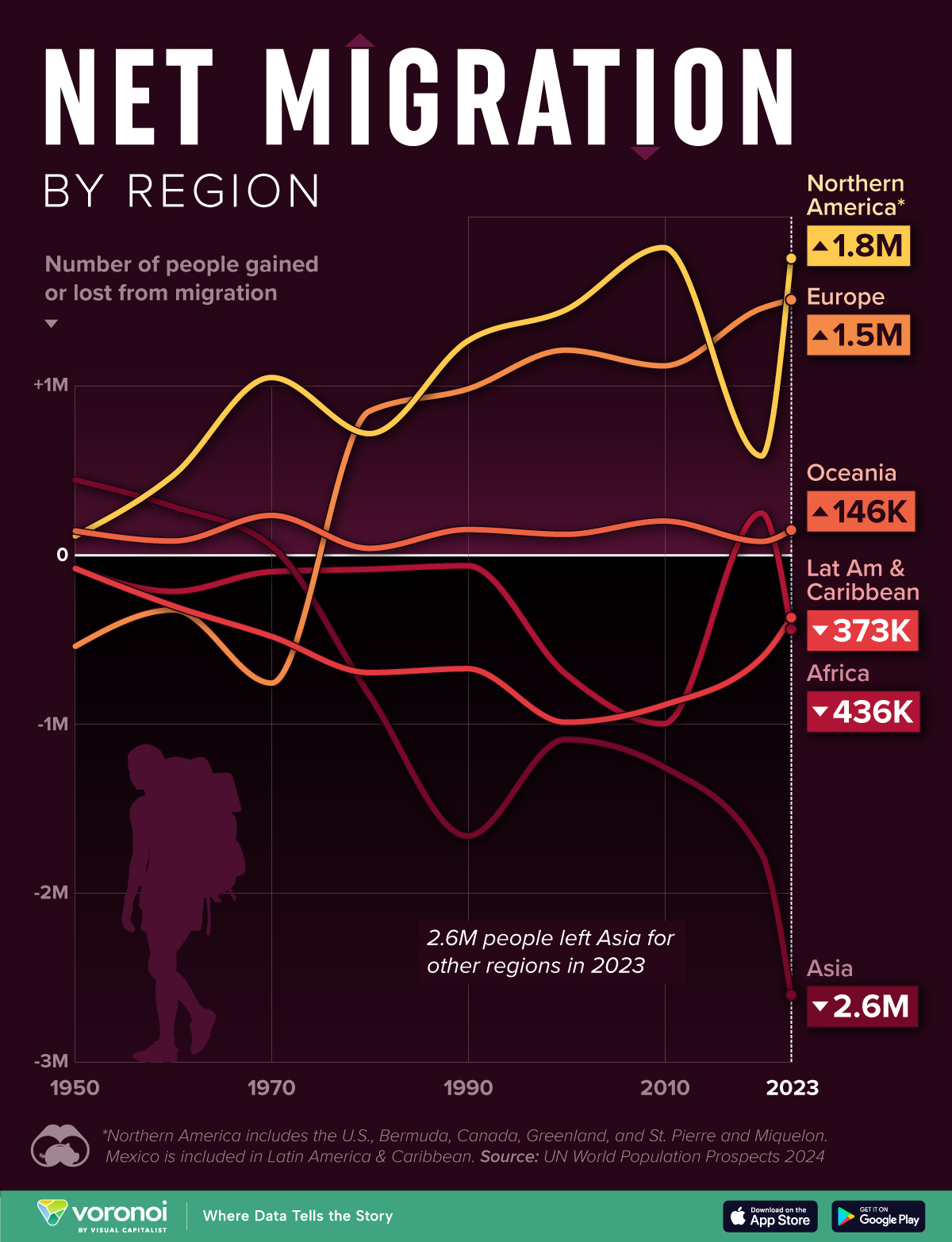
This graphic shows the flow of people globally by visualizing net migration by region, from 1950 to 2023 (in 10-year intervals).
Net migration refers to the difference between the number of people entering and leaving a country or region. All data was sourced from the UN World Population Prospects 2024.
Data and Highlights
The data we used to create this graphic is listed in the table below. Numbers represent net migration (# of people gained or lost) for that specific year.
| Year | Africa | Asia | Europe | LatAm & Caribbean |
Northern America* |
Oceania |
|---|---|---|---|---|---|---|
| 1950 | -79,640 | 444,440 | -539,880 | -79,940 | 112,540 | 142,490 |
| 1960 | -215,470 | 285,860 | -324,450 | -301,050 | 472,480 | 82,630 |
| 1970 | -98,840 | 53,360 | -757,510 | -481,670 | 1,050,270 | 234,390 |
| 1980 | -84,250 | -829,610 | 851,420 | -695,700 | 718,480 | 39,670 |
| 1990 | -63,570 | -1,662,240 | 981,960 | -672,560 | 1,265,530 | 150,890 |
| 2000 | -702,610 | -1,091,910 | 1,212,080 | -989,550 | 1,449,800 | 122,190 |
| 2010 | -998,430 | -1,253,480 | 1,119,290 | -888,120 | 1,819,570 | 201,170 |
| 2020 | 248,320 | -1,766,620 | 1,459,610 | -608,020 | 586,320 | 80,390 |
| 2023 | -436,290 | -2,603,560 | 1,510,380 | -372,550 | 1,756,190 | 145,840 |
*Northern America includes the U.S., Bermuda, Canada, Greenland, and St. Pierre and Miquelon. Mexico is included in Latin America & Caribbean.
From this data we can see that Northern America, Europe, and Oceania have regularly gained people from immigration. In other words, more people immigrated to these regions than emigrated.
Note that Europe saw negative values in 1950, 1960, and 1970, likely due to post-war reconstruction and political instability.
On the other hand, Latin America & Caribbean, Africa, and Asia have regularly lost people to other regions. People often leave developing regions to seek out better job opportunities and to escape political instability or war.
For example, the number of refugees entering the U.S. has historically spiked during conflicts, with the most recent example being the Russo-Ukrainian War.
Learn More on the Voronoi App ![]()
To learn more about this topic from a U.S.-perspective, check out this map graphic that shows where America’s 46.2 million immigrants have come from.
The post Net Migration: Which Regions are Gaining or Losing People? appeared first on Visual Capitalist.