![]()
See this visualization first on the Voronoi app.
Use This Visualization
The U.S. Population by Age Group in 2024
This was originally posted on our Voronoi app. Download the app for free on iOS or Android and discover incredible data-driven charts from a variety of trusted sources.
Key Takeaways
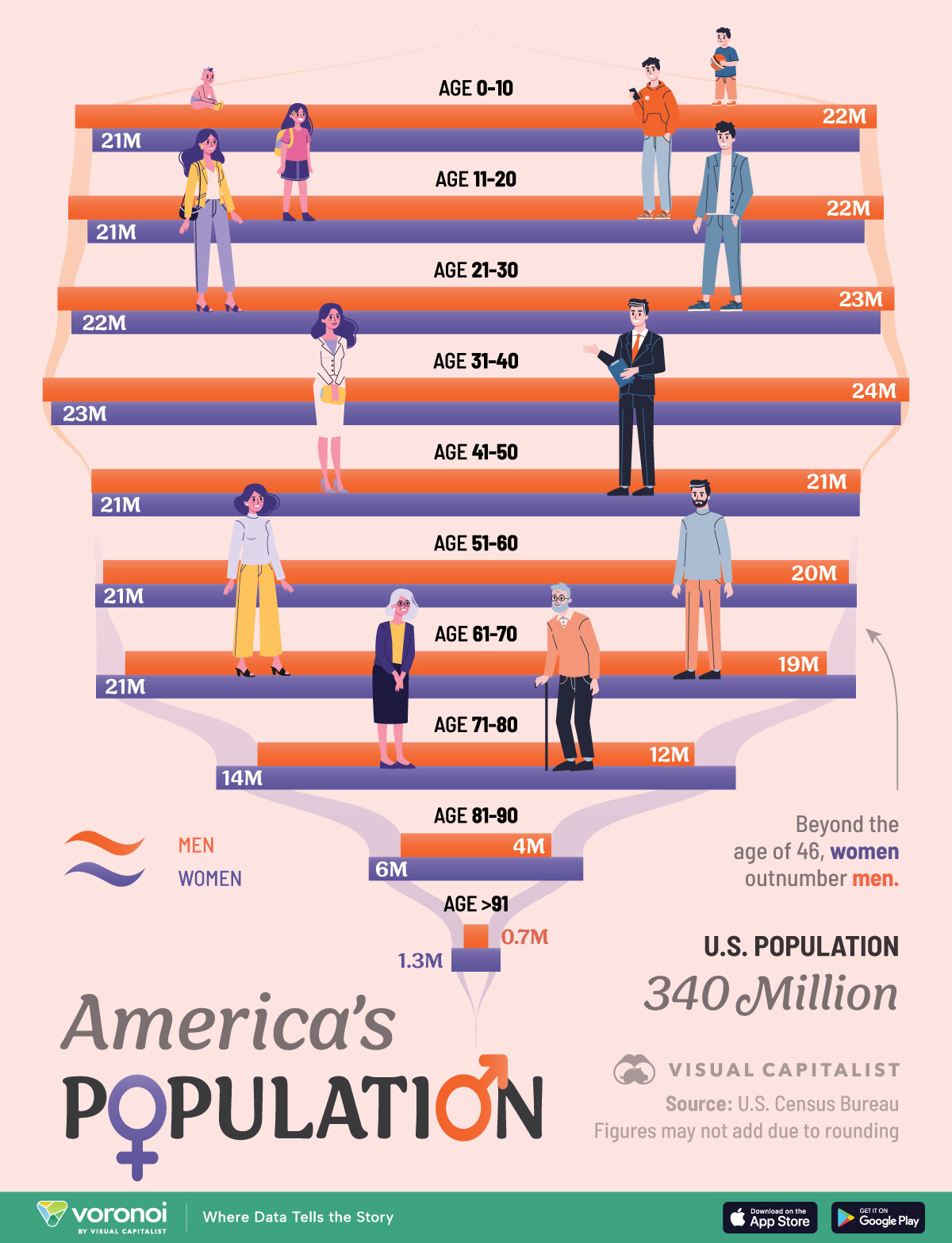
- Individuals aged 31 to 40 make up the largest share of the U.S. population in 2024, at nearly 47 million people.
- In all age groups under 50, men slightly outnumber women, but this trend reverses and increasingly widens as people age.
With the U.S. population getting older, how exactly is the population distributed across age groups today?
When looking at it by decades of age, interestingly, children under 10 continue to make up a larger share than those in their 40s, 50s, 60s. This comes as fertility rates hit record lows of 1.6 children per woman—down from 2.1 in 2007—while immigration supports population growth.
This chart breaks down the U.S. population by age and gender, based on data from the U.S. Census Bureau.
U.S. Population Distribution by Age and Gender
Below, we show America’s population distribution in 2024:
| Age | Male | Female | Male share | Female share |
|---|---|---|---|---|
| 0-10 | 21.9M | 21.0M | 51.1% | 48.9% |
| 11-20 | 22.3M | 21.3M | 51.2% | 48.8% |
| 21-30 | 22.9M | 22.1M | 50.8% | 49.2% |
| 31-40 | 23.7M | 23.3M | 50.5% | 49.5% |
| 41-50 | 21.1M | 21.0M | 50.1% | 49.9% |
| 51-60 | 20.4M | 20.8M | 49.5% | 50.5% |
| 61-70 | 19.2M | 20.8M | 48.0% | 52.0% |
| 71-80 | 12.0M | 14.2M | 45.7% | 54.3% |
| 81-90 | 4.1M | 5.9M | 41.3% | 58.7% |
| 91-100+ | 0.7M | 1.3M | 33.2% | 66.8% |
Today, the largest age group in America is people in their 30s, numbering close to 47 million.
In 2019, Millennials surpassed Baby Boomers as the biggest generation, and their share of the population is expected to peak by 2033. Moreover, immigration is projected to be a major driver of this growth.
Meanwhile, almost 43 million children are under 10 years old in America, making up about 13% of the total population. Of these children, males accounted for a 51.1% share. This mirrors a broader global pattern, where male births outpace female births in nearly every country.
When looking over each following decade, the share of males gradually decreases due to a complex mix of lifestyle factors, life expectancy, and mortality rates.
Most notably, among those aged 91 and older, women significantly outnumber men, at 1.3 million compared to 0.7 million. Going further, reaching this age group is a clear milestone—comprising just 0.6% of the U.S. population today.
Learn More on the Voronoi App ![]()
To learn more about this topic, check out this graphic on the world’s population as 1,000 people.