You are here

Business

Is This The Scariest Chart Out There?
Is This The Scariest Chart Out There?

Submitted by Lance Roberts via RealInvestmentAdvice.com,

Another week of volatility, but with no real resolution to the burning question of “where do we go next?” 

This past week, the release of the FOMC meeting minutes from April did little to solve the overall confusion. On Friday, I noted some key highlights from the minutes:

Participants generally agreed that the risks to the economic outlook posed by global economic and financial developments had receded over the inter-meeting period.


Gold Fund Inflows Surge To Highest Of The Year

Gold Fund Inflows Surge To Highest Of The Year

With high-yield bond funds suffering the largest redemptions in their history, this week saw gold fund flows soar to their highest in 2016 as buyers took advantage of the lower prices following the same path as George Soros, Stan Druckenmiller, Jana Partners, and Canada's financial giant CI Financial.


Junk bonds saw the single-biggest daily redemptions in history this last week...


"The Time Is Now" For Markets To Price In China's Next Slowdown, A Gloomy Morgan Stanley Warns

"The Time Is Now" For Markets To Price In China's Next Slowdown, A Gloomy Morgan Stanley Warns

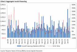
Just over a week ago, we pointed out that China's great credit growth stimulus from early 2016, when the PBOC injected $1 trillion in new credit in the first quarter of the year, had come to a screeching halt in April, confirmed by the lack of growth in China's broadest credit aggregate, Total Social Financing, which had just dipped to a negative growth print year-over-year.


Pages