The Moment The Market Broke: "The Behavior Of Volatility Changed Entirely In 2014"

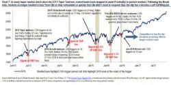
Earlier today we showed a remarkable chart - and assertion - from Bank of America: "In every major market shock since the 2013 Taper Tantrum, central banks have stepped in (even if verbally) to protect markets. Following the Brexit vote, markets no longer needed to hear from CBs as they rebounded so quickly that CBs didn’t need to respond." As a result, buy-the-dip has a become a self-fulfilling put.


